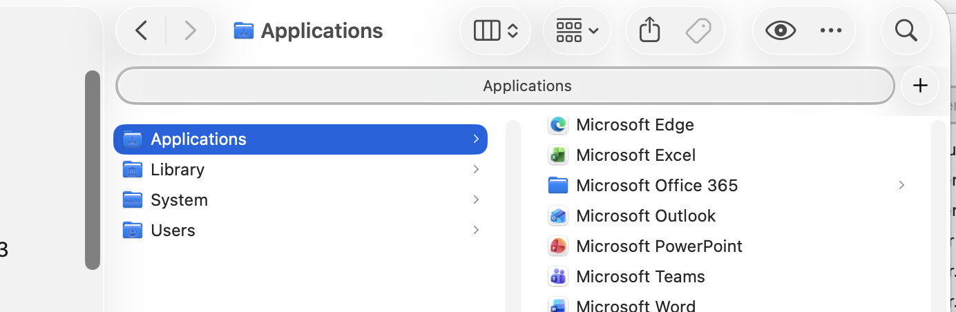
10 updates after the initial release of Tahoe I took the plunge and upgraded, I wish I hadn’t done so. Readability is so bad that it impacts my productivity. Currently I’m working hard to mitigate the various visual effects.
The latest I don’t understand is this one:
Why is there a second ‘Folder name’ in this rounded, grey field? How can I get rid of it?
That’s the “Tab Bar” - turn it on or off in the Finder “View” menu (or command-shift-T).
If you don’t open new folders in tabs (instead of windows) you’ll never need it, and if you do it will show automatically. The setting is meant for people who always want the tab bar to show.
I’m a long time Finder user, so I’ve used Finder Tabs for very long. I always have at least 3 or 4 open. Other Mac users I know don’t use Finder at all but keep everything on the Desktop. I grew up filing things in paper folders in filing cabinets, and am generally visual/spatial oriented.
It’s interesting to learn how different users organize their digital stuff!
The rounded corners for Tabs have been there also for a long time. I agree that the oval lozenge shape does not strike me as a “Tab” but more as a “Button”, and can see how the three appearances of “Applications” close together could be confusing.
Used to be, these tabs looked more like the tabs you’d find on a paper ‘manila folder’ as we used to call them, slightly round top left and right, joining to the contents straight down, sorta. I was using a mac on Sierra OS the other day and found its cleanliness and proportions nice.
Very true. A guy I’ve known for endless years, a highly intelligent and well educated person, doesn’t “see” a rectangle on his screen as a window that can overlap another window. If I give him full screen mode he gets lost and doesn’t even try to make controls -say the red close button- visible.
As an aside, your screen shot of the Finder’s toolbar is showing icons only.
How many customise the toolbar to show “icon & text”?
Every person I’ve set up Macs for wants the text to show under the icons.
Bonus tip:
I also add a “delete” icon (as well as “add new folder” and move the “search icon” to centre of the toolbar, making it easier to click on, as it can be hidden if Finder window is not very wide.
⌘ + F as a keyboard shortcut is not one many people use, or remember to use.
Not me. I show text under icons only when I want to learn and use the icons, and I learned long ago that the functionality that the Finder window icons provide is much more conveniently accessed (speaking for myself) through keyboard shortcuts.
I’d mostly forgotten that Finder windows have icons, to tell you the truth. My eye no longer registers them.
Highly depends on the app for me.
If I have only few icons up there and their meaning is clear to me, no text and just icons.
If I have very many icons in the toolbar or their design to me is not self-evident, I will choose text under icons as an aid.
So for me that means Finder is icons only while Mail has both icons and text.
I used to fiddle with the toolbars more but it kept changing each year so I gave up. I suppose I should know the icons after 40+ years of Mac use…
The batch of keyboard shortcuts I use is kind of random, I’m not fully a keyboard or mouse/trackpad sort and not 100% touch typist so probably damaged my neck over the years, looking down at the keyboard now and then…