While writing “macOS 27 Golden Gate Sharpens Tahoe’s Blurry Icons” (22 June 2026), I was chatting with Paul Kafasis of Rogue Amoeba about how it was good that macOS 27 Golden Gate’s app icons will be sharper and more distinct, but that it was a shame that Apple was still forcing all icons into the squircle shape that makes them more difficult to tell apart. Scroll through the TidBITS Member Benefits for a quick tour of some apps that haven’t changed their icons—I particularly like Acorn.
More specifically, we wondered, wouldn’t the similarity of squircle icons be especially problematic if the user had chosen either Clear or Tinted in System Settings > Appearance > Icon & widget style? (On the iPhone, touch and hold an empty spot on the Home Screen, tap Edit > Customize, and select Clear or Tinted.)
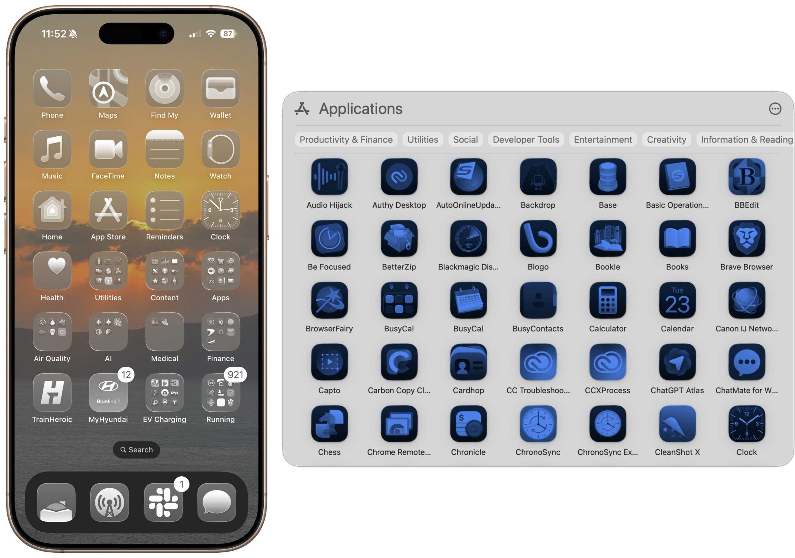
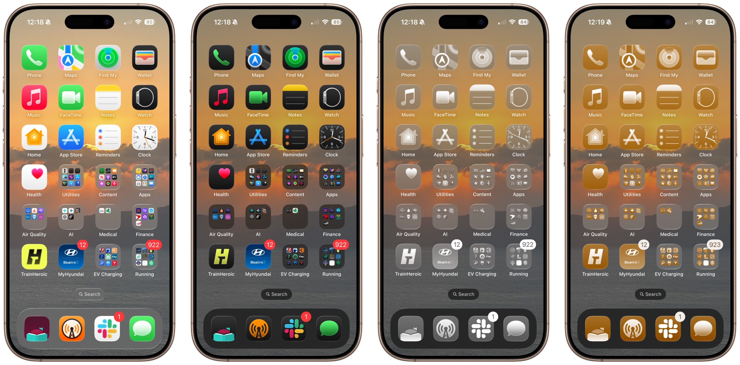
Answer: Yes, it’s nearly impossible to identify a particular app when they’re all clear or tinted squircles, as you can see below. My brain just shuts down when it sees them.
For comparison, here’s that iPhone Home Screen in Default, Dark, Clear, and Tinted.
Seeing just how difficult it was to distinguish between clear or tinted icons led to our next question, and to this week’s Do You Use It? poll. What percentage of Mac or iPhone users—or at least TidBITS readers—prefer one of these Liquid Glass monochromatic looks for all their apps? Some users with color vision deficiencies might prefer them, but are they at all common otherwise? If you prefer to see your icons in clear or tinted, tell us why and share a Home Screen or Spotlight screenshot in the comments.
Mac: For the icon and widget style on my Mac, I use:
Default
Dark
Clear
Tinted
0voters
iPhone: For the icon and widget style on my iPhone, I use:
Default/default here. The squircles IMHO are silly tech bro nonsense.
As @ace and others keep pointing out, shape can be just as important to distinguish icons as is color or design.
As a colorblind guy, I’m surprised Apple has chosen to just ignore this simple fact.
My choices are default/tinted. Thanks for thinking of posting this poll!
As a former photographer, I used to use a desktop/homescreen wallpaper photo of my own, changing them more on iPhone than Mac. Used to customise the iPhone more than Mac.
What I’m using now has more to do with outside factors than ≤26/7 customizations. The Mac has a middle gray color wallpaper (rarely seen, admittedly with so many windows open) and the iPhone is black Wallpaper with tinted white/black/gray icons.
So much fun has gone out of the Apple experience for me, and customizing its look, in recent years (excepting TBTalk), and we have lost so many friends/neighbors/pets recently that it just doesn’t provide joy to see image Wallpapers or colors every time I turn on iPhone, so this look seems appropriate. Sad, but there it is. Good, at least, that this is available, vs. Apple inserting its own “AI” Wallpaper ;-) .
Tried clear and tinted on Mac, iPhone and iPhone, but I got lost many times trying to find any application that I did not use on a daily basis… and reverted back to the dark option in all my devices. Another issue is that widgets are more difficult to read once you go clear or tinted, these usually use colors to highlight something important to you that is lost when they go monochrome.
I installed iOS 26 on my iPhone and iPad a few weeks ago. It just seems so pointless. Who thought that transparent dialogs and notifications were a good idea? That makes as much sense as transparent road signs.
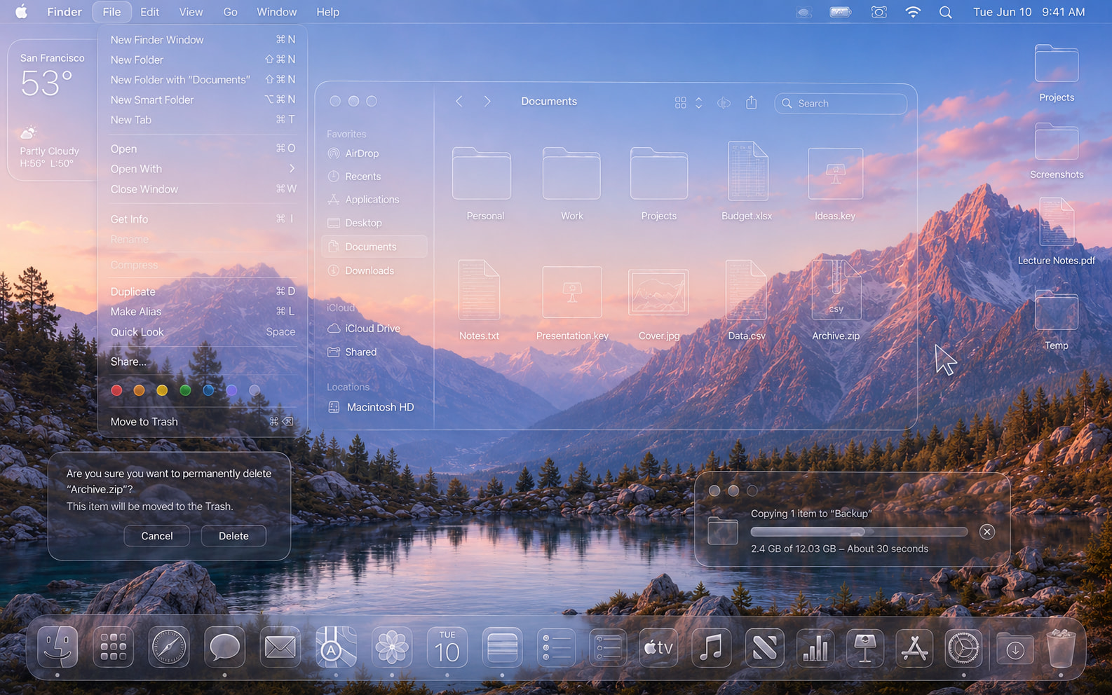
In fact, here’s what Liquid Glass seems like to me:
First, a disclaimer. I have not upgraded iOS or MacOS so I don’t use Liquid Glass. I also didn’t vote.
Looking at the panel of Default, Dark, Clear, and Tinted, this red-green color-blind reader has great difficulty with the latter two. Default looks best to me.
I use ‘clear’ and I don’t know why! I think I probably thought I’d see how it looked and then got used to it quite quickly. As I use Siri on the iPhone to launch apps and Quicksilver on the Mac - I have too many apps really so saying, “Siri, launch Mail” for example, is so quick and easy (as is typing two or three characters on the iMac’s keyboard) - which means I don’t take much notice of the icons themselves and so perhaps this is the reason that colours and shapes don’t matter to me. It annoys my wife - I’m not suggesting this is a benefit! I quite like the subdued, calm appearance of my screens overall without all the relative garishness of the default setup.
As a red-green color blind person myself, it always amazes me how frequently designers seem oblivious to the affect their designs have on ~10% of the male population. And what about all that red text on black backgrounds, looking at you Apple watchOS. Really hard on the eyes for me.
I voted default for iPhone but the truth was that I hadn’t really tried tinted or clear. My initial guess was that I get cues from icon color that help me quickly distinguish icons. However, I decided to give clear a try, and I actually like it. At this point I’ve also learned pretty much where each icon is on my first two home pages, and I generally use search for any app that isn’t on the dock or on the first two pages.
In fact, because I use the option to rotate my lock screen and home screen wallpaper each hour among my photo library, I’ve found that using clear and turning off the default ‘blur’ on the wallpaper is actually quite nice.
I’ll keep using it this way for at least a week and decide if I want to go back then. And I may try it out on MacOS as well.
Under Accessibility>Display for Apple devices, there is a Colors item that lets you set filters for various types of color-blindness. That should help.
Thanks Alan, never knew about those filters. Sadly I’ve just tried out all the options listed there and strawberries are showing up blue so not helping me!
It’s not pointless. Apple used to be about beautiful interfaces and great attention to detail in the way things looked as well as the way things worked. It’s what separated us from everyone else. That included beautiful icons; remember them? Remember that lush & plush theater chair that was the icon for Front Row? Or those colorful music notes on top of the shiny, shaded CD for iTunes?
They abandoned all that for flat, lifeless icons years ago. Why? Because that’s what Microsoft was doing! And now we have this liquid glass effect that serves no point except to make items within the rounded rectangle harder to see & distinguish. Anytime you need to figure out what an icon represents, it’s not done its job.
I want the return of icons that existed during the time of Snow Leopard & iOS 6. Detailed icons that have the beautiful shading, pop, definition, & color of what we used to know.