Let’s try to collect the posts about Tahoe here.
A couple of quick observations after 60 minutes of use. The ‘Applications’ app which replaces the Launchpad, doesn’t appear in the dock when opened. It also doesn’t have a menu bar so it’s just a shortcut to Spotlight. As I didn’t have Launchpad in the Dock, the Applications app isn’t in the Dock so you need to drag it from the Apps folder
Also on Applications, when you open the app it shows all applications from both your Mac and your phone! There’s not even a way (that I can find) to filter them out. You’d think one of the ‘group’ options — along with Utilities, Productivity or whatever — would be iPhone, so you could hide things you’re never likely to use. I’ve not used Launchpad or Spotlight for launching apps so I’ll do what I always do - have an alias of the Applications folder in the dock and launch from there.
General appearance of Tahoe is OK but the additional rounding on the windows feels odd when trying to resize. Apple Mail looks like an app from OS 6 days - it’s downright ugly. Of course this is all subjective and others may love it.
On a more positive note, I’m yet to find an app which doesn’t open. I was a little concerned about FMP 19 but it started and opened my primary database. I’ve not tried to edit anything but fingers crossed it’s OK.
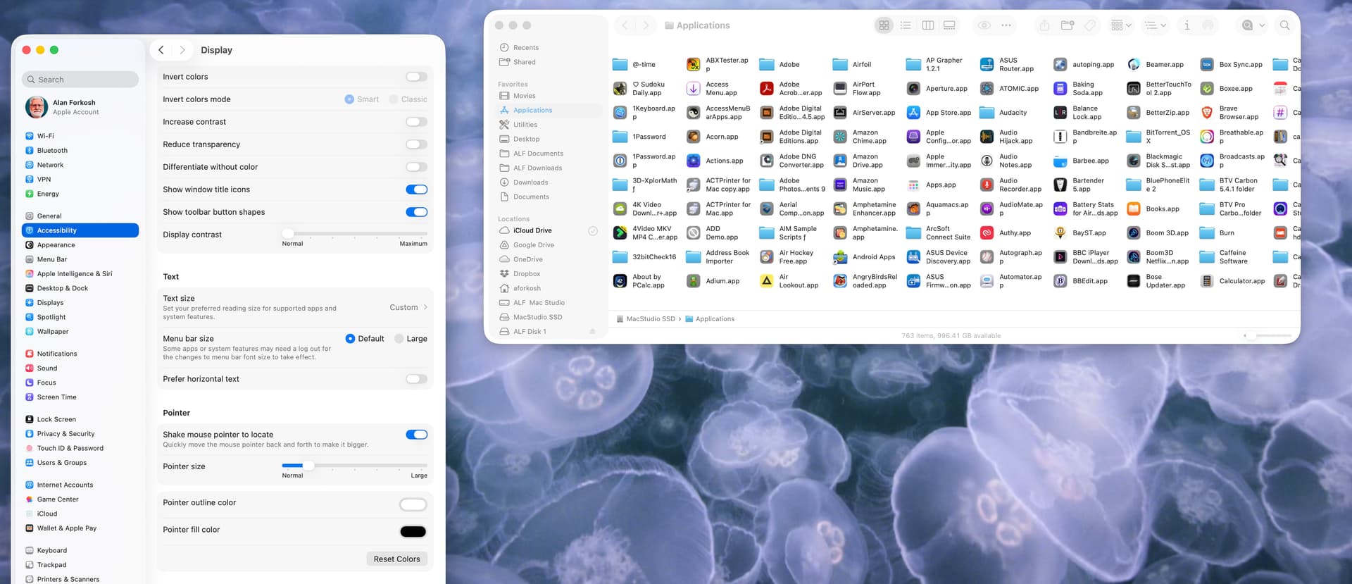
macOS Lake Tahoe: Finder windows are screwed up and a total mess after upgrading to make an understatement. Multiple icons for the same things. Locations cannot be rearranged – it was buggy before also as you could try and drag Macintosh HD above iCloud but Finder would revert it for you. You cannot drag folders/files to the Toolbar for quick access from there and randomly some previous aliases will be marked as question marks. Finder will greet you with not remembering the column width set (just as in Apple Mail if you use column view there). Icons in the Dock list are very hard to see (which is worst for those older software that have not had their icons updated, like Apple’s Remote Desktop…) and there is nothing except turning on magnification that could help you or turn on reducing transparency in Accessibility, which is likely to become a rather normal thing for people to do now.
I’ve just found an option in Spotlight settings to hide iPhone apps from the spotlight applications list. Much cleaner now.
2 Likes
I’m finding the icon for external disks very irritating. The perspective is the wrong way around, with the further end (at the top) wider than the closer end!
I had FileVault turned on against my wishes (I will turn it off again).
I don’t like the iOS icons, nor the Liquid Glass look. I see the Trash has been flattened - maybe it won’t hold as much! ![]()
I’d love to see a screenshot illustrating what you mean regarding Mail.
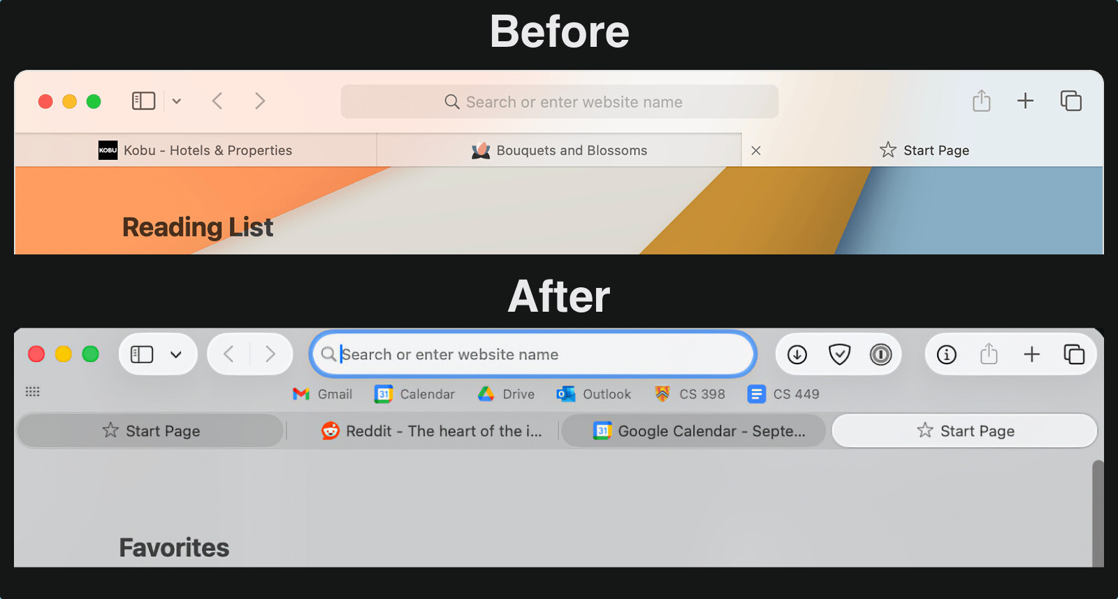
So apparently, unless you set Reduce Transparency to on, your Finder windows will display this pseudo transparent toolbar icon mess at the top. (source below, lists good options to improve Tahoe usability)

Seriously, Apple, who is benefitted by this poor usability?
2 Likes
I’m definitely on Team Reduced Transparency. At least unmodified Liquid Glass is still nowhere as bad an assault on accessibility as default or forced dark mode.
I had no network connectivity because Little Snitch was on 6.2.something and blocked everything despite the filter being “disabled”; that was fixed by disabling the content filter in the Network section of System Settings and then updating it to 6.3.1.
1 Like
Does anyone know how to turn off the “misfeature” in Safari where the background of the top of the window (the tab bar, the URL window and shortcuts bar, etc.) matches the top of the image displayed in that window? (That’s f’ing ugly!)
On iOS there’s Settings > Apps > Safari > Allow Website Tinting. Is there no such setting in Tahoe Safari?
On iOS there’s Settings > Apps > Safari > Allow Website Tinting. Is there no such setting in Tahoe Safari?
I couldn’t find it on the Safari preferences.
And “Is it really this bad?” I sure think so!

And that’s after resetting preferences to get rid of the shadowing and generally tone down the “New and Improved” look… It was a lot more fugly when the stuff on the top of the page had those shadows to stand out from the bookmarks.
The Ars review has another beautiful example of Finder pseudo transparent toolbar icon mess.
Again, Howard Oakley to the rescue.
2 Likes
As said earlier, it’s totally subjective, but I find the lack of colour very reminiscent of the first mono Macintosh interface of 40 years ago. It’s visually ‘harsh’. There appears no way to increase the text size of the mail count and with the small size I’m struggling to read it.
It’s not only Mail; Music and the Finder windows all look similarly abrupt. A simple tint across the list pane would make it far more gentle on the eye.
I’ll have a play with the accessibility settings to see if it can be improved, but if there are already articles drifting around the Internet advising how to improve the look of Tahoe, Glass is looking like a swing and miss.
It’s a little sad that I’m old enough to have used this…
4 Likes
There is a similat setting in MacOS Safari. Safari>Settings>Tabs>‘Show color in tab bar’
3 Likes
So this happens to the toolbar when
- You are in icon view
- The labels are under the icon
If you scroll down the page, the icons are visible as they pass under the toolbar.
If the labels are to the right of the icons, they pass under the sidebar when scrolling.
I hardly ever use icon view when there are so many items that I need to scroll. I use list view instead, and the column headers and toolbar are not transparent.
Too bad there is not a way to turn off this liquid glass crap.
1 Like
I prefer the After myself.
I installed Tahoe last night and so far there are no issues. No readability issues, no issues in Finder. Everything is working great.
2 Likes
I too am very interested how FMP 19 fairs, and will appreciate any reports. I depend on its scripts to maintain the work of a middle school academic league that is just beginning its season; so I can’t upgrade until I’m sure it will still work properly.