Do You Use It? Clear and Tinted Icons Are a Hard Pass

Originally published at: Do You Use It? Clear and Tinted Icons Are a Hard Pass - TidBITS

I’m always interested to see the results of our Do You Use It? polls, but some surprise me more than others. Our latest poll, “Do You Use It? Clear and Tinted Icons” (23 June 2026), was not one of them. It asked if you use Apple’s new clear or tinted style for your icons (and widgets) on the Mac or iPhone, and unsurprisingly, almost no one does.

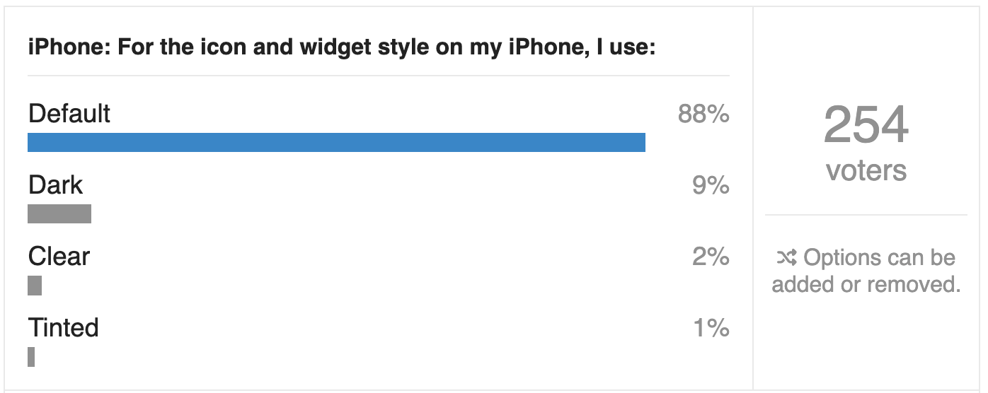
Of the TidBITS readers who chose to respond to the poll, only 1% said they use clear icons on the Mac, and no one admitted to using tinted icons. On the iPhone, clear icons were twice as popular—a whopping 2%—and just 1% of respondents said they use tinted icons. Dark icons, which retain color, were slightly more popular, but still couldn’t exceed single digits, with 6% on the Mac and 9% on the iPhone.
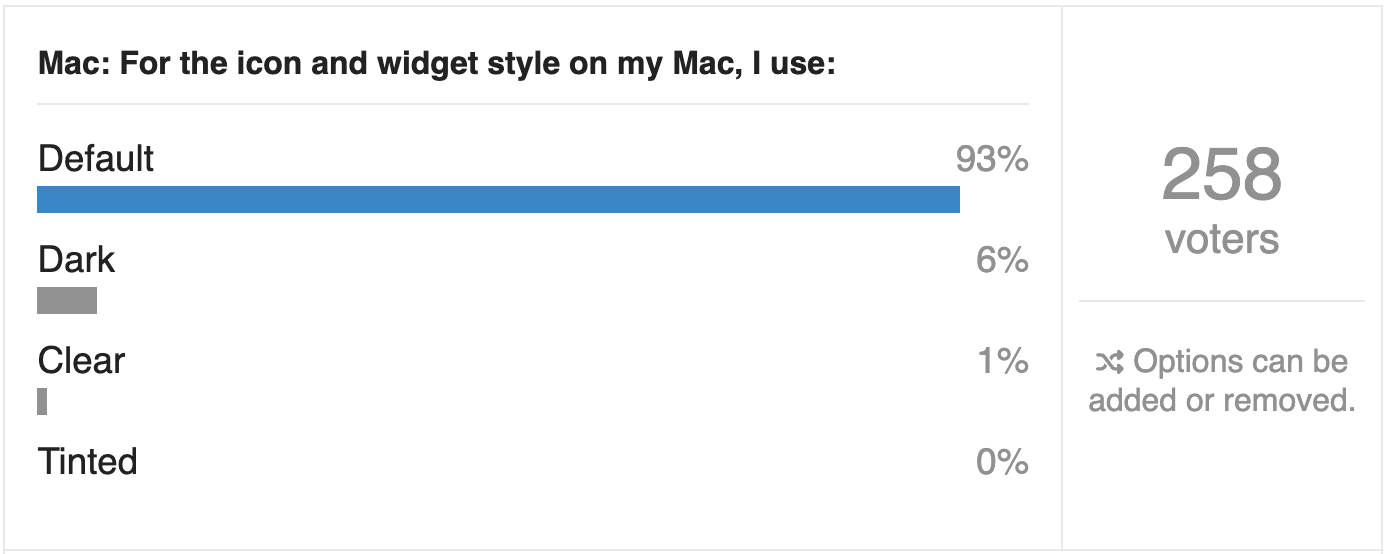
Do You Use It? cleer and tinted icon poll results for the Mac

Do You Use It? cleer and tinted icon poll results for the iPhone

TidBITS readers are perhaps the least likely demographic to switch to clear or tinted icons, because we have had many years to become accustomed to distinguishing icons by color. I even know people who organize their apps by color. Color is good!

The entire point of icons on the Mac and iPhone is to serve as the visual identities of apps, so you know which app you’re launching. Anything that makes it harder to distinguish between apps loses usability points.

Free Mac Icons from Squircle Jail

But remember that the poll’s real impetus was a related usability complaint: starting in macOS 26 Tahoe, Apple forces all app icons into a squircle shape, stripping away another key differentiator. Just as we distinguish icons and objects in the real world by their color, we also distinguish them by shape. After our conversation that triggered this poll, Paul Kafasis wrote an impassioned Free the Icons plea where he shows how icons suffer both aesthetically and functionally from “icon jail.” As Paul says:

Past icons weren’t just more expressive. They were also more usable. Having distinct shapes provided a useful way to tell icons apart. Tahoe eliminates that cue by forcing everything into the same squircle, leaving color as the primary way to tell icons apart at a glance.

Automator is the poster child here, going from an easily distinguished and highly personable little robot to a bland mugshot of a staring automaton that wouldn’t feel out of place on maintenance duty in Apple’s “1984” ad. (I was amused to discover that the filename of Paul’s Automator comparison screenshot is a quote from The Godfather: lookhowtheymassacredmyboy.png.)
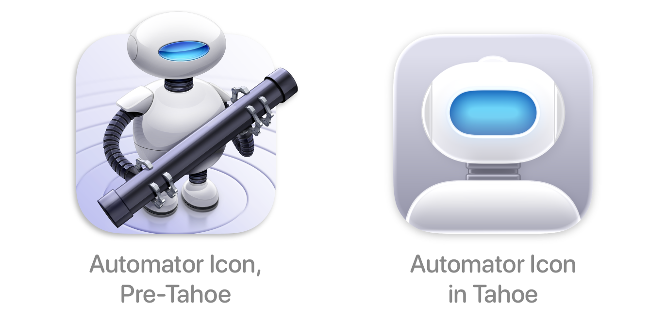
Look how they massacred my boy

At his Unsung blog, designer and interface wonk Marcin Wichary explores the topic of icons, pointing out that iOS is highly spatial, so icon location matters as much, if not more, than icon color, and helps explain why Apple has always required squircle icons in iOS. macOS, in contrast, is much less spatial—you can’t depend on app icons to be in the same place in the Finder, Spotlight, or App Switcher, and even the Dock is quite malleable. Without location as a primary way of identifying apps, color and shape matter more. His summary:

Apple has not done a good job shepherding their app iconography system. The system feels too rigid, and some of its ostensible benefits (dark mode, color tinting, glassification) have been executed poorly.

At least clear and tinted icons are just ill-conceived options that most people ignore. Forcing all app icons into squircles harms usability, hurts aesthetics, and erases app personality.

Apple, free the icons!

5 Likes

I can’t be bothered to track down how Apple described clear and tinted icons when they were introduced, but I am curious about the adjectives they used.

Was there ever a Do You Use It? for Dark Mode?

I never use it. And the only apps I have that are “dark”, on any operating system, are terminals. I think there’s a reason that the original Macintosh was black text on white – a change from the white text on black of PCs.

4 Likes

No, I haven’t done a Dark mode poll, though I laid out my issues with it in

I use Dark Mode as my default on macOS, iOS, and iPadOS.

More interestingly, one has to wonder why Apple have actually decided to do the whole squircle redesign in the first place?
What does it achieve, what were they wanting to gain or lose in making icons fit inside the box?

I don’t really understand what it achieves?

2 Likes

The problem with the change to the Automator icon goes well beyond the forced squircle. The previous icon was mostly squircle-shaped, with only the robot’s head breaking the boundary. They could have easily retained the pose and merely reorganized the design to fit fully within the squircle. Instead, they chose to design all the personality out of the icon in a manner that has nothing whatsoever to do with the shape.

The squircle is but one symptom of a larger problem in Apple’s interface design department: they’re stripping the whimsy out of everything. The Mac has always had a sense of whimsy and humor to its design, exemplified by the smiling Finder face. But minimalism, in stripping out “unnecessary” elements, throws out the baby with the bathwater by making everything maximally boring. As I look at my (pre-Tahoe) Dock right now, the only non-boring icons, aside from the still-smiling Finder, are ones that come from developers outside Apple. In particular I note the icons for BBEdit, Nisus Writer Pro, and GraphicConverter, all quite happy to sport shape, color, and design.

I can’t help but again bring up that all this minimal design makes me badly miss skeumorphism.

4 Likes

Totally agree. It’s not the Apple anymore that we switched from Windows for. Apple had the GUI, gutsy approach back in the 80s-90s, that differentiated us, taught us what a computer could be - not the DOS-ugly, character-less, numbers racket of the flat business model of using a new tool made famous by IBM. We started finding other uses, we started doing what we do better… and feeling better about doing it, end of day, too. I’m not sure “whimsy” is the right word for it but certainly more relaxed and fluid, graceful design that helped us all identify with Apple ethos, back then. Are the accountants and engineers finally taking over? It makes it weird when you see somebody who just doesn’t get it, take over a company you loved. Minimalizing us all with their apparent lack of design sense, making us all more drone like. The loss feels more personal. Yes, thanks for saying it so well: the problem goes well beyond the forced squircle.

1 Like

There is an additional issue that is generally not considered by web designers and programmers, but which annoys approximately 8% of all men several times every day. We can’t differentiate many colours unless they are really very bright and clear and not too small. Subtle pastel shades used for tiny LEDs and icons mean that we just ignore the colour aspect all together. When I recently explained to our daughter-in-law that colours are not a differentiating characteristic in my life, she was shocked. On the topic of icons, the shape (or the caption under the icon) is actually critical. Yet another reason to encourage shapes for differentiation.

5 Likes

Gruber tees off on the topic too.

2 Likes

I don’t see whimsy as being in conflict with minimalist. In fact, I’d argue even the old Apple that gave us the whimsical alternative to Windows (not to say its template), already very much followed a minimalist philosophy, for example the idea that a certain command or option was set in only one location (the most logical or the easiest to get to) rather than in multiple is something very Mac typical that to this day bugs me on Windows or Linux.

That said, I also feel like whimsy is being shoved out. I believe that a lot of what Apple these days designs for or how they choose to make their stuff work is much more driven by their marketing dept rather than users’ workflow or user experience. It now often feels like it’s more important to be able to show off screenshots that look like a sci-fi movie than ensure that workflows are as quick, lightweight, and intuitive as they can be. Those translucent windows and controls might look great in a 2-sec segment of a TV ad, but that same stuff that looks great and modern and cool and yada yada in that ad, is horrible to work with for hours when you’re just trying to get a job done and need to be able to read stuff unimpeded.

I hope Apple’s new leadership seriously reins in marketing and makes crystal clear that engineering and user experience always trump advertisement and chest thumping. Apple needs to regain faith in one simple credo: gadgets that are designed well and work well to people’s satisfaction, sell themselves. Crafted superbly, such products won’t need window dressing. Just let your exceptional engineering sell your hardware and your OS.

1 Like

My view is that’s true for the “old” Apple, when Apple was focused on computer hobbyists and creative professionals, but for Apple’s current—and probably for the foreseeable future—positioning as a global lifestyle brand, image, aesthetics, and premium pricing is what drives Apple’s sales. Think FASHION not FUNCTION.

Dr. Drang:

And more from Gruber:

And I agree that ResEdit’s icon rocked!

2 Likes

As a footnote, I remember being amazed by the quality of early NeXTSTEP icons…in grayscale!

It just goes to show how much can accomplished with shapes and shading.

Apple would do well to revisit its history.

1 Like

As far as I can tell, “squircle jail” is a way of forcing Mac icons to look like iOS icon tiles, which look the way they do so as to present bigger, better-defined finger touch targets on the home screen.

Apple’s designers seem to have decided that this aspect of iOS is now a central aspect of Apple’s software look, even on non-touch platforms where it serves no human interface purpose.

What is surprising is that Apple has made such a terrible decision to make interface changes that no one asked for, no one likes and no one receives even the slightest benefit from!!’

Hmm. I wonder why they might do that?

I have to say that I am completely unbothered by forced-shaped icons. In some ways, I prefer it to random-shaped icons. To me it’s a lot of people complaining loudly about something that’s so unimportant, if not almost trivial.

1 Like

My theory is it is because you can now run iOS apps on Macs, and the iOS apps with their bland icons had their feelings hurt. They didn’t fit in with the beautiful, expressive, distinctive macOS icons.

3 Likes

I’d say making disruptive hardware and software changes is deeply embedded in Apple’s corporate DNA. Even before Steve Jobs said, “ People don’t know what they want until you show it to them”, Apple frequently made “unwanted” and “unrequested” updates to its products. From removing 3.5” floppy drives through switching iPod/iPhone/iPad connectors every few years to Liquid Glass, Apple has consistently shown it doesn’t view forced obsolescence as something to be avoided.

2 Likes

It is. And when they do that to improve our lives we cheer and they sell.
This is not that.
This time everybody is up in arms about it because they made a lot of changes for no good reason and in the process (squircles, translucency, etc.) screwed up a bunch of stuff that wasn’t broken in the first place.

Make no mistake. There’s plenty to improve. But fix that without breaking the stuff that doesn’t need fixing.
It’s not that complicated once you muzzle your ad people and instead get the Susan Kares and the usability specialists in the room and let them do what they do best, based on actual data from experimenting with actual users performing actual user workflows.
This is not rocket surgery. It’s what Apple (and others) once routinely and very successfully did. To the admiration of an entire industry, and us — at least those of us old enough to have enjoyed high-quality interfaces and working efficiently on well crafted bespoke tools before iPhone drew in the mainstream Windows-damaged crowds and all the lifestyle bull**** that came with this urge to morph into most valuable mega-corp ever. (Just to be clear about what is certain to be the driver behind this gradual but steady enshittification of macOS.)

1 Like

In principle. I agree with your analysis. Of course, this doesn’t mean that some of the disruptive changes Apple chooses to make aren’t incredibly stupid as well.