Apple changes their UI look all the time. This goes all the way back to the beginning when they replaced the flat interface of System 6 with the shaded 3D interface of System 7. See also The Evolution of Mac OS - OS X Daily
Nobody ever asked for any of the changes.
As for what people like, that’s a matter of personal preference. Every change has had people who love it and people who hate it. Including this one - I can guarantee you that some people like it, even if you don’t know who they are and think they’re idiots for disagreeing with you.
I actually like dark mode – I find white backgrounds with black text far too bright, and when I try to dim down the white, then the contrast is lost and the text is hard to read. Dark mode in macOS mail works badly for me with one newsletter that insists on using red text (works fine with the white background, hard to read with a black background), so it’s not always perfect.
If I’m feeling picky I say that black text on a white background is copying ink on paper, and we can move beyond that with digital, but really it’s about design and readable contrast between the text and the background.
FWIW, given that this thread wasn’t originally about Dark mode, I am glad to have dark modes available on my computers and phone. One primary reason is that if you have a lot of “floaters” in your eyes (in my case due to some retina tears) they tend to be very noticeable looking at light-colored backgrounds, but invisible when the background is dark. Having worked that way for some time now I also find that the dark backgrounds are more “comfortable” to view for long periods. I’ve gone over to the Dark Side!
It was a good essay, it made a reasonable case, and it was written by a professional who legitimately qualifies as an expert in the field. My main issue with it springs from this paragraph:
Seventeen years later, now that app icons on macOS do have a uniform rounded-square appearance, they do look better adjacent to each other in the Dock. What’s even better is that over the last 19 years, apps on Apple platforms have distinguished themselves with a very recognizable visual identity.
All of that may be true, but the bigger question is whether the app icons actually work better for the user. The author, whose work I respect, did not address that point, which I think is the most important point of all.
His Mastadon account has a lot of interesting material:
Since Big Sur, squircle icons are the standard on macOS
Icons that do not conform to this standard are bad
Since developers didn’t fall in line, Apple is right to force them to
Clearly the author approves of the Japanese proverb “the nail that sticks out gets hammered down”.
I reject the premise completely. Apple’s Big Sur icons are awful; they put the lie to their oft repeated claim that they love the Mac and are not doing anything to replace it with iOS. When I look at my dock, what I see is 2 good icons and 29 bad ones.
And even if it is true that Big Sur icons are now the standard style, Apple should never have forced it on developers. If artistic icons are so awful then let the market rule on it.
I think his main point was that enforcing a consistent design pattern for icons creates an overall appearance that is unmistakably Apple and is clearly distinct from other platforms. I’m willing to agree there is a tiny amount of truth to that. That may matter to Apple, but I think it poorly serves end-users.
That’s exactly the point. Usability should trump marketing. If users cannot discern color or shape and use that to quickly recognize the target they’re after, that is a loss. Completely irrelevant if that perhaps makes for pretty ads. It’s still a net loss. And apparently Apple’s leadership needs to hear it some more: a refined user experience is more important than your salespeople’s vanity.
I’d say anybody who is familiar with Apple’s corporate culture, product development process and design practices doesn’t believe that Apple’s ad agency or salesforce, especially retail employees, have any meaningful input or influence. Further, until Tim Cook’s term as CEO has officially ended, senior management’s major focus will remain on operations, supply chain efficiency, and government lobbying, not advertising, public relations, or sales tactics.
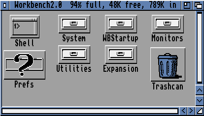
Apple would probably have a stroke if someone suggested that different files could have icons with different sizes. Like was common on the Commodore Amiga (at least with Workbench versions 1 and 2):