A few months ago, we pointed to an Apple icon comparison (see “BasicAppleGuy’s macOS Icon History,” 9 September 2025). Now Paul Kafasis of Rogue Amoeba has weighed in with another look at how Apple’s app icons have changed in macOS 26 Tahoe. Paul writes:
On the new MacOS 26 (Tahoe), Apple has mandated that all application icons fit into their prescribed squircle. No longer can icons have distinct shapes, nor even any fun frame-breaking accessories. Should an icon be so foolish as to try to have a bit of personality, it will find itself stuffed into a dingy gray icon jail. …
While Apple had previously urged developers to use squircle icons on our apps, they’ve now taken things much further to ensure compliance. It’s a shame.
The post is worth reading for Paul’s trenchant commentary, but it also illustrates just how much of a step backward the Tahoe icons are in both concept and execution. I couldn’t quite believe they were as blurry as they looked in his comparisons until I extracted Safari’s icons and compared them by toggling between versions in Quick Look.
The only thing I can say in Apple’s defense is that the Tahoe icons aren’t as objectionable when viewed in isolation—outside of comparisons like this, most of us don’t scrutinize individual icons. But uniform shapes and softened details have real user impact: they increase visual search time in the Dock and make it harder to distinguish apps at small sizes—especially on high‑density displays and for users with low vision. However, as I wrote in “The Dark Side of Dark Mode” (31 May 2019), blur is a bad thing, regardless. Applied to icons, it reduces edge contrast and legibility with no offsetting usability benefit.
It looks like Apple has fixed the Calendar icon, which Kafasis holds up for deserved ridicule in his post, in almost every version of xOS 26.1. It’s now a squircle with the day and date, looking like a page from a desk calendar. The one exception is the Apple Vision Pro, where the App Store shows the latest icon, but the app icon is still the 24-day month. I confirmed this by deleting and redownloading the app.
This is the wrong comparison. The comparison that shows how much Apple has declared war on distinctiveness is:
Pre-Big Sur icons vs. icons that have bowed down to conformity
Pre-Big Sur icons vs. icons that are sentenced to the squircle jail.
I can think of no squircle icon that is objectively better than the pre-squircle version. They all look like they’re being forced to compromise. Some, even a few Apple icons, look like they’re trying to show a little flair with parts extending behind the squircle, but even that is verboten in Tahoe.
And, they’re all smaller! A squircle icon isn’t permitted to be full size!
This is so not like Apple. It is like saying that from now on, all applications must look like Apple’s and must use the UI fonts. You’re not permitted to innovate in any way. Just fire your art department, we don’t want them.
My theory is it has something to do with apps that can run on both iOS and macOS; they don’t want the iOS apps to stick out because then they’ll get their feelings hurt.
But I say, the solution is to allow iOS and iPad icons to be expressive, not handicap the Mac icons. Let our icons free to be what they want to be! Let the icons be iconic!
This really makes me sad because as he closes with, we have the technology. This is a choice Apple has made to make something that was really cool, objectively worse by every account. It speaks to deeper issues.
And now I wish I had kept more of these icons on my dock over the years, I didn’t know that one day all the beauty would be purposefully taken out of them.
I agree so much with your last paragraph. So sad they continue the trend of dragging the other platforms down to the level of the iPhone rather than the other way around.
More evidence that this whole thing was rushed for no good reason. I just don’t understand their priorities anymore. They spend billions in dollars and invaluable amounts of time making mediocre movies, but can’t be bothered about the core values that have always set them apart.
Quick edit: to be clear by this I mean that even five minutes of Tim Cook’s time spent on Hollywood would be spent better on literally anything else at Apple.
And here I just thought, “Oh, look, they altered Safari’s icon to alert us to the fact that stuff on the web is even less precise and accurate than it used to be,” rather than that Apple was forcing developers to be on the wrong side of the next 1984 commercial.
I have sent the following feedback about the Weather app:
The compass rose in the app has NESW in the correct positions. But in between each there are 2 direction points that do NOT exist in the standard compass rose. These make it resemble a clock face. This is weird. Please would you change it so that it uses the standard compass rose’s ordinal points of NE, SE, SW, NW? You can read all about them, and see an excellent diagram, on Wikipedia.
I posted this to Bluesky, Mastodon, and Twitter, but it won’t viralize because I have no followers.
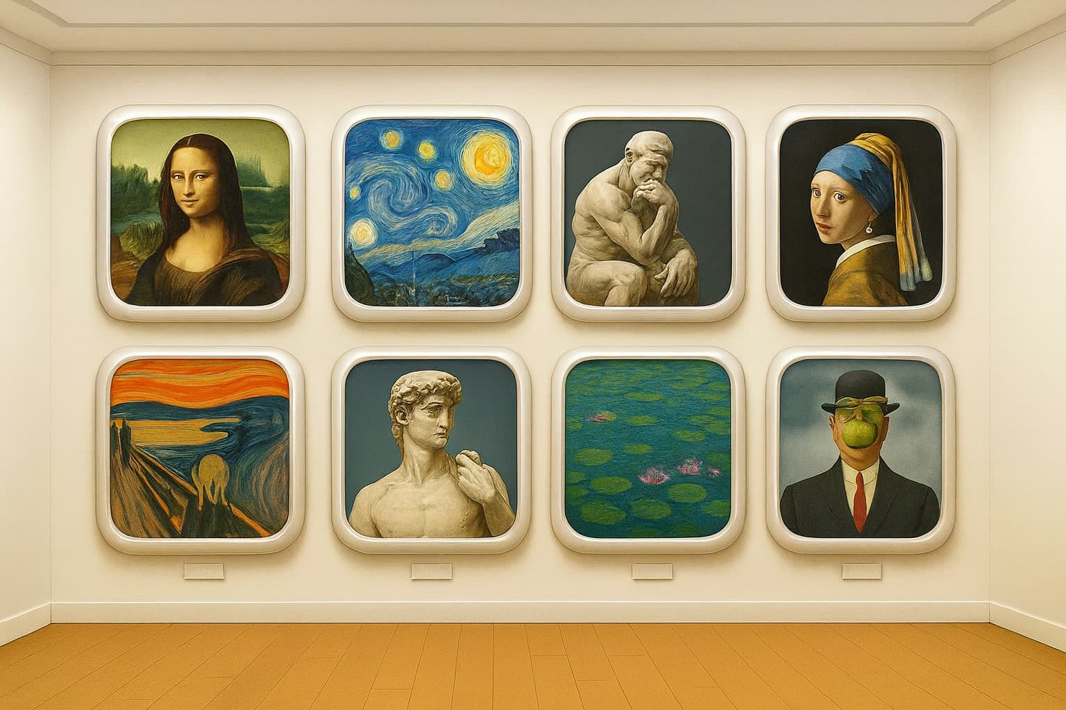
This took me about 4 days to create, using versions of DALL-E. I first used GPT-Image 1[1] via (free) ChatGPT, but after an initial image with duplicate artwork, no subsequent attempt worked. We kept getting blocked by the content filter. And, I kept hitting chat session and image generation time limits; you can only generate about one image in 24 hours, and if the system’s busy, one in 48 hours. Attempts that are blocked still count against the timer.
Why did the content filter balk? There are theories:
Didn’t want to create copies of real art, even if such art was in the public domain
References to real companies (Apple)
but my favorite theory:
When I asked for a gallery of famous works of art, it could only think of 7 without considering one with nudity (e.g. The Birth of Venus). So at first it duplicated safe art, then balked when we tried to get 8 unique works.
I tried using a Stable Diffusion model (via DiffusionBee), but it was awful. The Mona Lisa, for example, looked about as close to the real thing as the fresco damaged by the amateur restoration in 2012.
So after struggling with this for four days, I realized that ChatGPT is not the only free way to interact with DALL-E – you can also use DALL-E 3[2] from Microsoft Copilot, via Bing. I asked it for the picture, but it wasn’t what I wanted. So I uploaded ChatGPT’s picture as a model, and that did the trick.
What I didn’t think to try was uploading ChatGPT’s picture to ChatGPT as a model, and tell it to modify it. Theory is that would go through a different path – img2img – which wouldn’t have hit the generation content filter. That’s probably how Copilot created the final image. You can’t tell this, but the ChatGPT image and the Copilot image are very similar.
Anyway, this was educational. Or did you think I was that good an artist?