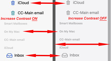
Opened the new version of Mail in the just ‘upgraded’ Golden Gate and immediately went searching for a fix! Included is what the Mailboxes Sidebar looks like in my few months old iMac.
Can you see the minuscule difference between the lower, grey list of ‘mailboxes’ with Increased Contrast enabled and disabled?
Can you even read the tiny light grey on white background text?!
Why does “Increasing” contrast make things LESS visible?
I can guarantee I won’t be ‘upgrading’ the OS on the computer for SWMBO!
I have spent 45+ minutes trying multiple settings and did a complete shutdown and cold startup and could not find a way to improve the readability of the tiny grey text. I’m sure there is a way, I just too stupid to find it. Any (reasonable) suggestions?
Mail’s settings Fonts & Colors seems to only affect the Message fonts (colors, size, fixed for plain text & quoted text colors). I have them set to three different fonts at 14 pixels/points. I don’t see any changes in what is displayed in the Side Bar.
I don’t see anything in Accessibility that affects “Text”. My choices are for Vision (VoiceOver/Zoom/Hover Text/Display [see below]/Motion/Read & Speak/Audio Descriptions), Physical and Motor (nothing about text or display), Hearing (nothing about text or display), Speech(nothing about text or display) and General(nothing about text or display).
Liguid Glass slider was set from minimum to max with no change to the text in Mail’s Side Bar.
Display doesn’t have any Contrast controls in my Settings. I DO have an Increase contrast switch in Settings->Vision->Enable (ON?)/Disable (OFF?). That is what my uploaded image shows. Left half of image is increased contrast enabled, right half is with increased contrast disabled. There is a extremely limited amount of change in the contrast of the tiny text but it is still grey text on a white background. Never endorsed in even the original Human Interface Guidelines. Size and color and background matters with text. :headbash: The whole scheme of Golden Gate seems washed out to me.
I share the OP’s frustration with the current trend in Mac OS’s to “grey down” text to the point where it becomes difficult to read (especially for folks with “older eyes”).
I wouldn’t be surpised to learn that the software development groups at Apple don’t employ anyone over age 30. Or very few.
Shouldn’t text that’s intended to be read be (true) black against white?
Not “grey against white” or “dark white against bright white?” (aside: I have no use for “dark mode” and will never use it – makes things WORSE)
I can see “greying out” text when it’s not intended to be read at the moment (to draw away one’s focus), but how can one act upon text (that’s meant to be acted upon) if you can’t SEE it to begin with?
I’ve improved text readability on my Mac by using the BetterDisplay Pro app. I go though the list of various color profiles to find one that seems to offer the best contrast for text. Then, I go to the “image adjustments” pane and tinker with the gamma setting (moving it “down” works best for me) to suit my taste…
“Reasonable” means something other than “suck it up!”
Alas, Sidebar icon size does increase the spacing of the lines and the overall size of the text, but there are no “icons” in that sidebar to “mess” with. And I was already using the “Large” choice.
I only ever use “Light” but I tried “Dark” without it changing anything about the text.
I’ll let others play with AI. I suspect the changes in Mail may show up in other Apple apps, especially those developed by the younger folks. I know a “young man” who is retiring from Apple soon and he is only 50!! So much for any elders there!
I may have to take my un-requested advice and suck-it-up!!
Not so bad for me. The most annoying new thing is that it looks like messages you are dragging between mailboxes are about to slip away somewhere else … not a good design in any possible world.
I so appreciate all the amazingly fast suggestions and help!
Here’s a vote for BetterDisplay Pro! I was able to get all the text in the Mail Sidebar to have the same contrast (at least to my eyes)! Dozens of adjustments and they appear immediately as you move the sliders, the best kind of feedback. The $21 “Pro” license is perpetual!



 I suspect the changes in Mail may show up in other Apple apps, especially those developed by the younger folks. I know a “young man” who is retiring from Apple soon and he is only 50!!
  So much for any elders there!


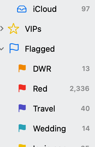

 I was able to get all the text in the Mail Sidebar to have the same contrast (at least to my eyes)!
  Dozens of adjustments and they appear immediately as you move the sliders, the best kind of feedback. The $21 “Pro” license is perpetual!