The MacBook Neo's default wallpaper

I am really astonished by the look of the the Neo “defaults”.

https://cdn.osxdaily.com/wp-content/uploads/2026/03/macbook-neo-wallpapers-610x632.jpg

The stuff introduced with Big Sur and Monterey was just painful, and yet this is even worse. Does Apple employ anyone anymore who is good at design? Anyone who has eyes?

2 Likes

It’s “trendy”; meant to sell units (I’m at the forefront of technology if I buy this…)

first thing I replace.

4 Likes

I only see my Desktop wallpaper at startup. The rest of the time it is covered up by application windows, Finder icons, and documents. So whatever Apple chooses doesn’t delight me or anger me much.

Personally, I regard “good” design as subjective. An iPhone that is as thin as a piece of paper and looks like a clear slab of glass sounds extremely attractive to some, for example. But I would rather have some physical ports and enough heft to be able to avoid dropping my phone a lot.

2 Likes

It’s marketing imagery, intended for display in Apple Store displays.

Most people, I assume, are going to change that wallpaper to something more personal. I use a picture from my Photos library.

1 Like

If you want a more fun wallpaper, use this image, tiled across the screen:

MulticolorLizard

Good luck finding any of your icons. :slight_smile:

8 Likes

A writer at Macworld points out something interesting about that wallpaper.

2 Likes

Well, it’s a bold marketing strategy for sure. People stumbling out of the Apple stores wailing “My eyes! My eyes!”

2 Likes

The easter egg might excuse it a tiny bit, but no.

2 Likes

I use my desktop to have a slide show going. Sometimes it’s covered by windows, sometimes not; never covered with files, though. I could probably manage with tiled lizards.

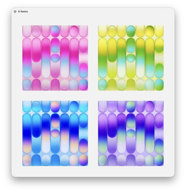
With a few exceptions, I’ve never used Apple’s wallpapers or desktop pics.
I have my own “collections” (most from saved pics I’ve seen here and there).

2 Likes

I remember when Windows 11 came out and comparing its included themes with Big Sur. At the time, I thought of the famous Steve Jobs quote about Microsoft’s lack of taste and thought that somehow, the roles had reversed. Sure, there are a lot of things to criticize about Windows 11, but strip away the various nags, and the underlying aesthetics are pretty good.

3 Likes

Yeah, I just helped a neighbor get a donated computer running Windows 11 and overall it is not bad. The task bar is pretty awful, but that’s not an aesthetic issue.

My word, I haven’t seen Shmuzzles in ages!

http://www.shmuzzles.com/

2 Likes

I think those look quite nice. I like them. Why, exactly, are they bad?

The design, the colors. They look tacky, inelegant, garish. They look like no decent designer got anywhere near them.

2 Likes

I like the design and the colors. They look fine.

If you look more closely at that image:

You may notice that it spells out “MAC” in a very stylized bubble-font.

Much like how the marketing images of the iPad mini have been using another very stylized font spelling “mini”:

2 Likes

That doesn’t make it better to look at. I’m not likely to get a Neo, but if I did, that thing would be the first thing I changed.

I don’t know about you, but I never use any of Apple’s stock wallpapers. My desktops always have pictures from my personal photo albums.

2 Likes

I took some portraits of my wife to be in 1977, and cropped versions make a slideshow for my desktop picture (why do we have to use the Windows term ‘wallpaper’?) Makes her smile when she sees them still, although this year it will be fifty years since we met.

5 Likes