indeed, thanks for pointing that out! If I defocus my eyes just right, I see a profile of Elvis in the swirling colors… ![]()
2 Likes
I used to do that too, plus interesting online images, say, from Nasa or aviation history (as that was my profession). Now with a 13” MBAir as primary Mac, I rarely even see the Desktop so have it set to black. Ah well, times change.
The choice of wallpaper is a fun side topic.
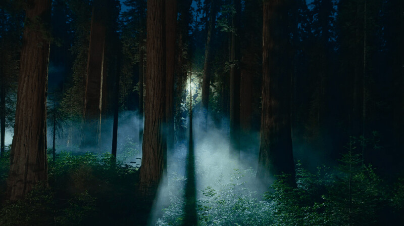
I tend to go for sedate nature photos that contrast well with desktop icons, such as macOS 15’s “Sequoia Night”.
On Windows machines, I tend to use subdued solid color backgrounds, though I’ve left the Windows 11 default wallpaper active in my main Win 11 environment. I used to use obnoxious solid color backgrounds for admin accounts so that I would never inadvertently login as an admin.
1 Like
I got my first SLR in 1971 (a Honeywell Pentax with no internal meter; you can imagine the results) and my first dSLR in 2006. To say I have a backlog of desktop material is a huge understatement. I have nearly 2000 images in some of my desktop picture folders. Before I started using my own photos, I used images from online sources like InterfaceLift and NASA. I have Wallpaper set to change every minute, and I wish recent OS versions hadn’t lost the ability to remember the last image used and start there instead of back at the beginning with every restart.
1 Like
How about that.
I just got my new Neo yesterday, and the first thing I did was replace the wallpaper. Speaking of wallpaper, when did “desktop picture” go by the wayside?
I like deep space pictures from NASA. Best of both worlds.
It’s been “wallpaper” for a few OS versions. I don’t find the new settings to be an improvement.
1 Like
You can go truly old-school and tile little 16x16 bitmaps, like these (scaled to 200% for easier viewing on modern screens):
![]()
![]()
![]()
4 Likes
I still have collections of ppats stashed away. Maybe I should convert them.
2 Likes
Personal taste. Personally I prefer a 50% grey bgnd as I’m editing photographs a lot. For me it’s a tool and I can’t understand how anyone can work with any garish bgnd. L.
3 Likes
The Neo wallpaper is meant to advertise the computer, especially in retail store displays. It’s not expected that folks will continue to use it for themselves. Apple usually releases a new wallpaper or every model and system release. But it’s mainly for advertising.
It’s pretty trivial to replace the wallpaper with anything you want.
3 Likes
The colors of the default wallpaper, especially if that’s an animated one, would provide interesting face lighting effect if one is doing a video call with nothing else on the screen… ![]()
1 Like
I know all that. My point was that their aesthetics have taken a dive. But aside from that, using butt-ugly graphics is not a good advertising, promotional, or in-store display strategy.
The display ought to look good. Years ago (2011? 2012?) I looked at pre-Retina MBPs in Tekserve and other NYC stores. Without fail, the MBP models with the better graphics badly needed calibration: they looked washed out and generally unimpressive. I saw them in enough stores to believe they were shipped that way from Apple. The refurb I eventually bought from Apple was the same. All it took was calibration for the display to look great, but you would never know from what people were being shown,
1 Like