I second that!
If you tap the i in the circle icon next to the Recent call it does what you want (goes to details without calling the number).
I agree it is a little too easy to accidentally call on this screen, but I think Apple’s thought is that you might want to just tap to quickly return a missed call.
1 Like
I think you’re right about that.
But perhaps it should be the other way around (and maybe that was what @macguyver was after). In that way, a tap on the entry would show details whereas only tapping the phone receiver icon (or similar) next to the entry would lead straight to a call. Considering that is the action you’d more likely want to prevent happening accidentally, hiding it behind the harder to hit target would probably be justified.
5 Likes
Yes! And that Recent Call has a little “i” in a circle, like it would give you Information about the call!
I have never seen that “I” pressed without it making an immediate unstoppable call!
1 Like
I agree – that circle i is a very small target for a finger, making it easy to miss and make a call. I do it very carefully, but I’ve shown it to others who can’t seem to hit it.
2 Likes
[NOTE: This and other posts were originally part of another discussion on Major changes coming in OS 26. This split thread was created the morning of June 25, 2025.]
OK, I did NOT intend to derail this discussion, so here are my last comments on the Recents list one-tap-dial issue:
I feel it is an example of Apple not adhering to its own design. Find any other scenario/screen in the iOS or iPacOS that instantly dials a number when touched. The default anywhere else is to ask confirmation, except in (Phone) Favorites. Even in Recents itself, results of a SEARCH do not instantly dial the number but instead show a modified contact with the date/time of the tapped call.
None of this changes the fact that it is poor design to make a frequently used feature which easily initiates potentially unwanted phone calls with out a confirmation… on a small pocket device with a touch screen.
Perhaps we should have a lock-screen feature that takes a photo and randomly sends it to one of the last 50 text messages you received. ![]()
OK… back to the shiny new xOS 26.
1 Like
I’m a bit confused… I tap the i-in-a-circle icon and I see various bits of information about the call and options of what to do with it. Not sure what other information you’re looking for but seems you’ve had enough of the topic.
Also, I don’t know what you mean by ‘unstoppable’. If I tap on the row to the left of the i-in-a-circle a call is initiated but the screen shows a prominent red End button.
I find it curious that ‘info’ is not one of the options you get when you tap-and-hold a recent call row.
I agree though that the endless changes in interface and Apple’s idea of how ‘most’ users interact in any given computing moment can be frustrating.
1 Like
How about crazy things like the “three dot” control in Photos on iPhone being at the top right when you have a single photo, but at the bottom right when you select several photos??!
Or “frequent” apps on the “siri suggestions” screen on iPhone when you swipe down on main screen constantly moving your apps around so your muscle memory doesn’t work? For example, I listen to audiobooks every day and Audible is one of my most frequent apps – yet sometimes it gets removed from that “recent apps” list for reasons I can’t fathom.
I’d rather Apple focused on fixing/improving little irritations like these instead of focusing on AI and liquid glass – but then little fixes don’t sell iPhone upgrades.
I have never actually used that feature. My home screen is one page, mostly containing folders where I place the apps. And I access everything that way.
Ever since Apple added folders to the home screen, I reorganized everything using them so I don’t have to go swiping through lots of screens - everything is always two taps away, and always in the same place.
I don’t think one has much to do with the other. These annoyances for long before this new UI began development. I’m sure they haven’t been fixed yet because someone in charge likes them the way they are, not because there isn’t enough manpower to make the necessary changes.
AI? So far, there’s been no problem turning it all off.
Liquid glass? I’m going to withhold any opinion until I get a chance to actually use it (and possibly disable parts of it).
No doubt Apple has insight into how the UI is being used by millions of people, plus the various Support data they gather. I mention this only to point out that an alternative perspective is that decisions are an attempt to serve the masses, and the masses might not agree with individual preferences. I prefer to believe that Apple acts for the whole.
No doubt that not all users agree.
I don’t know what Apple’s policy is today, but back when Jobs was running the company, he is known for deliberately not seeking user input during the design phases. He preferred to decide based on his own personal opinions (sometimes, but not always, taking senior staff opinions into consideration). Usually the decisions proved to be popular, but definitely not all the time.
I doubt it’s because someone in charge likes a specific behavior; I think it’s more likely that they don’t care enough to prioritize fixing the annoying behavior. To me, it’s just another aspect of Apple’s growing indifference to fixing known bugs.
I tried hitting the i in the little circle with my finger several times just now and the results were unpredictable. I could not see any difference in where my finger hit, but maybe my hands are too big, which is another problem.
1 Like
He was also known for running a company with a comprehensive set of HIGs (that the company itself also adhered to, at least mostly) as well as a team of people who did actual research on how folks use their computers. Not just anecdotal, lit, or meta, but actual observation studies pitting one mockup against another. They had actual Human Factors researchers and PhDs with stats and exp design expertise on their payroll.
It’s easy to dismiss Jobs as opinionated and snobbish know-it-all (and he certainly had some of all of that), but the same Jobs also knew when the company needed to get input and how to properly source that information (or whom to trust to get it done properly). There’s a vast difference between measuring where to put a target so users reach it fastest and most reliably vs. just polling among a bunch of social media drones which skin they find prettiest. I wouldn’t be surprised to learn that the Apple of 1990 spent more on HF research than the Apple of today.
2 Likes
I think this is an important aspect. Care to detail has taken second seat to a whole bunch of other considerations, many of which no user cares about. The fact that the old Apple could obsess over tiny little details until they felt they had tuned them in just right (and they had found reasons to shore up that belief), is perhaps one of the most forward-looking investments they made. A lot of Mac greatness isn’t just awesome tech, like Apple silicon or Darwin, but how so many little aspects of the interface between that cool tech and us the users got dialed in just right (or at least almost). ![]()
3 Likes
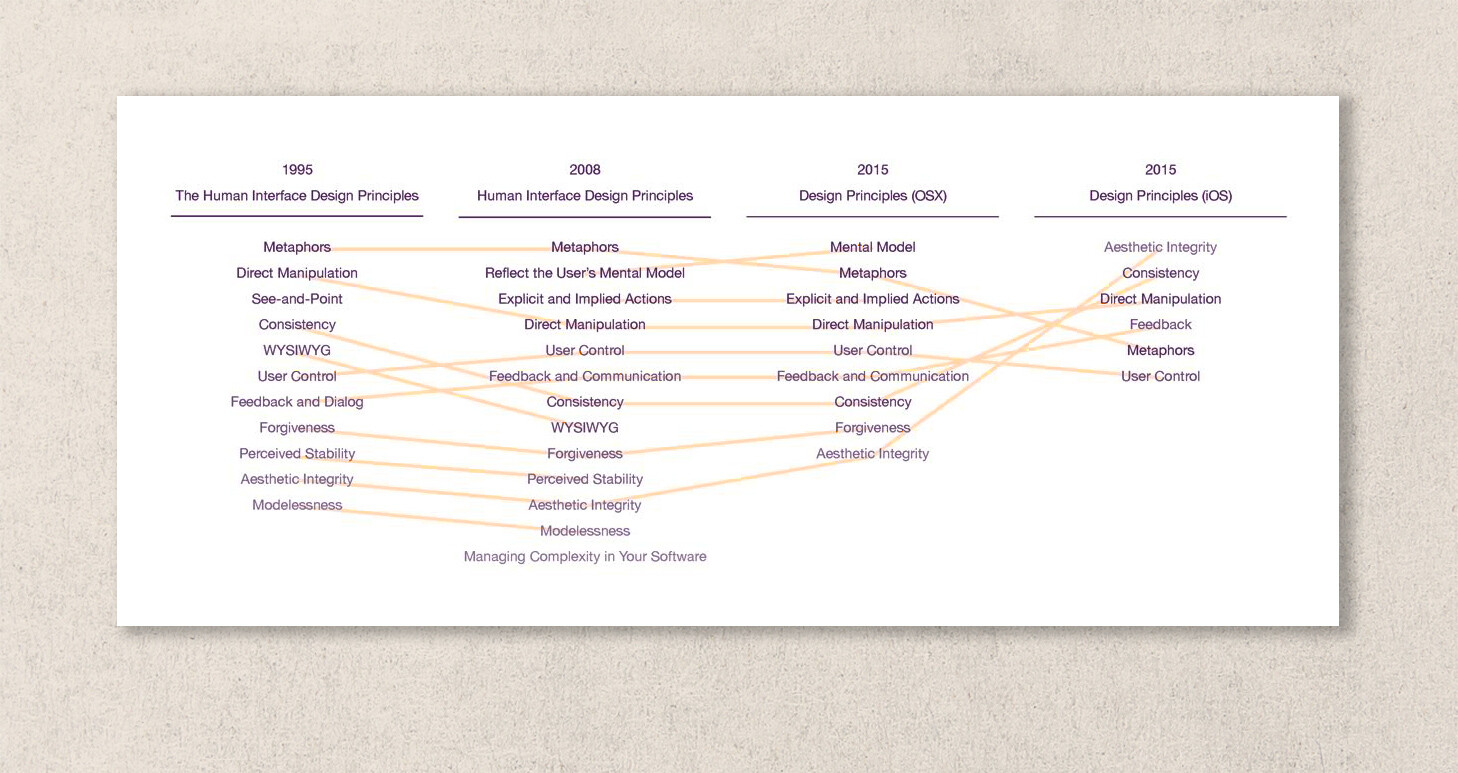
As this discussion was split from the __OS 26 thread, I will add an article written by Don Norman and Bruce Tognazzini in November 2015 for Fast Company. As two people who worked on HIG (and in Tog’s case literally wrote the book at Apple), they have a lot of experience.
I am posting this as a reference point. I recognize the article title below is a bit sensational and dramatic. I am not interested in getting people worked up and taking sides here. However, while the article is nearing 10 years of age and iOS/iPadOS has improved and changed in many areas, note the points they make in each major topic area. Especially in regards to “The Missing Principles” they saw absent/lacking in 2015:
The most important principles largely or completely missing in iOS are discoverability, feedback, recovery, consistency, and the encouragement of growth:
They go into detail on each of these principles, discussing how they developed based on and in response to human interaction, and how they were crucial to the success of the Mac. How much have each of these areas changed, improved or stayed relatively the same?
“How Apple Is Giving Design A Bad Name” by Don Norman and Bruce Tognazzini, FAST COMPANY, Nov. 2015
I was fascinated by the diagram by Michael Meyer showing the change in Apple’s user interface guidelines over 20 years (1995 to 2015):
7 Likes
That’s very likely. But remember that the Apple of 1990 was Jobs-free.
Larry Tesler (a Jobs hire out of Xerox PARC) founded the Apple Advanced Technology Group, Apple’s research lab, in 1986. That was the year after Jobs was fired. ATG was the unit that did most of Apple’s human factors, intelligent agent, and multimedia research in those days. Jobs shut it down when he returned as a cost-cutting move, with some of the researchers integrated into product teams and the rest scattered to the winds.
Apple’s researchers have started publishing research papers again only fairly recently.
3 Likes
That’s a very nice summary. ![]()
I think the point is not so much Jobs vs. not-Jobs. I suspect the crucial difference really is between the Apple that had to fight tooth and nail to win and retain computer users vs. modern-day Apple (where Mac is at best ~10%) that seems primarily obsessed with having the world’s largest market cap.
I’m only aware of more recent papers related to CS (ML primarily) and security. Have they published anything serious related to HF lately?
Interesting detail: Apple’s official support document for iPhone call history (ie. Recents tab in Phone app) has a modified screenshot to artificially enhance the “info” icon:

(Source: support.apple.com)
I could not find another example of this in Apple’s online iOS/iPhone support documentation. By this I mean an artificially enlarged icon or button (magnifying glass effect) floating over a normal screenshot of iOS, to emphasize a UI element. There is even a drop-shadow. It is not even used elsewhere on the same support page for call history, such as with the delete icon (red circle with white dash).
Fascinating anomaly. I wonder why Apple thought it necessary to emphasize that one element over everything else…
Does anyone know of another place where a button/icon is magnified on top of itself in a screenshot? To be clear, I have seen highlights or markings to emphasize UI elements, and perhaps other methods that make it clear they are annotations. I am trying to find an example matching this specific one from the “call history” support page.
Also of note, the title of each Phone app tab shrinks and appears at the top, center when you start scrolling… except Recents which simply vanishes due to the “All / Missed” filter buttons being in that space. The filters could easily be moved to the right, allowing space for the label. Additionally, I notice the space to the left of the “info” icon is greater in the Voicemail tab, even though the icon size is identical. This reduces the chance of missing the “info” icon, which is not really a problem because Voicemail entries do not instantly dial the number to begin with.