Apparently I screwed up by buying a monitor without looking at it first. A relative has one and is happy, and this discussion led me to believe it would be a good, if expensive, choice. I bought an Apple Studio Display.
I’m using it side-by-side with a several-years-old Acer H277HU (using 2560 x 1440 default resolution), and text looks sharper on the Acer. Is there anything I can do to make text look less fuzzy on the Studio Display (also using 1440 x 2560 default resolution, but in Portrait mode)?
Also, I like the near-white background for text fields (like the one I’m typing in now) better on the Acer. (I have Night Shift turned on constantly on both displays, if that matters.) If there is some way for me to adjust the background color in a text field, please nudge me in the right direction. Settings > Displays has a toggle labeled True Tone. I prefer the Acer with True Tone off and the Studio Display with True Tone on, but the single toggle affects both displays.
It’s been a very long time since I’ve done it, but look in Settings > Displays for “Color Profile”. You should be able to create a custom color profile for the display.
And as expected, AI only answers part of the problem.
While it is true that sub-pixel alignment is horizontal when in landscape mode, and the default configuration for sub-pixel alignment optimizes for this…
macOS does not do sub-pixel anti-aliasing.
Windows ClearType includes a “Clear Type Tuner” application, which you should run on each of your displays to optimize its algorithm. As a part of the tuning process, it will select the correct algorithm for horizontal-vs-vertical subpixel alignment and the order of subpixels (RGB vs. BGR).
A Studio Display is a retina-doubled 1440p display (5120x2880). When configured for 2560x1440, there will be 2:1 display scaling. There is a certain amount of anti-aliasing involved, but macOS should be anti-aliasing your native 1440p display as well, which I would expect to be fuzzier (since it’s anti-aliasing a lower native resolution).
Do you see the same fuzziness in landscape mode? If so, then there may be a bug in Apple’s anti-aliasing algorithm, although I wouldn’t think it would matter without sub-pixel optimization.
I’m surprised True Tone affects the Acer. I thought it is designed to only work with displays that Apple has certified for TT compatibility.
Have you run color calibration on the two displays?
I wrote about this recently. Calibration will help the two displays look much more like each other. You can’t do a perfect job without special hardware, but Apple provides a software tool that will definitely help.
Please, call it applied efficiency, not laziness. And thank you; I’m so lazy I haven’t learned how to use AI at all.
It’s interesting. I would not have thought to ask the question, because I would not have thought the answer might be yes.
That sounds like what I had seen before, but I could not find it for either display in Sequoia’s Settings (until I was composing this response; see below). Displays does have a menu called Preset, but there does not appear to be anything configurable in there.
True Tone definitely changes the appearance of both displays. I was disappointed that I could not have different True Tone settings for the two displays.
No, I cannot find any entry point to run calibration for the Studio Display, unless I have a “measurement device connected to this Mac.”
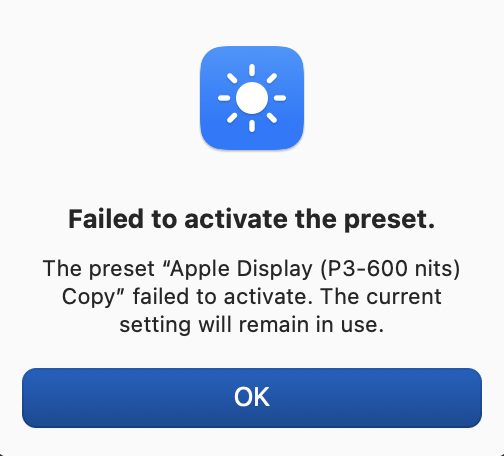
As a result of reading the responses in this thread and poking around Settings > Displays while composing this post, I did find how to run color calibration on the Acer display (choose the Acer display, choose Color Profile, choose Customize, and click the plus sign). The corresponding steps for the Studio Display do not present Color Profile, and choosing Preset, choosing Customize Presets, and clicking the plus sign lets me tweak some settings (Color Gamut, White Point, SDR Transfer Function) but does not offer a calibration option. By the way, choosing an offered Preset moved all my windows to the Studio Display and choosing the original Preset (“Apple Display (P3-600 nits)”) did not restore them, which I thought was a bad show on Apple’s part.
If I preferred the Studio Display’s color appearance, I would edit the Color Calibration for the Acer. Unfortunately, I prefer the Acer’s appearance (although I have no doubt that the Studio Display’s appearance is closer to “right”). I’m not doing any photo editing, so I’m not worried about being right.
Sorry for the slow response. Yes, I tried that, and I couldn’t see any difference. I plan to play with it some more, choosing Custom rather than the settings in the dropdown menu, but I haven’t had time yet.
Maybe the reason I didn’t see any difference is that the change was never implemented. I created a copy of the Preset with a different color setting; when I tried to switch to it, I got the following.
Oddly, if I wear reading glasses and get close, the Studio Display looks sharp. The Acer display looks sharp with or without reading glasses, both at normal distance and close.
Either way, I like the color palette on the Acer display better.
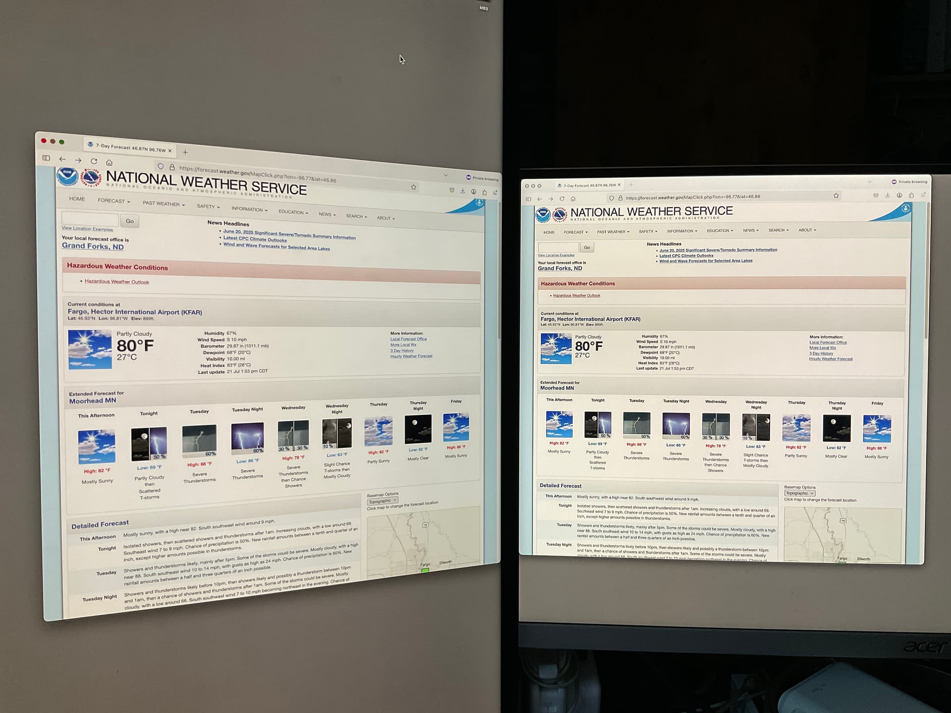
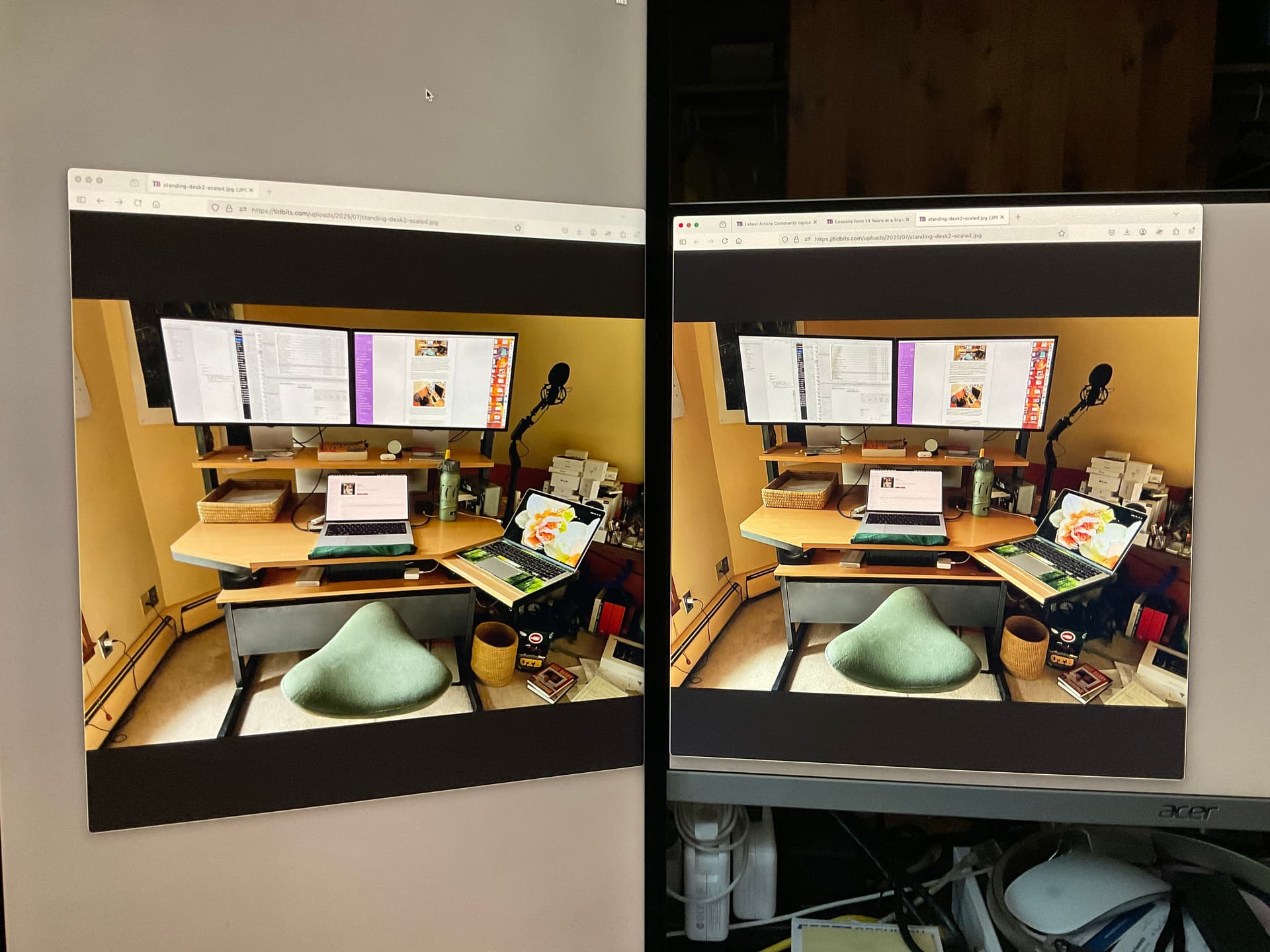
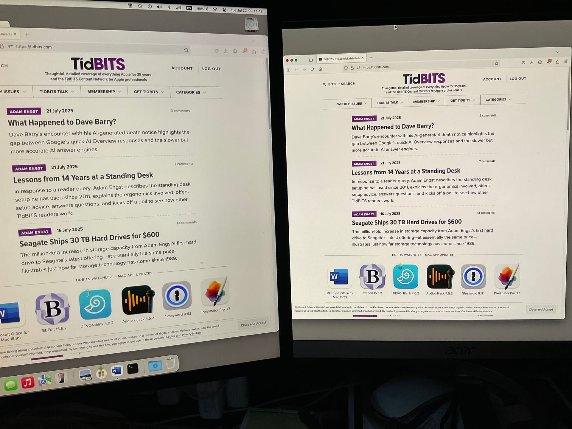
I was going to post screenshots of the same part of a web page (actually, part of the TidBITS home page) to show how the Studio Display is washed out. I took a screen shot on the Studio Display and a screenshot of the same area on the Acer display. If I look at the two screenshots on the Acer display, they look the same. If I look at the two screenshots on the Studio Display, they look the same. In other words, both screenshots are washed out on the Studio Display and both screenshots are not washed out on the Acer display. I’m wondering if I have a bum Studio Display. Comments? (I can take the Studio Display to an Apple Store, but it’s some effort. The nearest store is over 200 miles away.)
Yes, I can, although (due to a number of factors) it was a non-trivial task. And after getting the photos, the difference between the monitors doesn’t appear nearly as pronounced in the photos as in real life. Sigh.
The best example I see is the wall to the right of Adam’s desk. To me, it looks more orange on the right monitor and more washed out on the left (the Studio Display, in portrait mode). But it really is more noticeable in person.
Subjectively, it’s slightly worse. Realistically, I suspect it’s the same. (Despite the title of the thread, I’m commenting on the color scheme, not on the text quality, which seems to be the same in either orientation.)
Today, as I struggled to read the text in an email (in Mail), I tried something new. In System Settings > Displays, I turned on Show all resolutions and then changed 1440 x 2560 (Default) to 1440 x 2560 (low resolution). This made a marked improvement in my ability to read the text.