Let’s try to collect the posts about Tahoe here.
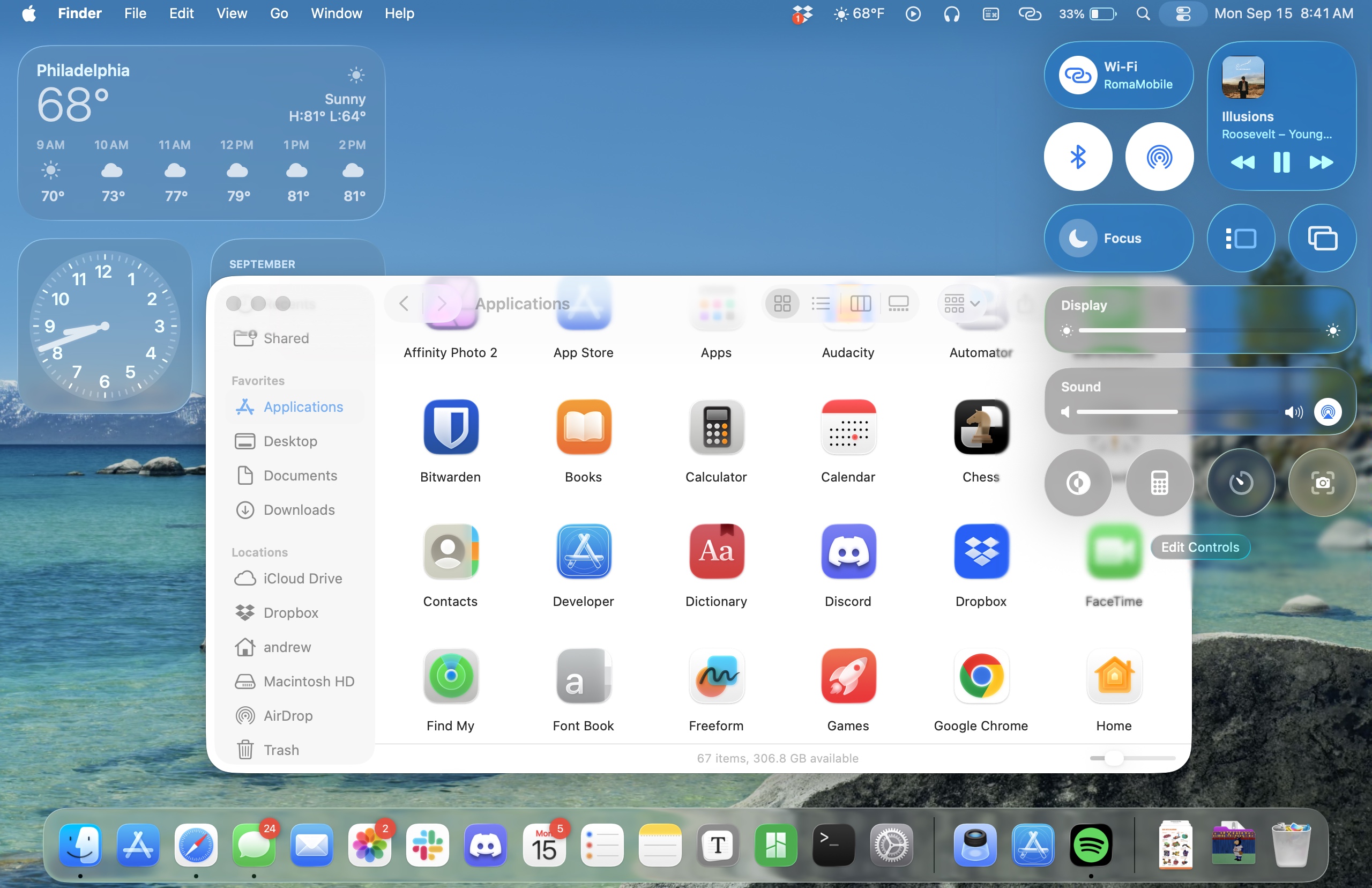
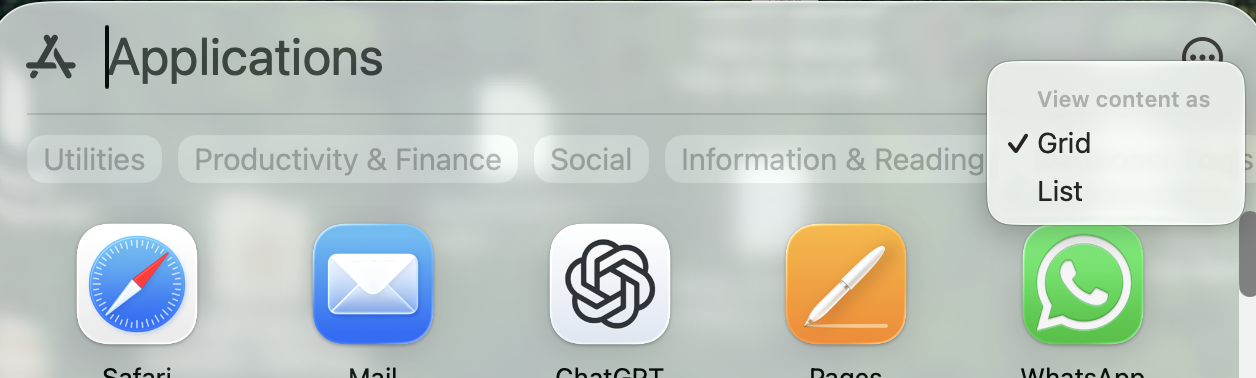
A couple of quick observations after 60 minutes of use. The ‘Applications’ app which replaces the Launchpad, doesn’t appear in the dock when opened. It also doesn’t have a menu bar so it’s just a shortcut to Spotlight. As I didn’t have Launchpad in the Dock, the Applications app isn’t in the Dock so you need to drag it from the Apps folder
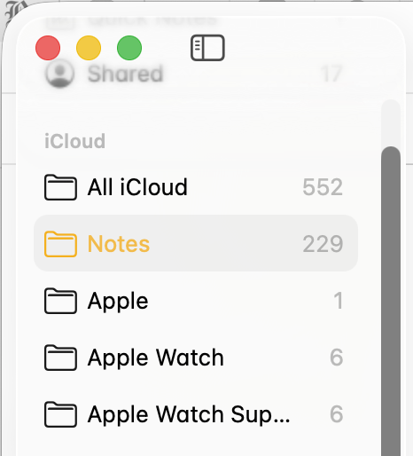
Also on Applications, when you open the app it shows all applications from both your Mac and your phone! There’s not even a way (that I can find) to filter them out. You’d think one of the ‘group’ options — along with Utilities, Productivity or whatever — would be iPhone, so you could hide things you’re never likely to use. I’ve not used Launchpad or Spotlight for launching apps so I’ll do what I always do - have an alias of the Applications folder in the dock and launch from there.
General appearance of Tahoe is OK but the additional rounding on the windows feels odd when trying to resize. Apple Mail looks like an app from OS 6 days - it’s downright ugly. Of course this is all subjective and others may love it.
On a more positive note, I’m yet to find an app which doesn’t open. I was a little concerned about FMP 19 but it started and opened my primary database. I’ve not tried to edit anything but fingers crossed it’s OK.
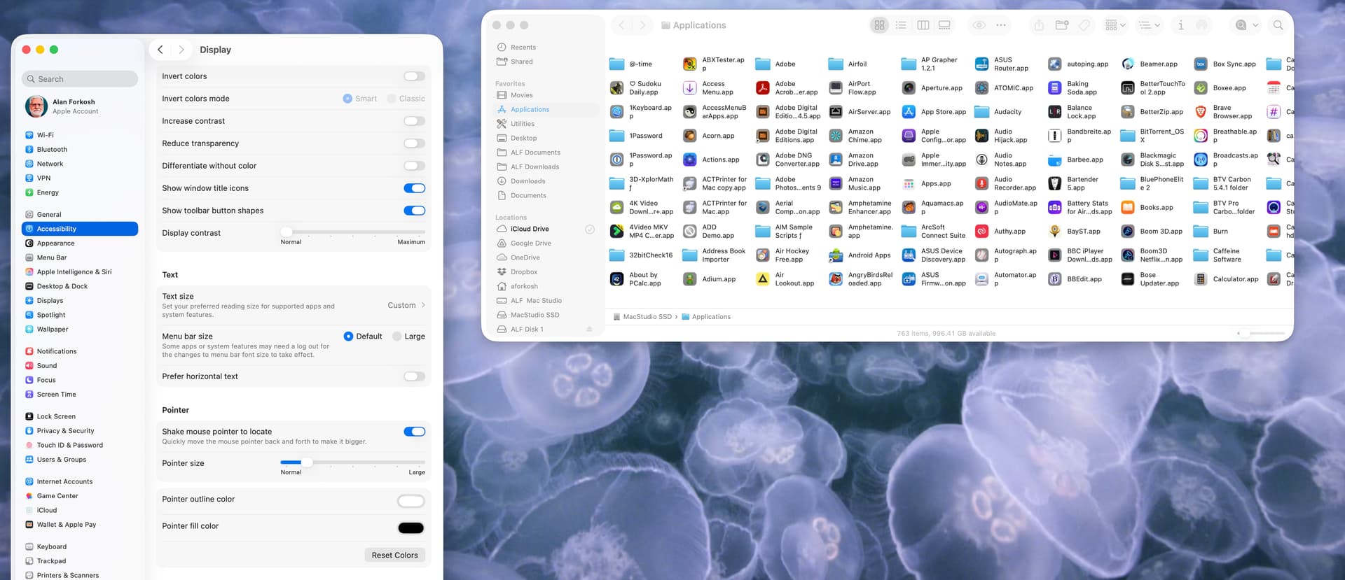
macOS Lake Tahoe: Finder windows are screwed up and a total mess after upgrading to make an understatement. Multiple icons for the same things. Locations cannot be rearranged – it was buggy before also as you could try and drag Macintosh HD above iCloud but Finder would revert it for you. You cannot drag folders/files to the Toolbar for quick access from there and randomly some previous aliases will be marked as question marks. Finder will greet you with not remembering the column width set (just as in Apple Mail if you use column view there). Icons in the Dock list are very hard to see (which is worst for those older software that have not had their icons updated, like Apple’s Remote Desktop…) and there is nothing except turning on magnification that could help you or turn on reducing transparency in Accessibility, which is likely to become a rather normal thing for people to do now.
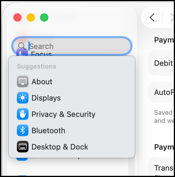
I’ve just found an option in Spotlight settings to hide iPhone apps from the spotlight applications list. Much cleaner now.
2 Likes
I’m finding the icon for external disks very irritating. The perspective is the wrong way around, with the further end (at the top) wider than the closer end!
I had FileVault turned on against my wishes (I will turn it off again).
I don’t like the iOS icons, nor the Liquid Glass look. I see the Trash has been flattened - maybe it won’t hold as much! ![]()
I’d love to see a screenshot illustrating what you mean regarding Mail.
So apparently, unless you set Reduce Transparency to on, your Finder windows will display this pseudo transparent toolbar icon mess at the top. (source below, lists good options to improve Tahoe usability)

Seriously, Apple, who is benefitted by this poor usability?
2 Likes
I’m definitely on Team Reduced Transparency. At least unmodified Liquid Glass is still nowhere as bad an assault on accessibility as default or forced dark mode.
I had no network connectivity because Little Snitch was on 6.2.something and blocked everything despite the filter being “disabled”; that was fixed by disabling the content filter in the Network section of System Settings and then updating it to 6.3.1.
1 Like
Does anyone know how to turn off the “misfeature” in Safari where the background of the top of the window (the tab bar, the URL window and shortcuts bar, etc.) matches the top of the image displayed in that window? (That’s f’ing ugly!)
On iOS there’s Settings > Apps > Safari > Allow Website Tinting. Is there no such setting in Tahoe Safari?
On iOS there’s Settings > Apps > Safari > Allow Website Tinting. Is there no such setting in Tahoe Safari?
I couldn’t find it on the Safari preferences.
And “Is it really this bad?” I sure think so!

And that’s after resetting preferences to get rid of the shadowing and generally tone down the “New and Improved” look… It was a lot more fugly when the stuff on the top of the page had those shadows to stand out from the bookmarks.
The Ars review has another beautiful example of Finder pseudo transparent toolbar icon mess.
Again, Howard Oakley to the rescue.
2 Likes
As said earlier, it’s totally subjective, but I find the lack of colour very reminiscent of the first mono Macintosh interface of 40 years ago. It’s visually ‘harsh’. There appears no way to increase the text size of the mail count and with the small size I’m struggling to read it.
It’s not only Mail; Music and the Finder windows all look similarly abrupt. A simple tint across the list pane would make it far more gentle on the eye.
I’ll have a play with the accessibility settings to see if it can be improved, but if there are already articles drifting around the Internet advising how to improve the look of Tahoe, Glass is looking like a swing and miss.
It’s a little sad that I’m old enough to have used this…
4 Likes
There is a similat setting in MacOS Safari. Safari>Settings>Tabs>‘Show color in tab bar’
3 Likes
So this happens to the toolbar when
- You are in icon view
- The labels are under the icon
If you scroll down the page, the icons are visible as they pass under the toolbar.
If the labels are to the right of the icons, they pass under the sidebar when scrolling.
I hardly ever use icon view when there are so many items that I need to scroll. I use list view instead, and the column headers and toolbar are not transparent.
Too bad there is not a way to turn off this liquid glass crap.
1 Like
I prefer the After myself.
I installed Tahoe last night and so far there are no issues. No readability issues, no issues in Finder. Everything is working great.
2 Likes
I too am very interested how FMP 19 fairs, and will appreciate any reports. I depend on its scripts to maintain the work of a middle school academic league that is just beginning its season; so I can’t upgrade until I’m sure it will still work properly.
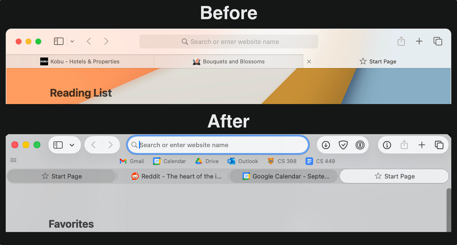
That’s swell, but rather than I like this vs. you like that, what the image conveys is there are several things that are just objectively wrong in the Tahoe picture.
Firstly, there are two tab states, but Apple has somehow decided to use three different shades for two states. Secondly, Apple has also decided that (some) tabs should use rounded bubbles. Nevertheless, faded fine lines have been left behind to additionally delimitate these round bubble tabs, but only in certain locations.
The before-Tahoe picture is perhaps not to everybody’s esthetic liking (a lot of folks have bemoaned the lack of color or flatness of the GUI), and to others that might be the case for the Tahoe picture, but that’s beside the point. The point is the Tahoe picture contains just outright bad UX. Not nice or ugly, just poorly executed in a usability sense.
2 Likes
So I continue to disagree - I still prefer the UI in the second photo. And I will also say that I am not seeing tabs that three different shading states in real-life Tahoe - this window I have open has 18 tabs open, with one pinned tab (a tiny circle on the far-left, which I think is better UI than before), the inactive tabs are all the same shade of gray, and the active tab is obvious - in part because it is the only one with text on it, but I think that happened before anyway.
And to me the controls on the toolbar are far easier to see - though, again, on real-life Tahoe on my machine the windows has a lot less contrast than your photo.
Really my only very minor complaint is that I don’t like the increased radius of the corners, which in the case of this tab are just touching the bottom of the blue “Reply” button on the bottom-left.
1 Like
I already have transparency reduced, so no transparent menu bar here. Thanks for the hint about stopping Safari going psychedelic. It was a nightmare!
2 Likes
Simon, I cannot reproduce the tabs you show in your photo. I have 5 tabs open, and only the active one is in a bubble. If I pin a tab, it moves to the left in to a circle showing the site icon. The 4 non active tabs are separated by shortened vertical lines. Are the Start page and Gcal tabs doing some processing? I just can’t get the same look on my new instal. How did you do it?
Funny thing, as I usually work in dark mode, I did not saw so many changes. Transparencies look nice in some parts, but not everywhere and more when your eyesight is not as good as it used to be… interestingly Mr. Oakley article is spot on how to reduce the confusion!. Thanks for the link!
FWIW, the Journal app seems very buggy. Every time I try to add a location it hangs and has to be force quit. When I reopen the app and try to edit a location it hard crashes. Seems the key tipping point to me upgrading is badly broken.
AH, I have managed to solve the issue. Those dark grey tabs in a bubble are obtained by Cmd-click. Useful if you have a bunch of tabs, and want to move some to a new window or do a multiple close etc.
1 Like
Well, in Music.app, shuffle BY ALBUM is broken. You get shuffle by “song”, regardless of what you select. I’ve been complaining that feature was missing from Music.app on iOS, it seems like instead of adding it to iOS, Apple has decided instead to BREAK it in Mac OS Music.app.
What’s an album? ![]()
It’s an aggregation of tracks with a specified ordering, for people with attention spans longer than a single song. :-) :-)
2 Likes
I played with Music.app a bit more. If I view the library “as songs”, “sort by album” is ignored. If I view “as albums”, it is honored. WHY should the viewing have any control over playback ordering?
OMG they really hate View as Songs. They’ve been removing or breaking functionality there for quite a while.
1 Like
Can somebody report on the new Spotlight, specifically its “snappiness”?
On Sequoia, even using the fastest Apple silicon money can buy right now (and making sure to turn off all web searching etc), there is often a significant lag, definitely feels like at least a second, between text entry and starting to see a populated list. Since I use Spotlight a lot for app launching (I’m a fast typer and I like keeping my hands on the KB), I notice this a lot (although if there’s only one obvious hit, Spotlight will eventually catch up so you can just hit return once you’re done typing without waiting for Spotlight to start showing stuff). So I’m curious if such a lag is still there of Apple has figured out in Tahoe how to make Spotlight listing super snappy.
Interesting. I have noticed a similar lag in Spotlight in recent weeks. I’m not sure when it began, but I’m sure that at some point in the Sequoia life cycle, it was fine. I was planning on rebuilding the indices when I get the chance. Have you tried that?
Once again, the Apple interface guys seem to have said “The Music interface isn’t broken enough, let’s break it some more!” Why are the playing controls now at the bottom of the screen and why can’t they be moved back to the top where they were more useful? If you search for a word in a song, there used to be an option to ‘show all’ – now you can only see nine at a time and have to scroll through them horizontally. As a podcaster, the Music app was one of my main apps but it’s now a nightmare every time I try to do anything which I could do before Tahoe. Hopefully, enough people will complain to Apple that they undo all the rubbish changes they’ve made to various bits of the interface … that’s if they’re taking notice …
2 Likes
Since iTunes demise it’s gotten worse and worse. I don’t Music much on my Mac but the controls moving to the bottom is definitely puzzling.
My requirements are few; a simple way to display my music and make it easy to find and play. I’d be happy to remove all the tiles for categories, suggestions, and AI generated playlists for “Picked for you” and “1990” and “Find your mood”. It’s a massive mess.
This persists across index rebuild for me. And I see it on other systems with other users too so at this point I’m assuming it systematic.
I have 3 observed problems with previous versions of Music.app:
- Sometimes playback will stop on the computer’s speakers
- Sometimes when it advances to the next track, the track doesn’t start playing. (Usually advancing to the next track, and then back-tracking will let the original track play.)
- General unreliability with AirPlay speakers. That’s true for both my old Airport Express and my new HomePod Mini.
#1 has occurred already with the new release of Music.app, but I’ll continue testing to see if that was a one-of, or a chronic problem (as it has been with previous versions of Music.app.)
I’ve asked my friend who works at Apple to go find the person responsible for Mac Music.app and punch him/her, but my friend has not responded…
1 Like
Spotlight lag (and clutter) were driving me crazy, so I started using LaunchBar to open apps.
It’s very fast and does a whole lot more stuff that I don’t bother with and should probably check out. ![]()
3 Likes
Something similar here. One song just stopped playing, I clicked on “Play”, but stopped playing again after one or two seconds. And again. And again.
I jumped to the following song, and it was ok again.
Check out your Spotlight settings in System Settings. Turn off as much as you can, then your App searches will speed back up. In my case I turned everything off except Applications, because if I want to search in most of the other areas I do the search in the Finder, or in Mail or Messages.
M4 Mac mini (2024), Apple Studio Display, macOS Tahoe 26.0 (25A354)
I use the ‘Flurry’ screen saver, and set it to activate after 10 minutes of inactivity.
While the screen saver is running, the following things occur:
(a) (Last week and earlier) under macOS Sequoia 15.6.1 and earlier: Press the Control key ONCE, and the screen saver would go away, the normal screen comes back, and I can return to work.
(b) But now, under macOS Tahoe 26.0, THREE presses of the Control key are required! – While the screen saver is running:
The FIRST press of the Control key → the normal screen comes back, but then, in less than 1 second, the Flurry screen saver magically comes back!
The SECOND press of the Control key → nothing happens, and the Flurry screen saver keeps running.
The Third press of the Control key → the normal screen comes back, and I can return to work.
So, now I need to press the Control key THREE times in a row, to dismiss the Flurry screen saver.
Note: If I activate the screen saver by moving the pointer to screen corner, then there is no problem: Press the Control key ONCE and the screen saver is dismissed, even in Tahoe. The problem occurs in Tahoe, 100% of the time, if the screensaver had been activated by waiting for 10 minutes.
(Also, I tried a couple of other screen savers, but the situation didn’t change.)
I don’t think so, I think it’s a system bug.
In Menu Bar I had ‘Show menu bar background’ off — which I believe is the default. I toggled it on and it correctly showed a faded white background rather than being transparent. I toggled it off again and the problem doesn’t come back. Given it’s version 26.0 I suppose there’s going to be glitches.
Given it’s version 26.0 I suppose there’s going to be glitches.
Well, I thought Apple was different, but it appears they’re increasingly adopting the Microsoft model of “ship it on time, and let the users debug it.”
1 Like
The darker text under stop-light icons; the blue highlight for the currently selected folder, rather than the yellow in mine - your photos look like something is set differently from the default.
Your examples look different from @trilo’s, but IMHO it still looks horrible. I get that transparency is supposed to make it look cool and all that jazz, but if things become harder to read or find, the user is disadvantaged just to please the designer. I will be searching for settings to undo the effects of those misguided priorities.
It’s a shame it has come to this. You’d think that’s what we have betas, public betas, and RCs for, with all their millions of downloads and GBs worth of social media posts covering the “experience”, yet here we are. Apparently the .0 version is now supposed to be treated like Public Beta v2.0. I’ll take this as another exhibit in support of all those cautioning not to update systems used for more than play before .1 or .2 is released.
1 Like
So far, Tahoe has worked well for me without major annoyances. No show stoppers. VMware Fusion has a glitch with Tahoe when the Mac returns from sleep that didn’t happen in older macOS versions - but since Fusion has not been qualified or tested for Tahoe I’m not surprised. It’s able to be worked around. I expect the issue is due to something that Apple changed.
I’ve also had to tweak some of the Liquid Glass/Accessibility setting for my tastes.
Most of the other applications I use (MS 365, Zoom, TeX, Vorta, UTM, VirtualBox, BBedit, Xcode, DaisyDisk) have had zero issues. No show-stoppers.
Software has always had glitches on initial release for as long as I can remember. Given the definition of a working program is one that has un-observed bugs/defects, we’re all “beta testers” to some extent. (Use some Linux distributions if you really want to feel like a beta tester, though).
Yes things seem worse lately — and that’s not just an Apple or Microsoft thing. I have to think that some of that is because software is doing more and is more complex. No software I know of can be proven correct, so testing is the only way to get a feeling for how “ready” for release software is. It’s a difficult task to test all possible permutations of a complex system and then interactions with other software that you didn’t develop to find all of the problems. There is a never ending debate to be had about when to ship software
I also question how many beta testers actually report errors. I get the feeling that too many “beta testers” have FOMO and are using pre release software simply to say they’re using it or succumbing to the hype of the marketing.
4 Likes
Two decades ago, Apple shipped an iTunes update that deleted people’s music libraries. Apple has always shipped buggy stuff. It’s nothing new.
1 Like
Here’s one that’s been bothering me in Safari:
When you have the sidebar open showing “Tab Groups”, the current tab group opens up as if you had clicked the disclosure triangle. This is already bad enough — I’ve got the tabs open on the tab bar itself, so I don’t need to see them all on the side.
But the worse part is: the group in the sidebar stays “disclosed” even when I click to a new tab group!
This seems so wrong that I thought there must be a setting — but I couldn’t find one. Am I wrong?
(And this doesn’t happen on iPadOS 26…)
Yes, I imagine we have different theme colours. In my eyes, the fact it was resolved by simply toggling a setting off and on suggests it’s a bug.
Upgraded today to Tahoe, didn’t see any immediate problems. Wanted to scan something using my printer, don’t keep the printer/scan app in the Dock as I only use it a couple times/week. Used to access it using Launchpad; at least I think that’s what it used to be called.
In Launchpad, all Mac & non-Mac apps were shown, had 1 page for Mac apps, a 2nd page for non-Mac. I had them all arranged alphabetically (on each page) & had set up 2 folders: 1 was for not frequently used apps & 1 was for never used apps; didn’t want to scroll thru everything. Frankly, didn’t use Launchpad that frequently but it was useful, especially for accessing my scanner.
The replacement for Launchpad (think it’s called Apps) only shows Mac apps; doesn’t appear to allow rearrangement of the order or category of the apps nor a way to show non-Mac apps.
Is there a way to make Apps more functional? Add non-Mac apps? Choose your own categories for apps? Am I missing some obvious functionality of Apps?
A 2nd issue I noticed: used to be able to right click on an icon in the Dock to close an app. Now it appears Control-Right click is necessary. Took awhile to figure that out. Is there a way to change something in System Settings to have a simple right click work to close an app?
Neither are huge issues, but both are inconveniences.
Thank you.
A PS to my previous question: Have noticed that right click doesn’t work for many things in Tahoe, Control-Right click is needed. In Safari, used to right click to open a link in another tab, now it seems Control-Right click is necessary. Is there anyway to change something overall in System Settings so right click works again?
Nothing new here. Apple has had problems with nearly every *.0 release of system software, going all the way back to the Classic days (I remember 7.0 and 8.0 also had problems, which were fixed in the next update/release). At least today, the updates will be downloaded - you don’t need to bring a stack of floppies to an Apple dealer to get them.
1 Like
On point one, I see all apps in the Apps app. There are a few options in the Spotlight System settings which you could check to make sure something you want isn’t turned off. Also check you haven’t inadvertently selected one of the filter tabs which only shows certain apps. I sympathise with your loss of organisation - these things can be very annoying.
On point two, I’m not seeing any issue with right-clicking. It works as expected and I don’t need the Control key. You could look at the Keyboard Shortcut options in System Settings/Keyboard and see if it all looks OK. Also check the mouse settings to make sure Secondary Click is correctly set to Click Right Side. It’s not unheard of for Apple to trample over previous personalisation settings during an update.
1 Like
Went back into Apps (formerly Launchpad); it changed overnight! Guess it needed several hours to set up in the background. All apps are now showing, even the ones from my iPhone & iPad! Still kind of crazy as it doesn’t appear you can rearrange the apps yourself or create your own folders/categories for app. ![]() So all apps are included, will just be more tedious to use. Will likely put the scanner app in the Dock to make it easier.
So all apps are included, will just be more tedious to use. Will likely put the scanner app in the Dock to make it easier.
Have checked my Trackpad settings, it was already set as the Secondary Click (right click) as Click w/Two Fingers. Turn the setting to Off & then back to Click w/Two Fingers; now it seems to be working correctly. Thx for your input.
You can turn the iPhone apps off in the spotlight settings if you prefer not to see them.
If you want a simple way to have a group of apps available, put an alias of each app you want into a new folder (named appropriately), then drag that folder to the right hand side of the dock. You’ll now have quick access to those apps in the dock. Create as many folder as you need.
The setting from System Settings is the default. You can also turn them on and off from the options button (the circled ellipsis in the upper right corner of the window). You can also toggle the view to a grid or list from the same button. That option also works for the Files Spotlight group.
Thank you; helpful to cut down on the # of app showing, especially since I don’t need to see iPhone apps on the Mac.
A new question: Keep getting a notice that I need to accept New iCloud Terms & Conditions. Have gone to System Settings multiple times & accepted the new terms & conditions; have restarted the iMac each time. Can’t get rid of the notice about accepting the terms & conditions, System Settings icon in Dock still shows a 1 in the corner. Is there some trick to getting Tahoe to notice I’ve already done this?
Thanks. Yesterday, the Options button didn’t include the iPhone settings, just showed up tonight. Also, yesterday the iPhone apps didn’t show up in the Apps “box” and the appearance was the same whether I chose Grid or List, it always showed up in Grid format. Today I can toggle between them & the appearance changes. Apparently it takes a long time for all the Tahoe setting to fall in to place.
I’m not seeing this here, just the option for list or grid. I thought it may only be available when iPhone apps are displayed, but I tried turning phone apps back on, and the option to turn them on or off still doesn’t show in the Spotlight ‘window’.
I discovered a strange quirk in Tahoe last night. My wife accidentally dragged her Downloads folder out of the Dock and so it was removed. She asked me to put it back, and no matter what I did it would not let me add the folder. She keeps her dock on the left side of the screen and has recent apps turned off. So I moved the dock to the bottom off the screen and turned on recent apps. Then it let me add her Downloads folder with no problem. So I then turned off recent apps and switched it back to the left side of her screen, with the Downloads folder remaining in place just above the Trash. And now it will let me add things next to the Downloads: it was just when there was only Trash below the divider that nothing was allowed to be added. Odd.
1 Like
I’m finding a lot of little not-too-serious quirks in Tahoe, many seem to resolve on their own after 24 - 48 hrs. I don’t remember a previous OS that took so long to “settle” into place; maybe I didn’t notice past quirks. It’s as if the iMac & the OS are getting to know each other & deciding what & when to accept changes. FWIW. My iMac still doesn’t seem ready to “accept” the new iCloud terms & conditions, no matter what I do. ![]()
Anyone happen to have read the T&C and know what is changing, in summary/simple terms?
I would make a stab at it myself but have to tend to some urgent admin first. Or maybe someone knows a trustworthy T&C explanation website (using HI, not LLC/AI).
(I noticed iCloud grayed out on a family member iPhone and a notice to accept new T&C and would like to be able to broadly explain what is new if asked).
For the first time ever I’m not upgrading to the latest macOS release day one. OK I run it on an old spare machine to check it out and it’s awful. iOS and iPadOS 26 are fine BTW (well with reduced transparency).
The big rounded corners on windows is really a backwards step to I’m not sure when, the 1920’s?
The misalignment of labeling of icons in mail is an embarrassment. how could Apple let this ship, where is the person who stops garbage going out the door nowadays?
I’ll admit it, didn’t read the T&C; just don’t have the patience any longer for reading them. My iMac continues to show I haven’t accepted the T&C. When I have the time, I’ll probably call Apple, only as I’m worried something will eventually malfunction if the T&C isn’t accepted.
I have updated, and not sure where HomeKit is on the devices, but with my buttons there is a definite lag when activating an action and having it occur. Are others seeing this?
It works here… go figure…
My Notes app looks fine also. I had reduce transparency turned on before installing Tahoe, visibility and general esthetics seem fine to me after 2 hours of use.

I suspect with my efforts to remove the most offensive aspects of “Liquid Glass”, I also reduced Safari’s ability to highlight the currently active tab. That’s something I miss.
I found a rather nasty little bug in the Tahoe Contacts app (I store contacts in iCloud, making no use of Microsoft or Google options). Note that the bug is not in iOS or iPadOS 26.
If you have more than 8 or so lines of text in a contact’s Notes section (as shown in the Notes box, with word-wrap to a 2nd line counting as 2 lines), the first line(s) of the notes are not displayed in the default view. And there’s no vertical scrollbar to indicate additional lines. This can cause the user to be unaware that additional information is stored in the contact’s Notes.
The only (reliable) way to see these hidden notes are to mouse-click down and then drag upwards in the Notes field, or switch over to one’s iPhone/iPad and look there.
1 Like
I can only replicate that when the first line of the note wraps to a second line. If the first line is short and does not wrap, it always shows.
In fact, for me it has nothing to do with the number of lines. If the first line wraps, this happens.
Also, as soon as you change the width of the contacts app window - even narrow it - the line wraps properly and all of the data shows.
Weird bug.
That’s why hidden scrollbars remain my biggest user interface pet peeve and the first setting I change when I set up a new machine. Even worse is when apps ignore those system settings or substitute the skinniest possible scrollbars. There have been a few occasions over the years where I have missed important information because of hidden scrollbars. Grrr…
4 Likes
Are scroll-bars still configurable? On my Mac (15.6.1), the Appearance settings page lets you configure scroll bars:
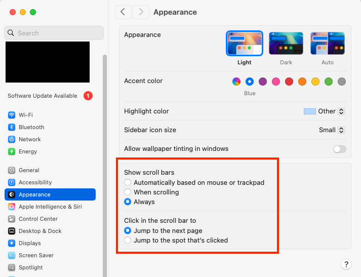
If they’re turned off or set to automatic, see if changing the setting to Always changes anything.
If your mouse has a scroll-wheel, can you spin it to scroll the field?
2 Likes
It might be nice if someone could write an equivalent to Greg Landweber’s Kaleidoscope, so we could pick our own interface appearance. When I convert old Macs to run Linux Mint I am always surprised at the variety of appearance schemes that are available.
1 Like
One of the advantages of completely separating the GUI from the operating system - as it’s always been in the Unix world. You can pick-and-choose whatever you want, including:
- GUI API layer (!)
- Window Manager (software to let you manipulate displayed windows)
- Metacity (part of the GNOME version2 desktop)
- Xfwm (part of the Xfce desktop)
- Openbox (part of the Lxde desktop)
- And dozens of others
- Hundreds of skins/themes that can be configured for window managers.
And for most window managers, it’s not terribly difficult to design new themes.
I know that macOS has the capability for skins and themes. Apple developed the Appearance Manager way back in System 8, and I’m sure its concepts continue to exist up to this day. But it’s a private API, making it pretty much impossible for third parties to develop new appearances.
On the one hand, I completely understand the fact that Apple wants macOS to have a common look, to avoid confusion. But on the other hand, I have not been a fan of the latest looks. I would prefer something different - including some of Apple’s historic looks, like the Aqua UI - which I always found particularly good looking.
2 Likes
Yes, the scroll bar configuration options remain in Tahoe.
(I’ve installed Tahoe in a Parallels virtual machine on my M1 MacBook Air running Sequoia 15.7. I haven’t explored it yet, nor have I tweaked any settings, but performance seems fine so far.)
As mentioned above, I installed macOS 26 Tahoe as a virtual machine using Parallels on my M1 MacBook Air (16 GB RAM, 2 TB SSD) running macOS 15.7 Sequoia. It seems to work well, so if anyone wants to try Tahoe without upgrading your computer, it is completely feasible and reasonable to do so.
Creation of the virtual machine was pretty easy, but first you need to download Xcode 26 from the app store to get some necessary drivers. (I understand that you used to be able to download the necessary files as a smaller package before Tahoe was officially released, but that may not be possible any longer.) After downloading and installing Xcode 26, you will need to download the Tahoe installer. I used the IPSW version, but I think the regular installer from the App Store will work, too. After that, I created the new VM from within Parallels and accepted all the defaults.
So far, the only Tahoe setting I have changed from default is to enable the scroll bars. I plan on tinkering with Tahoe at my leisure over the next few weeks. I am going to give Liquid Glass a serious try, but I think that when I decide to upgrade my real machine, the “reduce transparency” option absolutely will be exercised.
Others have shown similar interface oddities, but I find it truly bizarre that a company so focused on minimalism and elegance will ship an interface that looks like this:
3 Likes
Tab management in Safari is in my view broken. It used to be it was easy to see when you had more tabs than would fit on the tab bar. Now I find that I have to fiddle a lot to find tabs.
Did they remove Tab Overview as a menu command (shift-cmd-) and/or a toolbar item?
Is it normal that printer driver compatibilities are not anticipated or universal workarounds installed in new systems?
Can’t print to Konica Minolta Bizhub C550i
Unfortunately, yes. I’d say printer and scanner connection problems are one of the most common issues on troubleshooting message boards.
Printer driver issues should be a thing of the past with modern printers and driverless printing (AirPrint/IPP Everywhere). All of my printers have survived macOS upgrades from Sonoma through Tahoe unscathed since I ditched their proprietary drivers back in Monterey and went driverless (all my printers support AirPrint).
It seems that driver problems are present for printers that dont’t have driverless support and whose vendors haven’t decided to invest in updating their proprietary drivers for newer macOS versions. Older, discontinued printers are particularly vulnerable to these issues.
This problem (needing THREE presses-in-a-row of the Control key to dismiss the screen saver) persisted in macOS 26.0.1, but now it seems to be fixed in macOS 26.1. While the screen saver is running, I can now press the Control key just ONCE to dismiss the screen saver.
1 Like
Well I finally bit the bullet and updated from Sequoia to Tahoe (26.1). So far, I’m impressed with how well everything is working. In fact, my only real complaint is that the size of the Calculator window in Scientific mode is significantly larger than before, and I can find no way to shrink it back to the size I have allocated for it on my (somewhat obsessively designed) desktop.
[Edit: Ok, now two complaints: Why did the beautiful overlay that appeared when you pressed the volume up/down keys get replaced with an ugly, up in the menubar popover with a slider display that is so granular it’s useless for quick adjustments? I knew I liked the sound at three bars on the old transparent overlay display–which I would argue was much more liquid-glassy than the new ugly slider thingy.]
1 Like
So the week when .1 came out I was fighting with internet provider about an intermittent DSL outage (restored to 100% after 10 days), so I didn’t know it was out and wouldn’t have tried with intermittent internet.
Anyway, long list of notes below for your entertainment.
First impressions though are ‘meh’, ‘ugh’, ‘why is this better?’, and ‘I wish they wouldn’t keep on turning on stuff I’ve turned off’ and a couple of ‘ok, yeah maybe that’s cools’…
Software Update settings changed to favor Apple so I changed back to my prefs
iCloud > Manage Storage, I always delete Siri data and now it takes more steps to do so and at one point a window told ‘your request is being processed’. Wait, am I not the Administrator of the Mac? I did not make a request of Apple, I gave a command
On/Off buttons/sliders are now oval and wider, how is this better
Animation of the sliders has some lines along the edge of the buttons going partway across and I don’t get the iconologic meaning of these lines. I’m not sure how to show that as I think I’d have to take a screen video and crop it very tightly…
Corner radius of windows seem larger, don’t see how this is better
Finder and Settings left columns are in rounded box, with blank space above, below and left which seems a waste of screen realestate
I was checking Widgets in notification center and was told they’d been moved to the desktop, regardless of my wishes. At least there was an option to revert!
Editing Menu Bar Controls in Settings takes you to Control Center. What? I wanted to work on Menu Bar…
Calendar Widget, hm. I had been hoping for a multiple month display, there is room for 2 months side by side, but no, there is still only one full-month Calendar Widget alas
Stocks Watchlist Widget still limited to 6 items. Used to be 10 or 12
I guess for some reason they want users to open the associated apps for these 2 Widgets
Default Web Browser is hidden in Settings > Desktop & Dock > Widgets. Maybe it has been there for a while but seems an odd place for it
Settings for Spotlight are quite different. There is a long list of Apps and maybe that’s useful but it might make sense to have a standard for ‘turn on/off all’ if any list of buttons is more than x.
There used to be options for types of files, now it’s just ‘files’
Clipboard history in Spotlight seems new and nicely enough they note that ‘personal and sensitive information may appear in search results’, which is uh, kind of obvious and makes me wonder why they warn users about it, perhaps Spotlight shares its activity with Apple. But I already use LaunchBar for this for a long time so turned it off
In Login Items & Extensions is something called ‘hdutil’, shown as from unidentified developer. I thought I’d turned it off but it’s on again. Would be interested to know what that thing is
In Application Notifications is ‘Kerberos’. I think it was in previous MacOSes but I still don’t know what it is and it’s not explained. If it’s important enough to list in Notifications you’d think they’d explain what it is. I don’t recall ever seeing a Notification from Kerberos
Menus are now chock full of tiny icons to the left of the text commands. I don’t find this an improvement. The icon department must be very busy
Saved to iCloud, as usual with software updates, lots was turned on although I’ve had them off for a very long time through several updates
In Settings > General > Storage > ‘Store in iCloud’, Desktop & Documents, Photos, and Messages are all selected On. It’s a non-standard dialog (not new in 26.1 btw), because if you turn them all off then the button lower right to confirm the decision is not clickable, you can only Cancel. Gives the impression you cannot turn storing all this stuff in iCloud off, and gives no indication of current status
Settings > Accessibility > Display shows several on/off buttons at the top that are off and gray (as if not able to be clicked) but clickable. I discovered this by clicking Invert Colors, and then turning back to normal. Oddly enough then the Settings and other windows had dark backgrounds as if in ‘night mode’ (which I have set for 10 pm but it’s now only 830 pm)
Then I looked in other Settings Panes and discovered that on/off buttons are often gray even though clickable. Maybe it’s been like that a long time and only now I noticed
When the Desktop is visible behind open windows, it used to be the icons of items on the Desktop were visible. Now they are only visible when showing the Desktop. I don’t see why this is better, it gives me the feeling Desktop is broken or lost
Folder icons in Finder Windows had turned themselves to Red. Then I discovered this was some automatic change based on my change in text highlighting. So I picked a color from the apparently new Folder Color option in Appearance > Theme
Then I noticed that Folder Icons take on the color of the Flag, but… wait there’s no reference to Flags (or was it Tags) in the context menu, just colored dots and… ahoy! there’s a Customise Folder option that allows lots of interesting changes to Folder icons, whoop!
That led me to notice in Mail, The Favorites are in my highlight color when selected, Smart Mailboxes don’t change from black when selected, and the On My Mac mailboxes are some other color I didn’t choose, when they are selected; nothing in Mail Settings about it
Changing Keyboard or Display brightness with Function Row keys, instead of a big centered indication there is now only a tiny barely noticeable indication up by the Status Menu. I don’t see this as an improvement
Connecting to my same years long in use Wifi router takes about 10 seconds instead of previous 2-4 seconds
I’ve set up a new cellular data wifi box and Tahoe rarely remembers it, I have to select Other… and enter the name and long password about 3 out of 4 attempts to connect
Sometimes clicking on the wifi symbol in Status Menu connects to the wifi, sometimes it presents the long-standing pop down where one can turn wifi on/off or go to Settings, etc. I thought maybe it was the setting for ‘automatically connect’ but I turned that off and it is still inconsistent
In Mail, I noticed that keyboard command equivalents shown are in gray text, not sure if this is new but I now find myself confused, Apple seems to have done away with the idea that gray means inactive/not available yet in fact it now has no such meaning. I don’t know if this is a Tahoe thing
Also in Mail, perhaps other apps, there are commands in black with > symbols for further options but the options are all gray. I thought if all the after > options were gray so would the main command before the >. Hm. maybe also not recalled correctly but is frustrating
Maybe not new in Tahoe but Apple demands the User Account Password with some activities related to iCloud. This puts full login data about my account in Apple’s hands, which doesn’t seem right. I always change my account password after being forced to give it up like this
This whole ‘Liquid Glass’ thing, seems like a waste of space with bigger roundings and more gaps, and makes things more visually confusing for me, with blurred gunk behind search fields, option buttons etc. One nifty thing is the reversed image of the material displayed behind clear buttons, along the edges of the buttons, like real glass (more noticeable in iOS)! Still, I need to look again at Mr. Engst’s article about making it more like the old style…
Used to be, you could drag a window to the right to put it in a new ‘Space’, but now nothing happens when I drag a window to the right edge.
Anyway, congratulations if you made it this far, though maybe the Reply was deleted for being too long…
5 Likes
‘I wish they wouldn’t keep on turning on stuff I’ve turned off’
This is my major issue; Apple keeps turning on stuff I’ve turned off. Can’t tell you the amount of time I’ve spent either on the phone or in chats w/Apple about problems I’m having w/the new iOS and OS since the upgrades to 26.
I’ve never made note to changes I’ve made on my systems in the past so when things get fouled up after an upgrade, I don’t even know where to look as the settings setup is always different. I always need to ask to escalate the call as the 1st person I speak to never even understands what I’m asking. Then I get a senior advisor & the 1st thing they tell me is that whatever it is I’m asking about isn’t possible in the new iOS or OS.
Either I’m persistent enough that they finally figure out what I’m asking & provide a way for me to change the setting(s) back to what they were or I eventually give up. Sometimes after a long conversation, I keep looking at the settings & eventually figure out on my own where the problem is & I fix it myself.
The most blatant example: My phone has always been set so that when a call comes in, the full iPhone screen shows the phone call & I can easily accept the call or send it to voicemail. After the latest upgrade, when a call came in, it only showed in a small portion at the top of the screen, I couldn’t see it well enough to accept the call or send to voice mail or just not accept the call. Spoke to a senior advisor at Apple, he said there was no way to “fix” that, it was not possible to have the full screen show the incoming call. I was frustrated but figured I had to accept what he said.
Later that same day, I was checking something else in Settings & found the setting: Phone - Incoming Calls - Full Screen (or Banner). Obviously I changed it to Full Screen. Extremely disappointing that a senior advisor said there was not a way to do that.
That’s just the tip of the iceberg as to how frustrated I’m becoming w/Apple.
Sheri F. Ross
sf.ross@icloud.com
9 Likes
One more thing I forgot above… used to be, when switching to the Dictionary App, the search field would be emptied and cursor placed, so: switch to app, start typing, hurrah!
Only in Tahoe, switching to the App, one finds it as one left it, so mouse over, click or multiclick in Search field to clear it, then back to keyboard. I use the translations of Dictionary daily, it’s always open, so this is an annoyance. I looked in its Settings and didn’t see anything on this. Maybe I can use Dictionary thru LaunchBar…
(added later: oh, and the usual loss of saved signatures in Preview app. Seems to happen every major update. Sigh.)
If you use iCloud Drive, Preview syncs signatures so you have them on multiple Macs. I’ve never lost mine in any upgrades, but perhaps that’s why.
Fill out and sign PDF forms in Preview on Mac - Apple Support.
1 Like
That might be it. I use very little of iCloud, I use one Mac as primary and wouldn’t need the signatures on other devices.
I suppose I’ll retrieve scans of signatures from my previous primary Mac (can’t find them on the new one) and just plunk them in as needed. ![]()
I’d just turn on iCloud Drive on the previous Mac first, then the new primary Mac, and see if they sync over. Feels easier than redoing the scans.
In macOS 11.7.10 Big Sur on my MBA M1, Dictionary behaves as you described for Tahoe. I’ve noticed that clicking the x in the search field clears the search field and deactivates it. I make it a point to backspace to remove the current search so that the search field remains active. As you said, the previous state is maintained when the app is relaunched.
Thanks @Will_M , how odd! Til Sequioa the search field would empty itself upon switching to the app on my mac. I don’t recall researching that, maybe there is a Terminal command that would change the behavior.
For now I’ll have to hope someone who knows will post it or wait til I have time to research it. For now my workaround is command tab to Dictionary and immediately tap esc to clear the field then start typing what I’m searching for.
BTW I’ve learned when looking up words, there are a couple of tricks, one I forgot and one that I’m using, and that’s to select the word then do shift+control+D and Dictionary appears with the word in the search field and looked up. This is useful when looking up words in Apps where select > control click > Look Up doesn’t work. A bit quicker where available, is three-finger tap in a word (selecting not necessary).
Now if Apple would just buy the Langenscheidt Dictionaries and incorporate it into Dictionary, that would help. Or at least enable phrase searching. It has phrase definitions in it, you just can’t search for them any way I know of.
apple changes settings routinely. I have turned Game Center off in my phones and ipads at least 50 times over the years without ever turning it on. They used to turn bluetooth on with every mac update but I haven’t seen that for a long time.
They do, after all, know what you want better than you do. Apparently.
4 Likes
Have run into the same situation w/Game Center; never turned it on yet it “mysteriously” keeps being turned on for multiple iPhones & iPads over the years. Game Center even has a name assigned to me; not my Apple ID, an off-the-wall name. The same name always appears; wonder how it was generated & why that continues to happen.
Things such as this are highly annoying. It’s not the occasional occurrence that’s annoying, it’s that there are so many of them & the repetitiveness of them.
2 Likes
Yes I’m late to the party (???) so if any of these complaints have already been addressed and/or solved forgive me but… A good many of my comments (but not all) will have to do with the application Music but Apple’s odd choices show up all over the place!
Apple has in a whole lot of their changes in this macOS and very, very importantly, to me at least, looked away from something as simple as muscle memory.
On the good side:
Things, generally, appear to be a whole lot faster and more stable.
More security and more speed is always a good thing! (Except if you have to explain it to a cop!)
On the UNnecessary side:
System: To me “Liquid Glass” is no better than something nasty on the sidewalk. Something you would gladly walk around and forget about. For me it’s almost totally worthless/useless. It’s seems to be another one of those changes for change sake!
Icons: Did anyone really need a change to the look of the icons??? I mean I’m all for moving on something if there’s a real need for a change but…really?
Mail: At times Mail shows a thin (regular) line for separation of mail and messages but at times it becomes a thicker line.
Music: For audio volume in Music your hand/mouse wants to go to the top, where the volume control has been for years, but apparently someone got the bright idea to put it at the bottom (I imagine the discussion went something like: “Oooh let’s change this little thing and really f**k ‘em up!”). Using it [might] be doable if it weren’t for the unmovable part of the feature. I still can’t figure out why anyone would want it that way. That goes for the system volume to. The same people also thought it a good idea to put the scroll bar at the bottom where it interferes with seeing a song when it’s down there. A real and obvious waste screen real estate.
Music: The icon for “syncing” in Music was made so minuscule as to be almost invisible, and put it in a really out of the way place also all the way down at the very bottom of the page.
Music: Dismissing the main Music window in favor of it’s mini player manually works fine but when done from a key command it doesn’t dismiss the larger application image.
Tiling: I really wanted to find it useful but I was hard pressed to find anything helpful about it. I guess if we were still in ‘60s and I was on the production team for the film The Thomas Crown Affair it might make sense as it has that look.
I’m sure more observations will come into view but for now that’s it.
My wife just updated to Tahoe, and has some truly bizarre behavior. Her sister’s Contact and Mail data disappears and reappears, then disappears if you actually try to access it. Very bizarre…
For instance, if she opens Contacts and selects her sister’s record it displays, but if she actually tries to access in any way, for instance, editing, it disappears, doesn’t even show in “All Contacts.”
If you quit Contacts and reload it, her sister’s record reappears, but again disappears on access. (Rebooting doesn’t improve on this.)
Mail was behaving similarly. When you first open Mail, all her sisters email, and in folder would initially appear then disappear. Now it is just gone. Any ideas?
Thanks.
I’ve had that behavior on my system (that’s stuck on Ventura) for several macOS versions, unfortunately. I’ve never taken the time to figure out a fix, if one exists.
She says it’s not new to Tahoe, just much worse. She’s seems to have lost all her sister’s email. I have had chance to go into the ~/Library data files yet.
What I’ve tried:
Rebooting, of course.
Onyx’s delete and rebuild Mail index didn’t fix it.
Disk Utility / First Aid found ~20 “Resource Fork xattr is missing or empty…”
Said it repaired them but refound them when First Aid was repeated, even from Recovery Mode. Also “descendants” (74) of dir-stats object (id…) is greater than expected (64)…
Is the drive (not a spinner) going bad?
Later:
WELL, I didn’t know Apple had FOUR support tiers…
;-)
Will, I can only imagine how stressful this must be for your sister and yourself.
I’m still on Sequoia for now, and have taken the radical approach of only using Fastmail’s Mac app for my email & calendar, and have done the same for my iPhone SE. Touch wood, I’ve never had anything on the scale of what you’ve described, but I now feel that perhaps I’m better off not having Apple’s apps connecting to my data at Fastmail…
Feels odd to quote myself but…
This effect I describe in Dictionary is now also in Signal app on the Mac (26.1) when clicking to Reply to a text bubble. It used to be, clicking reply would exerpt the bubble AND place the cursor in the text box so you could immediately start typing (as we see here in forum replies).
Now, in Signal, clicking Reply only excerpts and doesn’t place the cursor. So I’m starting to think this is some OS oddity that might be correctable with a Terminal Command.
If anyone knows of such a command, please advise. Thanks.
Just a note that this is also true if you open an encrypted disk image file from the Finder. It used to be that the cursor was in the Password field, and you could simply type the password; now it is not, and you must click in the password entry field before typing the password.
I assume that this is a minor bug and not a deliberate design decision.
1 Like
OK now I am re-replying to Self but wanted to update this for anyone interested.
I intentionally reboted more often over the last week, and although Signal was not updated that I am aware of in that time, the cursor now places itself in the message window when clicking to Reply.
Also, Dictionary is sometimes putting the cursor at the end of previous word when I alt-tab to it, and sometimes the previous word is selected. It’s not consistent. Discovered that hitting the Enter key will highlight the previous word after an alt-tab, and that’s a bit easier for my hands to reach than esc.
No known change to OS, all automatic updates are off.
The latest update from Apple for Mac is appalling:
Finder = this is change for change sake! Appalling
Apps = who came up with the categories and dumped all the apps all over the shop - 80% of the apps now shown are of zero interest to me but I have to wade through pages and pages to find what I am looking for - SOOOO frustrating.
Screen shot has been disabled! Why doesn’t anyone at Apple test anything these days - they have opted for Microsoft testing through it out the door and wait for complaints and then fix.
I hate complaining - but Apple is now my least favourite IT company!
HELP! Is there any way I can revert to the old interface??
Not shure what you are talking about. Screenshots work fine over here (macOS 26.2).
1 Like
Screenshots on a M2 MBA with 26.2 working here too. Could be access routes have changed since recent OSes, and I think there’s a new one, shift-cmd-5, which opens a little toolbar showing the options. There’s also been a screen shot app for a year or two.
I find it a bit unfriendly that when a long-standing function has been changed, the user is not alerted and informed by the OS upon first attempt to use the old way. So it goes.
I’ve been using shift-command -5 for years . It may be part of the original OS X spec. I’ve used it because it’s an efficient way to access all the options (full-screen, window, manually selected rectangle, as other pictures or videos).
Golly! only noticed it recently by mistake! almost all the screenshots I make are with shift-cmd-4, one day I hit 5 instead. ![]()
Either Shift+Command+3 or Shift+Command+4 or Shift+Command+5. With Shift+Command+5 you will find more options
CMD-SHIFT-3 (capture entire screen to file) has been around since the earliest days of the Mac. At least System 6, if not older.
CMD-SHIFT-4 (capture region to file) has been present since MacOS 9. Not sure about 7 or 8.
CMD-SHIFT-5 (launch the Screenshot app) was introduced in macOS 10.14 (“Mojave”)
The format has also changed over the years.
- System 6 saved a MacPaint file
- System 7 switched it to a PICT file (associated with the SimpleText utility)
- Mac OS X 10.4 switched it to TIFF
- Current macOS releases use PNG
- You can change it to JPG, TIFF, GIF or PDF, if you like. At least you could in 2021.
- I’m not sure if other releases used other formats by default.
And FWIW, CMD-SHIFT-1 and -2, although no longer supported, used to be for ejecting floppy discs. -1 for the first drive and -2 for the second (or external) drive.
4 Likes
9 posts were split to a new topic: Screenshot of a scrolling window’s content
Hey, is the macOS 26 Tahoe still buggy? I haven’t updated it yet. I’m running on macOS sequoia.
I’m on 26.2 on all my machines (iOS & Mac) and am not seeing any substantial bugs.