This, in particular, is one of the apparent design goals that points more towards “chicness” than usability. The thinner you make the bezels on a phone or tablet, the harder it becomes to hold the device without touching the screen in places you aren’t wanting to touch it.
My iPad Air 4 has roughly a quarter-inch bezel all the way around, and I have great difficulty holding the tablet to show what’s on the screen to the person facing me without inadvertently tapping somewhere along the edge, changing what’s on the screen. The bezel on my iPhone 12 Pro Max is less than half that size, and without a case, I literally cannot hold it without accidentally touching the screen—the distance that the device indents my skin when I grip it along the edges is greater than the width of the bezels.
If you extend current bezel trends to the limit of absurdity, you end up with a device that’s all screen on all sides with nowhere to hold it without touching the screen. Completely “elegant”, but also completely unusable. Where do you draw the line on “too much screen and not enough case”?
(As for being “drawn into the software interaction”, a plain black surround is normally visually ignorable no matter how thick it is. In fact, making the surround too narrow risks running your content into the uncontrolled background of whatever’s behind the screen, potentially disrupting such absorption of attention.)
Given Apple’s good track record on accessibility in the software (Liquid Glass notwithstanding), it’s a real shame that their hardware design continually sacrifices accessibility for apparent luxury appearance. This is where a clear statement of design philosophy would help us understand why they make such seemingly counterproductive design choices.
I don’t think it is. They don’t front and center that phrasing much except at the bottom of press releases in small font. I don’t see it in their marketing anywhere particularly.
I don’t laugh hysterically when I read that which I would if it was Meta or Google, so I don’t think it’s far off how they see themselves…in the context of being a trillion dollar corporation.
It’s a good goal but it reeks of hollow corporate-speak, and… isn’t that what every citizen is striving for in a civil society? Not quite something to crow about for a company with 150k employees. This should be a given.
I experience inadvertent screen interaction regularly, and an elderly family member I try to help does it even more often. quite frustrating. I guess we’re ‘doing it wrong’ and should learn to grip it along the sides or get a $200 accessory of some kind…
I was happy to see the bright orange iPhone Pro Max. Finally, real color at the high end! Though not my preference for a bright color, it’s a start. And I liked some of the skeuomorphism, the skeuomorphic Address Book in particular.
I agree and have been saying basically the same thing. The point where Apple started to no longer care about “the rest of us” was 14 years ago and they started chasing things that would maximize profits.
I recently had occasion to pull out my old slot loading iMac (a 1999 Graphite iMac DV SE) which has been patiently waiting these past 20 years in the hall closet. I spent a couple hours playing around and remembering when Apple had a sense of humor, when they delighted us with their whimsy. Back in the day we were still trying to figure out the Internet and personal computers were actually fun. “Those were the days my friend, I wish they’d never end.”
And yet to Jobs the user experience was sacred.
Making the user experience worse just to make an extra buck or carelessly dumping premature garbage onto users is not something Steve was known for.
But either way, I tend to believe these characters are all more facetted than Woz good, Steve meh, Cook evil.
What I find interesting is that these discussions usually focus around when Apple left the righteous path and who’s responsible. But that basically suggests that most are indeed in agreement that Apple did actually stray and that they today are doing things they should not be (or not doing what they ought to). And if that’s true, then I guess the question becomes what leadership would need to do to right the course. Almost the entire leadership is being exchanged right now and Cook himself will be gone too within a few years. This is the moment when Apple’s course could be changed for the better (and yes, for the worse too, but I prefer not to worry about that). It’s an exciting time to watch. And hope.
The Bondi Blue iMac I gave my wife back around 2000 is sitting on the top a filing cabinet near my office desk. Around the corner on another filing cabinets sit an Underwood Noiseless Typewriter and a hand-cranked Burroughs mechanical adding machine. They’re visually interesting milestones of technology. The 2024 MacMini on my desk is the machine I’m using now, and I find it an visually interesting milestone of modern computer technology. They’re useful and they work well – or at least worked well in their time).
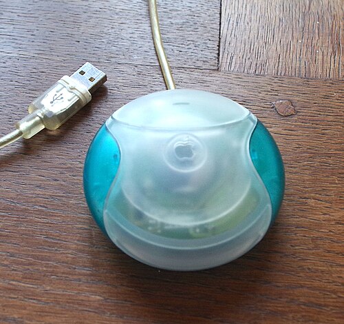
What bothers me about design is when it gets in the way of usefulness. Think tiny light gray print on white, or the odd tiny little symbols on the ports in the clean metallic skin of the MacMini. I have to crane my neck, grab my big magnifier, and pull out a flashlight to see those symbols. Some are so cryptic that I wind up poking cable ends at them to see what fits. I don’t know what happened the round Hockey Puck mouse that came with the the Bondi Blue iMac, but it was replaced long ago by a cheap one that was much easier to use.
I wasn’t able to get the iMac in the color I wanted — had to settle for gray instead of dark blue — but today I can order an iMac in any of what, six colors? So that’s a positive on Apple’s part. (I do admit I loved my white MacBook.)
My iPhone case also reflects my choice, which the color may or may not — and I’m always going to cover it to protect it. Only time the color mattered (deep purple) was the only time I used a clear case ). My iPad case is a custom photo case (my wife is sticker happy with hers).
In simpler terms, I’m getting the customization I want for the most part, have a choice again on an iMac. And the coolest looking thing they’ve done since the gumdrops was a failure anyway (cube).
Yes, like making a MacBook (M4 Pro) so minimalistic that it lacks an LED showing if it’s on, sleeping or off. Design (or rather ‘looks’) over function is always a bad thing IMHO
I see many have already replied to this thread. But I doubt I’m alone in liking Apple’s design choices for their latest systems and greatly prefer them to their older models. I’m in no way in the luxury market for anything but I appreciate the sophisticated design of Apple’s latest hardware–phones, iMacs, Minis, mice, keyboards, etc. I have no problem with how they work or feel. I’m even okay with the latest version of iOS. I appreciate many of the features and it’s easy to make it work visually. I’m still using Catalina on my iMac so I cannot speak to what Apple has done to MacOS. I may not be so please with its design and feature choices there.
There’s engineering tradeoffs for everything. They may not be good on some absolute scale, but when you have to trade off speed of delivery, cost, convenience, etc.