On the iphone, I use the space-saving setting that shows only the icon, not the text names, and I often don’t know what app some of the icons represent. I use the search swipe as a launcher, generally.
Frankly, I’d remained ignorant of having the options on my phone - but now I’ve tried out Dark, Tinted and Clear and immediately switched back to Default.
Also discovered the option to go “icon only” (with titles hidden) and that’s even more of a non-starter. Given how many links I add to my home screen, I’d never be able to identify 75%+ of them, let alone all of the apps I have that I rarely access. Who uses THAT “feature”?
1 Like
Same with me.
Default ( but don’t use icon view on my Mac)/Default on iDevices because there is no other choice!
Never ever used icons when I have a choice. As soon as Greg’s Browser became available in System 7(?) I stopped using icons even in Finder. Now I use Pathfinder instead of Finder. Icon view is still available but I stopped reading picture books several decades ago.  I never understood why icons were so popular when plain text removed the need for color, tiny pixel differentia and wasted screen space. I don’t even like emojis that can have different meanings to different people. I’m just ecstatic that I can have things my way in my computer (at least).
2 Likes
I use default (dark mode at night, light mode in daytime). Clear/tinted works well for people that rely almost entirely on muscle memory — I do too, but am not fussed by most icons. Some often used, ugly ones get stashed in a folder (Duolingo comes to mind).
Well, like almost everyone here, I use standard icons, but (and I may be an odd one here) my brain has never been very good at ‘reading’ icons, and I still find text much more salient. Obviously, that’s a problem for a GUI designer when you want everything to be the same-sized blobs on screen, but I must lose hours a month looking at the 25 icons in my Dock trying to identify which one is ‘Preview’. The only ones I recognise quickly are Calendar, Zoom and, rare points for Microsoft, Word and Excel, because they all have letters on them. And as others have noted, things have only got worse the more cartoony and abstract icons have become - as for ‘tinted’ and ‘clear’, words fail me. My menu/dock solution is to have an Applications alias as a normal folder pop-up in the dock, where one click brings it up as a nice list of application names. Relief!
1 Like
I use dark in CarPlay
I’m biased because I use the dark mode full time, which reduces the incidence and severity of migraines. I tried the dark icon theme as soon as it was available and found I preferred it, and have been using it ever since.
1 Like
I made it for 6 days, but now I’m back to default. As i suspected, I get a lot of clues about icons from their color. My biggest issue on iOS and iPadOS was when sharing to apps - the flat / transparent icons were hard to distinguish.
If I had a wallpaper that was specifically designed to work with transparent or tinted icons it may work better.
I didn’t like clear or tinted on MacOS at all.
Clear and tinted icons??? I couldn’t get over Spotify changing their icon making it challenging to recognize. Gut feel is they earned a lot more hate than Apple because at least you can control what’s being changed and the options. 
The primary objective for interface design should be accessibility. This doesn’t mean being boring, but it does mean paying attention to UI rules. Apple has slipped in paying attention to fundamentals.
1 Like
I’ve seen gorgeous themes and aesthetic kits for iPhone with which you can replace every icon - indeed every element - on your screen(s) to create a harmonious and engaging whole. For me, very compelling and appealing. I’ve had to force myself to step away, though, because it makes it even more impossible to know what lies behind each icon.
1 Like
With dark icons on a dark black colored background, the icon squircle outline is de-emphasized and the icon graphic image is emphasized. So much so that on my iPhone at least, I usually run with large icons only, without text labels.
Although … I still find it useful useful to use a consistent brown (a color Apple’s and 3rd-party icons rarely use) for the icons of my shortcuts that I use as widgets on the Home Screen. To clarify my which is my own stuff.
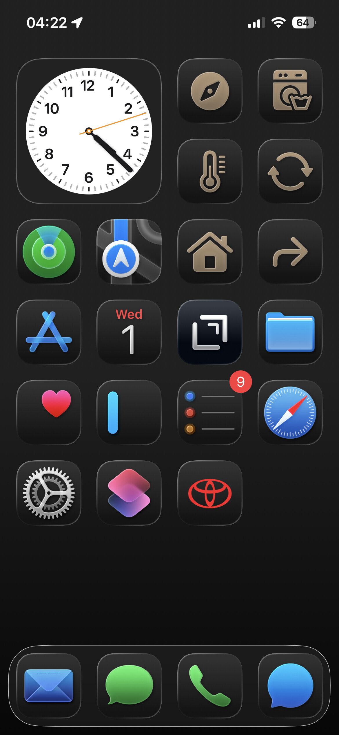
2 Likes
I used to use Color Oracle to quickly display what a webpage looks like to people with protanopia, deuteranopia, or tritanopia — it was an eye-opener! and useful when building webpages.
2 Likes
Hi Deborah! You could always have one phone for style and another for function.
1 Like
How did you know?
Late to the party.
I use Tinted. Clear is annoying. I’d rather see an opaque option, too!
The whole Rounded Rectangle icon thing is loathsome. Everything looks the same, especially with the limited color palette Apple uses. For me, a Mac user since the 512K, to feel lost in the Finder is quite an accomplishment, Apple,
I liked when icons could have actual shapes.
I loved the old CandyBar icon app and still use it to replace some icons on my Mac.