Originally published at: Charts in Apple’s Numbers Spreadsheet: Which One When? - TidBITS
Apple’s Numbers and Pages apps provide a plethora of charting choices. But neither helps you with the crucial decision regarding what type of chart to use for which kind of data. Here’s a roundup of your choices, and some advice as to when each should be used.
1 Like
Thanks for a great introduction to charts and their uses. It’s good to know how to interpret them, even if one doesn’t generate them regularly.
This is an excellent article, thanks for setting everything out so clearly! Should be a required read and reference for anyone making charts. So many charts I see are meaningless, misleading, or wrong. It seems some people think that putting data in a chart makes it more reputable, without consideration for why they are doing so or what they want to communicate.
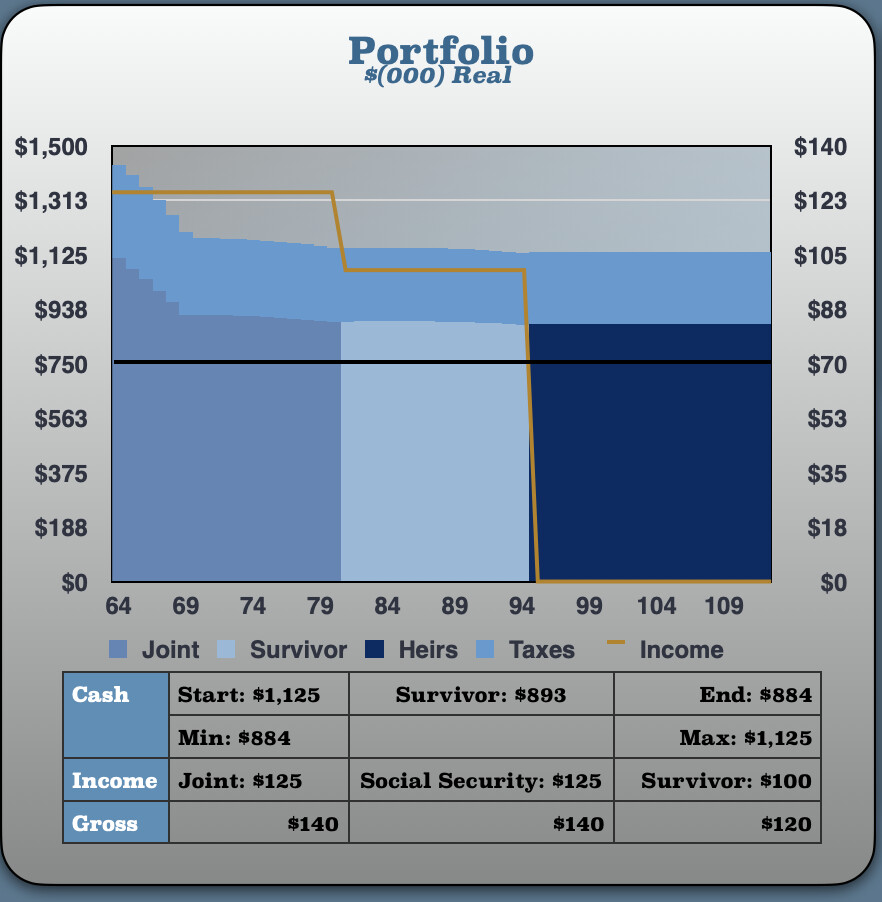
You can also get a lot more advanced when creating charts in Numbers by combining multiple chart types, shapes and your own tables. You simply ensure that the axis are consistent and then align them on top of each other. Here is one I like:
I confess to being an Excel rather than a Numbers user. One of the big reasons why is Venn diagrams, which are used in media to compare overlapping audiences. It’s super easy to do an accurate Venn diagram in Excel. You have to jump through hoops on Numbers. If you want to change perspectives, it’s like jumping through hoops that are on fire:
https://discussions.apple.com/thread/250233520
They are often used other industries as well.
then you should use Excel, I have never, ever, ever needed to make a Venn diagram. But it would be very easy using circle shapes. On the other hand, if I needed to do it often, I would obviously use something that did it
1 Like
That’s one of the reasons why I, and many millions of other individuals and businesses pay to use Excel rather than Numbers. The link I included is a question a high school math teacher asked an Apple Forum who had been searching around and could not find guidance about Venn diagrams in Numbers anywhere. Venn diagrams are used regularly in many, many industries and services other than advertising. They are not unusual.
I also think that if Numbers had more and better analytical features Apple would have a much bigger market share for its productivity apps, and Microsoft would be feeling much pain in its bottom line. I would certainly prefer not to shell out big bucks for them. They might also sell more Macs.
Sure, you go with that. I have used Excel for over 20 years, they have a few features that I would like Numbers to have (but now that Numbers has added Pivot tables, after MS trademark or patent expired, that list is small), but overall, it is not a feature if you don’t use it, Excel has a lot of clutter that most people simply don’t use, and therefore it is not a feature.
for example, crappy database stuff - use a database, lots of good free ones out there.
.
My biggest peeve with Excel (besides the terrible ribbon) is that outdated one honking table per sheet paradigm. It is so mush more convenient with adding multiple tables each with there own naming, dimensions, and formatting. On Excel, you change the entire row, or entire column - very inconvenient.
I originally wrote a financial planing tool for my retirement funds in Excel. It does taxes, reverse taxes, taxable and tax preferenced investments, multiple income sources, inflation, everything is a variable so you can do what if analysis and see how your portfolio responds, what are your best retirement options etc. I converted it to Numbers because I was sick of paying the MicroSoft tax. It is so much easier to maintain, easier to present, just overall a better modeling tool than Excel.
I totally get why people are fixated on Excel (because their employers choose it, so it is easier to use one than multiple), but overall, I do not choose it and I am more than happy with my decision. and it is one born of years of experience.
I am totally happy for you to continue with Excel, no one will argue with you. But for me, Numbers does it all, and does it better.
Take care
1 Like
Has anyone here used KaleidaGraph? It has been available for the Mac since 1988. Like Excel and Numbers, it combines a data base with mathematical and graphing tools. Unlike them, however, it has always offered a much wider choice of tools for data manipulation and of graphics styles and lettering, so one can easily use it to turn out high-quality, publication-ready figures.
Back in the 1990s I used KaleidaGraph on a Mac to calculate data points and error bars from experimental measurements, generate theory-based or best-fit curves for comparison, and then make well-labeled monochrome graphs for publication in scientific journals. At that time I was always surprised by the almost universal acceptance of Excel despite the primitive-looking charts it produced. To me they looked amateurish compared with the handsome, professional-grade graphs made so easily with KaleidaGraph.
Perhaps Excel and Numbers are now much more capable, but when I recently took a brief look at using Numbers for producing a good-looking graph I was not impressed. The latest versions of KaleidaGraph for Macs and Windows are available at <www.synergy.com> and a 64-bit version is expected next month. It can import Excel data if you only need KaleidaGraph’s superior graphing capabilities.
1 Like
Sharon sent me some text about the new radar charts that Apple added to the last version of Numbers.
Radar Charts
A radar chart—also known, for obvious reasons, as a spider, web, or even star chart—is a recent addition to the Numbers repertoire. It packs a lot of data into a smallish figure, using multiple, equidistant axes radiating from a central point; the areas of the resultant polygons represent values. They’re not too hard to create, but they are difficult to interpret, so use them only if both you and your audience are experts. Read more about them here.

1 Like
I was just looking at this article again, and something struck me about Dual-Axis Charts: the distortion it might create - look at how different the curve of the temperature line is.