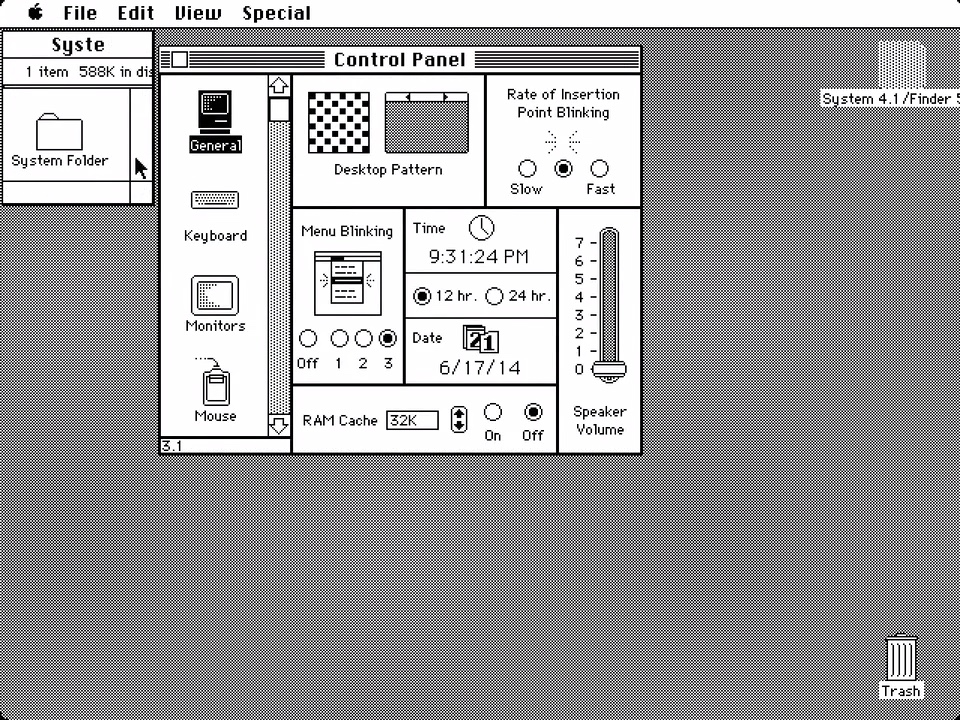
I agree, Jolin. I suspect a factor contributing to the excellent interface design of the early Mac OS was the fact that they had to do it in black & white.
I think it is that in a way. The problem is that iOS design usually thinks about a portrait screen while Macs have a landscape screen. That means that a design which anchors the labels to the left of the window and the controls to the right of the window works fine in iOS (where the labels are still going to be pretty close to the controls) and breaks down in Mac OS (where the labels and controls can end up pretty far away from each other).
For some reason, I’m reminded of the websites (like our NC DMV) that have implemented a chat-like user interface, so I’m sitting there trying to re-register my car and all the action is taking place in this one tall skinny window. It was clearly designed to work well with a phone, but takes no advantage of the additional power and screen area of a computer.
I’m looking at that long list and thinking that now I have to sort out what category my desired setting is in before I can even begin to find it, using only words and smaller icons.
On the other hand, it looks like it would make sense to tap a category and see the list of settings in that category without going to an entirely different detail screen as System Preferences does. So, it could end up being faster and allow me to tap a few categories experimentally to discover where the setting is.
Both Preferences and Settings have a search box, so that’s a wash.
I agree with the critique that it’s such a portrait-oriented approach for a landscape-oriented screen.
And @Shamino , thanks a whole lot for sending me off on a half-hour nostalgia trip through the early Mac screens! Made me recall that after all these years I still have an emotional bond with that pixel artwork and the Chicago font.
John Gruber discusses the new Mac Settings app with Craig Federighi from Apple during his ‘Talk Show Live’ video beginning at 41:20 in the video.
Federighi noted that the version in the current beta will be subject to many changes during the beta period. For example, the beta version of the Mouse and Trackpad options show only the possible selections and while the current System Preferences version has short video clips demonstrating each option. Federighi made clear that something similar will appear in the new Settings app, but it wasn’t ready for the first public iteration. So, perhaps, by the general release, Apple will be making better use of the space.