I reckon’ you should whack a big TidBITS home page button up the top of the TidBITS Talk home page. What say ye?
The Articles link at the top of every TidBITS Talk page takes you to the TidBITS home page:

I guess the wording could be “TidBITS Home”, but that might look funny with the multiple repetitions of “TidBITS” so close to each other. I have to admit, though, that I don’t associate “Articles” with going to the home page, so can understand why you wouldn’t have noticed it.
1 Like
@jzw is spot on. We did want a way to link to the main site, but anything with the word “Home” in it feels like it should point to the same site, and anything with the word “TidBITS” in it is just confusing. That’s why we settled on “Articles” and “Issues”—they’re at least accurate, if not entirely obvious.
I’m open to other ideas, though!
2 Likes
I feel like a link to the Talk site in the subheadings with “Weekly Issues” , “Membership”, etc. would be a fine place for “TidBITS Talk” on the right side. The “Comments” links from the main page do link to the Talk site, but not to the home page. But, I can always keep trying to remember to just start typing my URL with “talk” and autofill will get me there pretty quickly too.
TidBITS Talk is in the Get TidBITS menu on the TidBITS site, which isn’t ideal but seemed like the best spot given the limitations of the design. The thinking is that most people will read TidBITS articles and will see the links at the bottom. And of course, once you’re on TidBITS Talk; Discourse lets you set notifications so you learn about new stuff in whatever way you prefer.
And then there are people like me who use Talk as the home page. My bookmark goes to https://talk.tidbits.com/.
From there, I read everything new since my last visit (everything where the headlines are in black, vs. gray for articles where I’ve already read everything). I see the main TidBITS articles when the corresponding Talk articles linking to them are created.
3 Likes
Yeah, this is actually an interesting technique, and I don’t think we realized it would be useful when starting out. If we were redesigning TidBITS from scratch, it wouldn’t be insane to do everything in Discourse, with articles as wiki posts in Discourse and comments after them. (That wouldn’t get us our archives, of course, or as much design control, but it wouldn’t suck.)
Exactly what I do too. Talk is a great vantage point for TidBITS world.
1 Like
And me too.
But now I have repeatedly looked for obvious links between “Talk” and “Tidbits” and not found them. I think you have “over-thinked” this… ![]()
Just click on the links on top of the page that say “Articles” and “Issues.” To get to Talk, click on the “Get Tidbits” link and scroll down.
These are not obvious at all. There are no “Articles” or “Issues” at the top of any page I see, at least on an iPad. Furthermore, such generic terms aren’t much guidance. “Get Tidbits” could mean just about anything on either site. Why doesn’t it just say “Go to TidBits Talk?”
The “Get Tidbits” and “Categories” menus have many seemingly redundant entries, and their respective organizations are unclear.
My point is “tidbits.com” and “talk.tidbits.com” are the two central features here, as I see it. There should be prominent links between them, not ones you have to dig for.
3 Likes
I don’t think I’ve ever been to tidbits.com before today.
Like others, my landing page is the talk.tidbits.com page and that seems to handle enough for my needs (hopefully I’m not missing out on too much).
I should have mentioned that I was using the TidBITS home page as the starting point.
There has been a long-standing issue with TidBITS in that the main Articles content site is somewhat isolated from the Talk discussions section and vice versa. While there are cross-links in each major article and its respective Talk conversation, it does help to have a major UI button at the top of each for both sections.
That being said, why not “Articles”, “Issues” and “Discussions”? In my mind “Discussions” or something more descriptive to what really goes on here would help link visitors here.
A note about UI: When viewing TidBits Talk in Dark theme you see this:
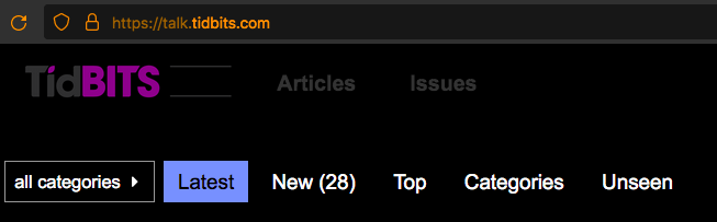
The “Talk” logo is reduced to just two thin bars. The other gray elements (“Tid”, “Articles” and “Issues”) are manageable, though not highly visible.
This screenshot was taken in Firefox. Standard macOS UI (Dark Mode off).
Articles and Issues links in header did not show at all for some time here. But now they are back.
I’m not sure when I implemented those, but at the time, it required custom CSS, which must have caused this in some way. I just upgraded to a Theme Component in Discourse, which lets me specify whether the extra nav bar items appear on mobile or not. It’s important to turn them off on the iPhone, where they screw up the display, but happily, they still appear on the iPad then.
Suggestions welcome. The problem is that most of the terms make sense only with a lot of context, since many people don’t really grok the difference between TidBITS and TidBITS Talk. On the TidBITS Talk site, having a link that says “TidBITS” would just be confusing (aren’t we there already?)
Because that increases the horizontal width of the menu in a problematic way.
The Get TidBITS menu is organized alphabetically, apart from the top item, Email, because that’s far and away the primary choice. I’m not sure what the criticism of Categories is, since it’s also organized alphabetically. There are no redundant entries.
True, and the fact that it’s coming up again spurred me to try something new. The links on the TidBITS Talk site remain the same (though they’re now handled by the theme component), but I’ve added a top-level menu item to the main site. Previously, I’d thought that would look really horsey, but it seems fine. The new TidBITS Talk top level item has sub-items for Article Comments, Discussions, and Site Feedback (the three sections here), and I moved SlackBITS into this menu as well, since it felt out of place in Get TidBITS.
Let me know if this addresses the concerns.
I’m not a fan of dark themes, so while I had enabled it for those who want it, I didn’t realize until now that it had separate graphics. I’ve uploaded some that replace black with white. A little weird, but whatever.
2 Likes
I think you’re overthinking this. In place of “articles” put “Tidbits Home”. I don’t find that confusing at all.
1 Like
Just checked and the Dark theme now has a “Talk” graphic. The main TidBITS header and sub-menus look great to me.
The top of the “TIDBITS TALK” sub-menu directs to:
https://talk.tidbits.com/
and the “Discussions” sub-menu directs to:
https://talk.tidbits.com/c/tidbits-talk/6
I noticed the font kerning of the “TIDBITS TALK” menu is larger than the others. Not a problem, just wondered if it was a conscious choice.
Thank you for the improvements!