The Mac system settings in Ventura now resemble one of the “features” of iOS that I hate the most. I have nothing against lists, but I don’t want to see System Settiings that way, Where there SHOULD be a list, as in the App Store’s Purchased and Updates sections, we get big dumb panels instead of the nice, sensible list that went away after High Sierra.
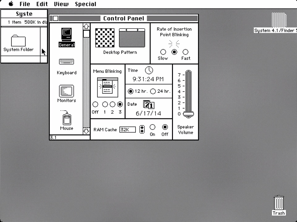
Ventura system settings? It’s all a matter of perspective. You could also argue that this is going all the way back to the Mac System 4 control panel, which also featured a left-side list of panels that would present content in the rest of the window:
Of course, what you like has nothing to do with “right” or “wrong” here.
Personally, I preferred the System 7 control panel, where each panel was presented as a separate app:

2 Likes
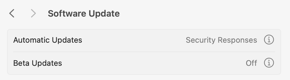
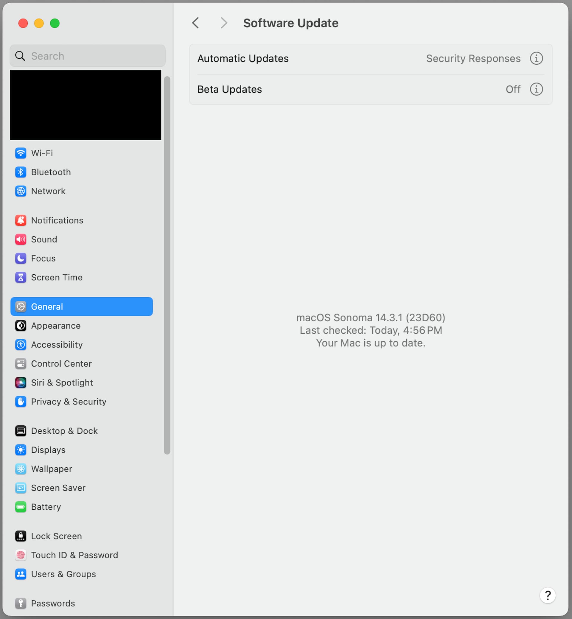
Indeed. The update settings are a prime example. Why should I have to click on that minuscule circled i next to Automatic Updates to reveal the really crucial settings when I already have all that completely wasted blank space below? It’s an extra click and extra obfuscation that serves no real purpose. Unfortunately, that’s because iOS GUI paradigms are being transported to macOS willy-nilly. There is a reason you do GUI a certain way on a constrained 6" screen. However, there’s no reason to do it the same way on a 13-30" screen. That’s the failure here. It’s a good thing™ to not have the Mac do things the exact same way the iPhone does them. That doesn’t mean folks have to relearn entire paradigms, it just means you design with ther user in mind rather than the developer.
3 Likes
I am sorry, and Adam is going to be… but I am becoming concerned that obfuscation is the purpose.
3 Likes
What macOS seems to be moving to is closer to iPadOS than iOS, from what I’ve seen. And with that, you’re dealing with more comparable screen sizes. iPadOS is designed to make better use of a larger screen, which is part of why Apple split it off from iOS in the first place.
The real key difference between iOS/iPadOS and macOS is the input method. Everything on iDevices is done via touchscreen, but no Mac yet has a touchscreen. And things that make sense with a touchscreen don’t necessarily make sense with a pointing device (trackpad/mouse), and vice versa. So trying to make the interfaces identical between the devices makes both less optimal. (Remember Windows 8? That too was an attempt to make a single interface for touchscreen and mouse-driven devices. It didn’t work well either.)
One of those differences is target area. With a mouse, you have close to single-pixel precision for your clicks (prior to Retina screens, it was single-pixel precision), but on a touchscreen, your precision is limited by the size of your finger. Even using a stylus on a touchscreen isn’t as precise as a mouse, because of the hard-coded target area minimums, and even an Apple Pencil doesn’t have a point as small as the active point of a mouse cursor.
Alternatively, sliding your finger across a touchscreen is no more difficult than tapping the screen. The equivalent with a mouse is clicking and dragging, a motion that is a little more awkward. It’s closer with a touchpad, but still not quite the same because of the touchpad’s distinction between a tap and a click. (Even when tap-to-click is turned on, dragging isn’t simply a matter of tap-and-slide.)
These are just two obvious examples. It just doesn’t make sense to converge these interfaces in the way Apple appears to be trying to, any more than an on-screen QWERTY keyboard makes sense on a smart TV when your input is via directional arrows on the remote.
I would disagree with this point. Since I’ve been typing for well over 30 years, my brain expects to find characters in that layout. I can move the cursor where I want much more quickly that way than a simple ABC grid (the way many smart devices do).
Of course, Apple’s Apple TV method, of using a touch-pad to rapidly swipe over a single row of (alphabetically-sequenced) characters is better than anything involving cursor buttons and a grid.
“Never attribute to malice that which is adequately explained by stupidity.”
There’s no benefit to Apple in making it hard, so it’s vastly more likely that the designers are just not very good.
System Settings is terrible. I hoped Apple would improve it in Sonoma after all the criticisms of the initial release in Ventura, but such was not to be.
2 Likes
“Never attribute to malice…”
I almost thought I’d gotten away with it… ;-)
But what I was speaking of specifically was the auto-update preferences. I don’t have an installation of Sonoma or Ventura right now, but I remember them as similar to Monterey in that they default on. If I de-select “Automatically keep my Mac up to date” the Advanced settings of “Check for updates” “Download new updates when available” and “Install system data files and security updates” are all still selected. I’m sure the “Advanced” label deters many from seeing that. Maybe they don’t don’t want their bandwidth or storage space choked with unwanted updates. I didn’t say “malice,” but I would call still downloading the updates deliberate obfuscation.
No, I don’t think so. I have default installs of Monterey and Ventura in VMs, and they have only “Check for updates” and “Install Security Responses and system files” selected.
That seems entirely reasonable to me, and is what I’d recommend to most people.
In System Settings, it’s a bad UI that makes users click the i button next to Automatic Updates, but it doesn’t imply anything advanced. So in that regard, System Settings might be slightly better than System Preferences.