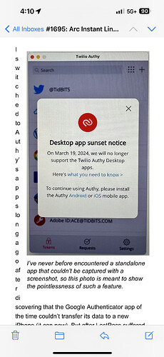
A few of the articles had odd text flow around images. I’m viewing the email on an iPhone 15 Pro Max. Not much of an impediment.
Drat! I know why this is happening, but I hadn’t thought about the Pro Max-size screens.
Whenever we have a vertical screenshot that’s right-aligned (and sometimes with the center-aligned screenshots), we set the width to 320 pixels because @jcenters determined long ago that that width would eliminate all text wrapping on the iPhones that we had at the time—but neither of us ever had one of the larger screen models.
What I’ll need to test (my father has one of the larger phones) is if there’s a screenshot width will eliminate the wrapping on those phones without causing problems for the smaller screen phones.
I can also be a tester, if you can stand 1 reply per day. Send me test emails if it will help.
Thanks—I’ll see if I can figure out a functional test scenario. The problem is that forwarding mail often rewrites it, so I need to figure out how send a test directly from our server, which goes only to the email address associated with the logged-in admin account.
