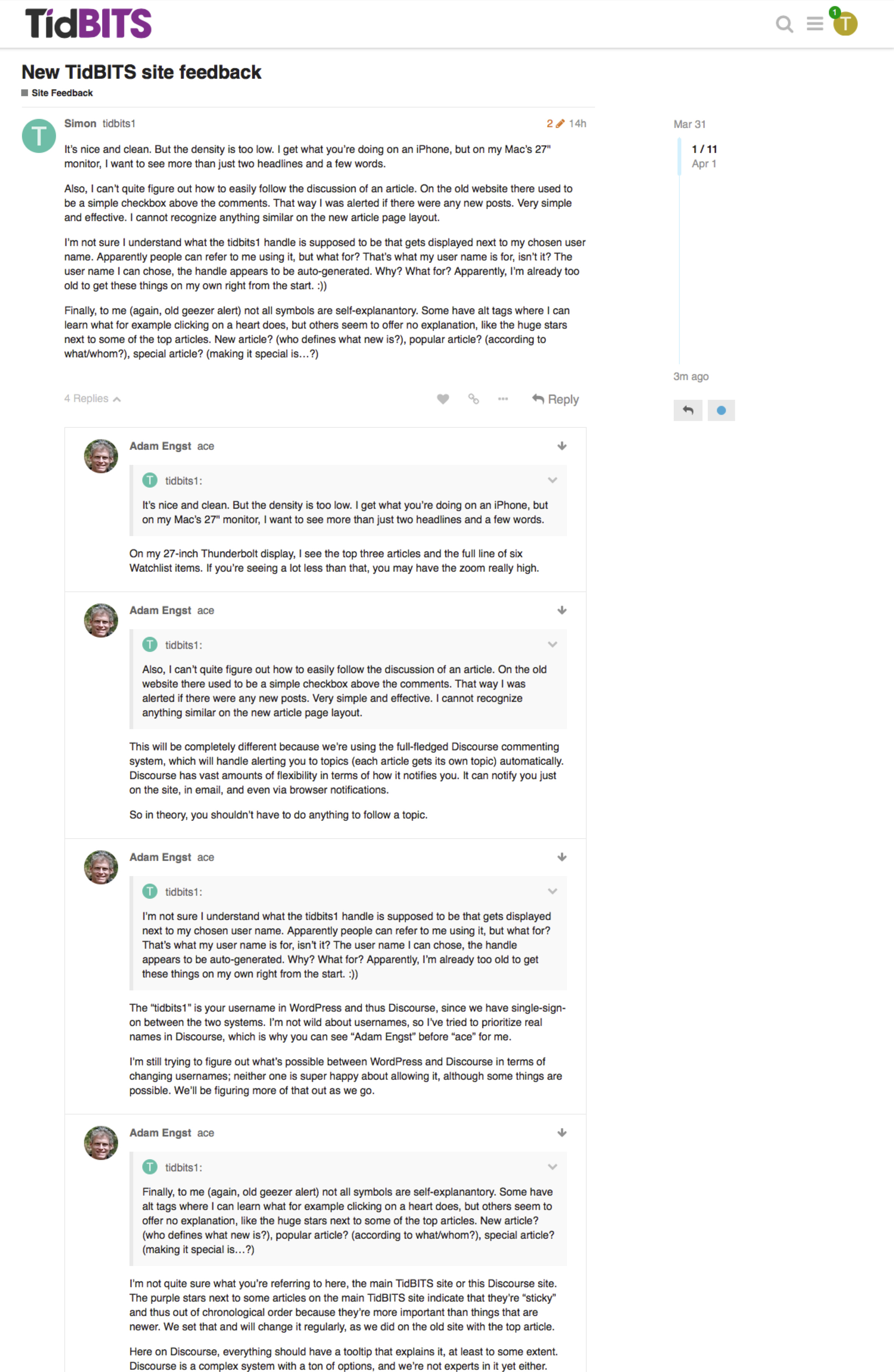
It’s nice and clean. But the density is too low. I get what you’re doing on an iPhone, but on my Mac’s 27" monitor, I want to see more than just two headlines and a few words.
Also, I can’t quite figure out how to easily follow the discussion of an article. On the old website there used to be a simple checkbox above the comments. That way I was alerted if there were any new posts. Very simple and effective. I cannot recognize anything similar on the new article page layout.
I’m not sure I understand what the tidbits1 handle is supposed to be that gets displayed next to my chosen user name. Apparently people can refer to me using it, but what for? That’s what my user name is for, isn’t it? The user name I can chose, the handle appears to be auto-generated. Why? What for? Apparently, I’m already too old to get these things on my own right from the start. :))
Finally, to me (again, old geezer alert) not all symbols are self-explanantory. Some have alt tags where I can learn what for example clicking on a heart does, but others seem to offer no explanation, like the huge stars next to some of the top articles. New article? (who defines what new is?), popular article? (according to what/whom?), special article? (making it special is…?)
One more thing. There are articles that show comments (like the recent new 9.7" iPad article or the Apple strikes back at Google article), but then on the forum that thread shows up empty.
I would assume that’s because those comments were written on the old system. But then again a lot of other comments from the old system seem to have disappeared during this transition.
Yes, all comments from the old system have been imported as WordPress-native comments because that was the only way to keep the nesting. Discourse doesn’t do nesting and there was no way we could import the comments and keep the connections with the original articles — we tried.
This should be confusing only very briefly as there’s overlap between articles that have old comments but that people still wish to comment on.
On my 27-inch Thunderbolt display, I see the top three articles and the full line of six Watchlist items. If you’re seeing a lot less than that, you may have the zoom really high.
This will be completely different because we’re using the full-fledged Discourse commenting system, which will handle alerting you to topics (each article gets its own topic) automatically. Discourse has vast amounts of flexibility in terms of how it notifies you. It can notify you just on the site, in email, and even via browser notifications.
So in theory, you shouldn’t have to do anything to follow a topic.
The “tidbits1” is your username in WordPress and thus Discourse, since we have single-sign-on between the two systems. I’m not wild about usernames, so I’ve tried to prioritize real names in Discourse, which is why you can see “Adam Engst” before “ace” for me.
I’m still trying to figure out what’s possible between WordPress and Discourse in terms of changing usernames; neither one is super happy about allowing it, although some things are possible. We’ll be figuring more of that out as we go.
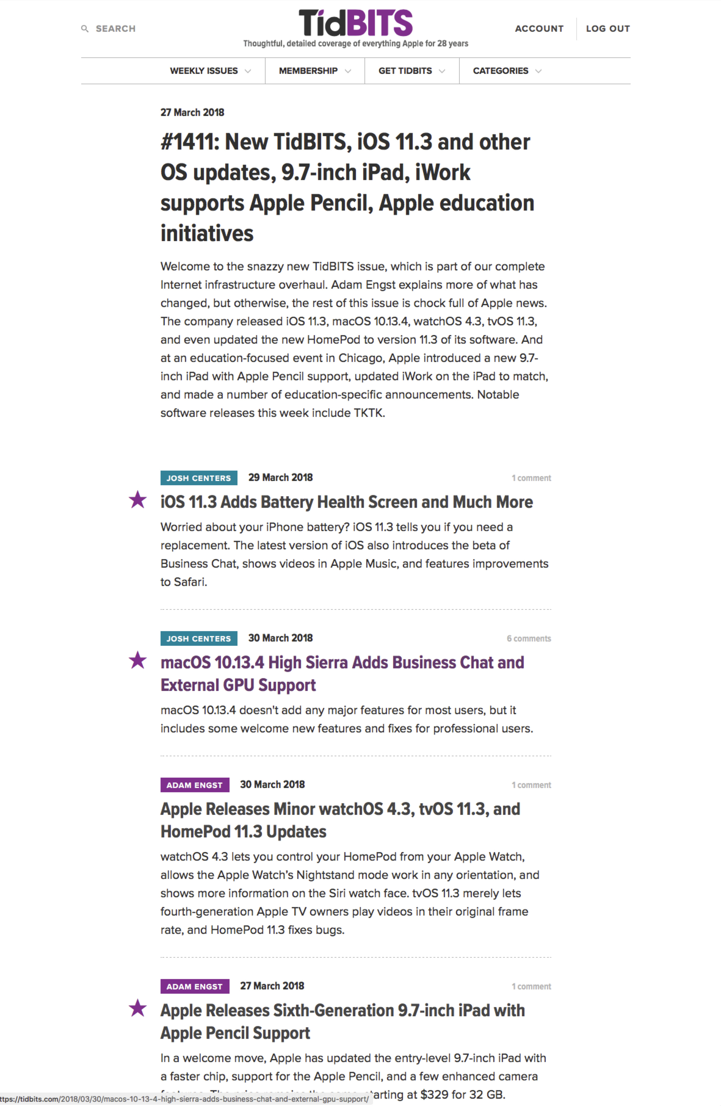
I’m not quite sure what you’re referring to here, the main TidBITS site or this Discourse site. The purple stars next to some articles on the main TidBITS site indicate that they’re “sticky” and thus out of chronological order because they’re more important than things that are newer. We set that and will change it regularly, as we did on the old site with the top article.
Here on Discourse, everything should have a tooltip that explains it, at least to some extent. Discourse is a complex system with a ton of options, and we’re not experts in it yet either.
In fact, it just chided me for replying to individual bits of your message separately rather than doing it all in one message. Oops!
Can’t edit account information on the site, so the email that is being used is my personal email and not my list address, which I don’t like. Cannot set a profile picture either since nothing on that tab can be edited.
Cannot seem to mark all comments as read.
Emails directly to me include a link to “Visit Topic” which do take me to the topic, but do not show the reply that I received in email. In fact, the replies that I receive directly in email do not appear to exist in discourse at all. Or if they do I can’t find them.
If you add a link, it is not clickable, which I think makes the link button useless.
There’s no path )or no obvious path) to get back to the main TidBITS site, and if there’s a way to get to the overall articles on Discourse, I don’t see it, although the top-level site is mostly just the articles.
There’s no differentiation on Discourse between an article, a short comment with link to external site, or a software update of note, they all look exactly the same.
Functionality would be improved drastically if you could expand and collapse an article right there on the top-level page. the article summary is quite short, which is not a real problem, but loading a new page and then having to go back to the top and loading another page is not very friendly since there is no menu on the page.
Facebook/twiter/Reddit widgets and links should be able to be disabled for members. There’s a lot of links to facebook, which makes me very uncomfortable.
Displaying the comments at the bottom of the page but then having to go to a separate page, reloading all the comments and potentially logging in again, is not a very good experience. The field to comment should be right there on the article page.
The article page should probably have a top level menu next to “Issues” for “Articles” that shows the most recent few articles (or maybe all the new articles since the last issue). However, if the article is simply expanded on the main page, this wouldn’t be needed.
Several times clicking/reloading the top level page from an article has taken in excess of 10 seconds, far too long (not every time, but more than once). Loading an article is usually fast, but then images load late and the page shifts, and that total load time is quite long. For example, I clicked on “iOS 11.4 Adds Battery” and the article text loaded in 3 seconds, but with an odd overlay-looking panel at the top. after 6 seconds, that panel loaded and image, pushing down the page and exposing the top of the page underneath, which had only been visible through the overlay previously. By the time everything settled down, it was 10 seconds from my click.
I saw the same behavior on loading " Apple Releases Sixth-Generation…" but the delay was much shorter overall, only 2 seconds total load time. So, not consistent.
On a large screen, the site is very sparse, with a very low content ratio. I have a good sized monitor and I have three article headline with 2-5 line summaries on my screen. even in the article view, the header is so large and the articles top loaded with images that there is very little text on screen in 900 vertical pixels. it *looks nice.
The article list on the main page should have the Icons/headshots of the author to the left of the name. Coloring each author’s name is a neat trick, but it looks like the color should be a category indicator instead. That might make more sense.
This is what I get on my portrait orientation 24" monitor. The density is too low. I prefer the type size and column width on this talk page. Just my 2¢.
But overall, it feels really crisp and fresh. The content is as good as ever and everything is very snappy. Well done guys, a great job.
The combination of the commenting and a new discourse forum is a welcome new aspect to TidBITS and I hope it furthers some discussion. It will be interesting to see if we can add activity here during the upcoming WWDC.
The single-sign-on system means that the main TidBITS site running in WordPress is the source of all account information. I’m still trying to figure out what we can enable for editing there — by default WordPress doesn’t like users to edit their usernames. Email addresses should be editable there.
I can’t prove this right now, since I have read everything, but I think if you click the New tab at the main screen, there’s a Dismiss New button at the bottom right.
They must exist. Scroll up?
It’s conceivable that you don’t have a high enough rating for that yet. Discourse has the concept of user levels, and everyone starts at a low level and moves up over time. I’m an admin, and I’ve just posted a link below, so it should work.
Yes, from Discourse’s standpoint, every post in our WordPress site is equivalent. I’m not sure there’s any way around that, though obviously the Watchlist items are quite different, since they’re just app names.
I’m still feeling my way into this system too, but I think it depends on what you want. For the most part, just read the comments at the bottom of articles on the main TidBITS site — that’s why they’re there. TidBITS Talk, once I get that moved over, will be its own category, so it can be looked in on separately from the Article Comments category.
A full article expansion there might be pretty weird, since it would need a closing control at the bottom. I’d need to see an example elsewhere of how this could work.
I could imagine some “previous/next article” display at the bottom of each each article, but the bottom of articles is already getting very cluttered. Again, show me an example of where this is done well.
Personally, I just open things in new tabs with Command-click.
Those links are completely local, as you can see by hovering over them — there are NO trackers or off-site code involved. That said it would be easy to hide them for members.
This is a tradeoff, I think. The problem is that Discourse offers a very rich commenting environment, and there’s no good way to embed that on another site. I’ll look into it more, but I don’t have high hopes.
Logging in frequently shouldn’t be necessary, since our WordPress site will remember your login, and Discourse is using single-sign-on with WordPress.
That’s an interesting idea, and would provide easy access to articles. And it would be simple to implement, I think.
Huh. Our developer is extremely cognizant of performance issues, but obviously the site is still new so we’ll keep an eye on it. I haven’t seen that sort of problem before.
There are a few things going on here.
We don’t publish that many articles per week. Besides Watchlist items, which have their own horizontal list, we seldom have more than 3-5 articles per week. This last week was an exception, in fact, due to all the Apple announcements. So it’s not like there’s a lot to compress in, like the New York Times.
We’re intentionally trying to focus on content, and make it easily scannable. Those decisions resulted in fairly large fonts, relatively short line lengths, and lots of white space. You can always shrink the font size in your browser if that feels better.
The featured images in articles are of course a “waste” of space, but after having very little imagery, we wanted to try going in the other direction. Once you’re in an article, you’re going to be scrolling no matter what, so I’m not sure the image makes that much difference.
All that said, we can perhaps remove some of the white space to tighten things up a little, particularly on the headline pages.
We’ve tried getting headshots of authors in the past, and it’s a royal pain. It turns out to be very hard to get everyone’s head in roughly the same size, and have the color (or greyscale) be equivalent in each one. And as soon as someone new writes for us, it’s a lot of extra work that we have to decide will be warranted (will they ever write again?).
We can revisit the author colors — it would be trivial to lose them entirely — but we moved away from categories because it didn’t seem that anyone paid any attention to them. Again, since we only publish 3–5 articles per week, no one was using category as a way to decide what to read. And the title of the article usually makes clear what the category is anyway.
Try reducing the font size in your browser. Browsers should remember that setting.
I’ll look into increasing the information density where reasonable, but I don’t want to hurt overall readability, which is what would happen if we increase the line length, reduce the line spacing, or lower the font size too far.
The trouble with reducing the font size it is shrinks the width of the view frame. Exactly the same number of characters on each line, just smaller text and shorter lines (unless there is some way to change font-size on the site other than ⌘- +/-). Yes, it gives slightly more vertical info, but the tradeoff is pretty grim.
I can’t get Discourse to behave like the old system. I can set threads I’m interested in and then I get an email when there’s a new post to those, but the system also sends me a email when a new thread gets started even though that has nothing AFAICT to do with the threads I’m interested in. How do I tell it to inform me only for those threads I have selected myself? What I’m trying to do is of course emulate the old check box at the bottom of TidBITS article pages right above the comments.
Try clicking your avatar in the upper right corner, and then the gear button to get your Preferences screen. Then, click Notifications in the left sidebar, and fiddle with the settings there. Also be sure to click Categories under that and make sure you’re not automatically watching entire categories.
I don’t yet know how all the settings interact, but I’m pretty sure you’ll be able to control the notifications in a useful way.