I sometimes end up on the front page of TidBITS, and can’t find my way in here. Eventually I realized that I have to use the “Get TidBITS” menu to access the TidBITS talk link. That’s not at all obvious.
Then, I was even more confused because it took me straight to the actual TidBITS Talk category, not the forum homepage, but I didn’t notice. So I couldn’t find the topic I had come to comment on. Even doing a search at that point didn’t turn it up because it was auto-limited to the current topic. I was so confused. I thought maybe the topic had been deleted, then I saw the extra text in the search box and realized what was happening.
Frankly, I won’t visit the main site very much, since I get the weekly issue, but I’ll visit this site quite a bit. I suspect you’d prefer me to use the main site as my entry point rather than reflexively skipping it to come straight here by memorizing this URL.
You’ve hit on something that’s been bugging me too, and for which I haven’t thought of a really good solution yet. The two main ways to go from the main site to this discussion site are the TidBITS Talk link in the Get TidBITS menu and the Join the Discussion link at the bottom of any article. But both of those are a little fussy to get to, and take you to specific places inside this site, rather than to the latest posts.
I’m open to suggestions for a different navigation menu structure for the main site that could make the discussions more prominent. Perhaps a Discuss menu item that would have links to TidBITS Talk and Article Comments? Other ideas?
And presumably SlackBITS, too. I think that menu makes a lot of sense.
I think I’d probably just have one menu item for this forum though, calling it TidBITS talk. For better or for worse, I think “talk” has subsumed article comments within itself. Just treat this whole forum as an entity.
I’m in the same boat (get the weekly issue so don’t visit the main site much), and I always come straight to this site. In fact, I’ve set up a shortcut I tap on in Safari’s quick access icons. Is it better for TidBITS if I come here via the main site? I could change my habits if so.
The problem is fitting such a button in, both visually and logically, since we have no other buttons that do that sort of thing. It’s the sort of thing that seems easy until you work through the details.
There was a big spike in usage in the few days surrounding taking the site live, but since then traffic has fallen back to pre-redesign levels. I’m not particularly happy about that, since my hope was that if nothing else, we’d get more Google search traffic from having a mobile-friendly site, which wasn’t true before.
But as with what you guys are saying, I suspect our most loyal readers just get email, and seldom interact with the site.
The Articles and Issues buttons at the top of the TidBITS talk page aren’t pretty either, but they get the job done. On the TidBITS main page I see plenty of space left for a button between search and the TidBITS logo.
There’s nothing that I want the site to do that’s problematic in a desktop browser because of the design being responsive to screen sizes. There are a few things (like the topic of this post) that I’m still trying to figure out the best way of handling, but how it works on mobile is never a gating factor.
If you have a specific request, please feel free to share.
Two things on the articles pages (desktop Safari):
The pictures linking to other stories (between the article and the comments) are a tasteful size if you make the window really wide. As you narrow the window, it jumps from one row of 6 across to two rows of three across. But–they get twice as big. As you narrow further they go to three rows of two pictures that are three times as big as the originals (and noticeably pixelated). This means that at my standard window size (I like small windows so I can have plenty of them), it’s two screens to get from the bottom of the article to the comments, if any.
In reader view, there’s no byline at all. It would also be helpful if there was some way to have reader view show if comments exist for the article, but I expect that’s harder.
[Last week I finally made the jump to global ‘use Reader if available’ and I’m trying to not do exceptions for now. Sorry Adam, and publishers in general. I understand that you care about appearances, and that I’m peculiar. I only care about content, and I’ve discovered that by having sites look as much as possible the same, there’s much less mental friction getting right into the content.]
I don’t know whether the following constitutes a design flaw. Open tidbits.com in Safari on macOS. Resize the widow to make it as narrow as possible and the header collapses into the ‘…’ menu. Click on the ‘…’ to get the drop down menu and then dismiss the menu without clicking on any of the links. The scrollbars for the Safari window are now gone and it’s not possible to scroll the window with either the mouse or the keyboard. You can get the scrollbars back by reloading the page. I’m seeing this behavior with Safari 11.1 on macOS 10.13.4.
There’s definitely some tweaking I want to do with this behavior. The icons get smaller as the window size shrinks to 750 pixels (which doesn’t seem “really” wide to me consider that a 27-inch iMac screen is 2560 pixels across ;-)) but then they grow again and change the number of rows. The row behavior is right, but the growing is not.
Safari’s Reader view has no specs or API or documentation, which means there is nothing we can do to improve the performance of TidBITS there. I’d encourage you to file bugs with Apple, since I consider the fact that the byline doesn’t appear to be a bug, but one we can’t fix without knowing what to do.
Whoa, good sleuthing! That is absolutely a bug and I’ll file it.
I click through from my TidBITS email, chose to login, when I finished logging in, I was in the top of the TidBITS front page. My first thought was, “oops, do I need a separate forum login?”
I scanned for a “forum” or “talk” link without success. I back arrowed Safari (iPad) and reloaded.
The distinction between “articles” and “issues” on the TidBITS home page is a holdover from “TidBITS as a newsletter or magazine”. Here in the discussion zone*, we mostly use the term “issues” to refer to problems, not weekly article digests.
I suggest this discovery roadblock contributes to the lower numbers on what could be my favorite forum for Apple issues. It’s well-structured, and it’s populated by true Apple experts who can explain things clearly.
*contributing to the “what do we put on the menu” issue is terminology. Is TidBITS Talk a “discord,” a “forum”, a “board”?
Let me see if I understand the sequence. Were you logged in at the TidBITS site to begin with? I’m guessing not, because if you were, then clicking the Login button in Discourse would not take you back to the main TidBITS site. We use single sign-on so there’s only one account that’s used for both sites (the main site uses WordPress, and Discourse has to run on a completely different server for technical reasons). But if you only log in to Discourse, you will hit that confusion on the first login.
This is on the main TidBITS site? There was no resolution to the question of how to make TidBITS Talk more obvious, so we just left it in the Get TidBITS menu, as noted.
That’s why the menu on the main site is Weekly Issues. I could change that here, but it feels as though anyone who has any history with TidBITS knows that we publish an issue every week and have for almost 29 years.
It’s hard to know—since we have nearly 24000 people receiving TidBITS in email each week, and every article has links to its comments on this site, that would seem to be the primary portal to discussion, along with the comment links at the bottom of every article. I’m not sure how many people come to a site looking for discussion but not articles.
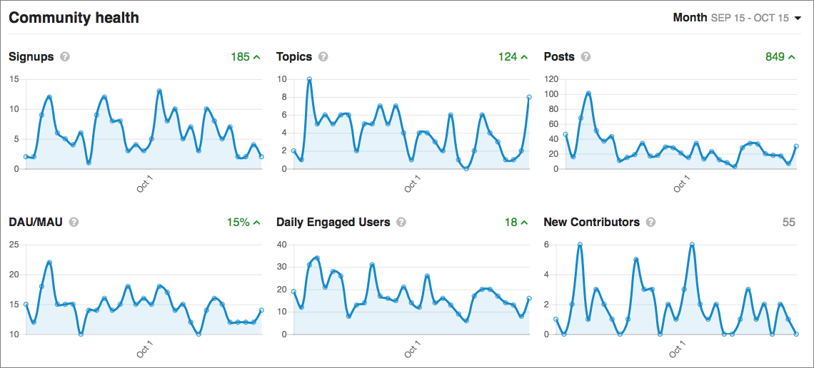
Most stats are rising here, although I don’t quite know how the fact that many people interact only via email might change these numbers.
It is a little awkward. I see TidBITS Talk as a discussion forum. But our Discourse site also hosts this Site Feedback category (also a discussion forum), and the Article Comments category, which isn’t quite the same thing, since all those comments appear under their articles on the main site as well.
I’ve never much liked the term “board” because it stems from “bulletin board” which was co-opted by the online community from the physical space and never really said anything about discussions to me. “forum” is fine. “Discourse” is the name of the software, not of an instantiation, so that doesn’t really work. The main problem is that what you have under articles are “comments,” not a “forum.”
I’ve always been a little uncomfortable about the word “community” because I think of a community as one where many of the individuals know each other and come together to form a whole that’s somehow different than the sum of the parts and that strengthens the individual connections. But maybe that’s just me.
The New York Times Magazine had a column about “community” in the digital world not long ago as well. The tension it highlighted is that communities should be self-governing, not subject to rules set down from on high (which I do as well )
 )
)