When Apple redesigned System Preferences to System Settings, I was hoping for one change they did not make: Eliminate or rethink the General Settings section.
I have never understood why some things fall into the General category and some do not. Why, for example, is Time Machine a General setting but Appearance is not? Why is Sharing a General setting but Network is not? Why is Startup Disk a General setting but Control Center is not? And on and on. There seems no logic to the division. So why maintain it?
I can no longer count the number of times I have scoured the main Settings listings for some infrequently used setting…and not finding it…only to realize it is in the General section. Or vice versa. [Yes, I eventually use Search if I can’t find something, but that’s not typically my default option.]
Apple should either get rid of General or define what belongs in that section in a way that makes some sense.
There was a “general” control panel going back to at least System 6 and probably earlier than that. My understanding is that “general” holds things that don’t have enough companions to go in a named group.
After the reorganization and iOSification of System Settings in Ventura, I decided I’m not even going to bother trying to remember how or where various settings are categorized. I’ve capitulated. If I don’t know exactly where something is, I’m just going to use the Search box in the Settings panel to try to find what I want. I already had been doing that with settings for browsers like Firefox and Chrome, which gradually have become lengthy laundry lists of questionably organized options.
It no longer seems worth the effort to try to keep up with UI changes, particularly since many of them seem arbitrary and unpredictable. Apple (and others) seem very happy to ignore their own design guidelines and change their UI for seemingly arbitrary reasons and at arbitrary times.
Don’t get me wrong: I’d much rather have access to a lot of user configurable settings than not. If, for whatever reason, developers do not organize settings in ways that are consistent and make sense to me, I will settle for an interface that makes it easy to search for the setting I want rather than removing access to the settings.
I prefer the ‘old way’ where prefs panes were grouped and more easily visible at a glance. In the new way, searching is virtually required. It works ok if you know what you’re searching for but I’ll never understand why it was felt necessary to change at all.
My minor gripe is the inability to horizontally expand the window - it always feels ‘cramped’ to me. Perhaps if it could be expanded and the options could shuffle it may be more visually useful.
Of course I don’t see any way Apple would change back based on user feedback, they’ve clearly decided the iOS way works for even the largest of screens.
I quite like the new approach, not found it an issue.
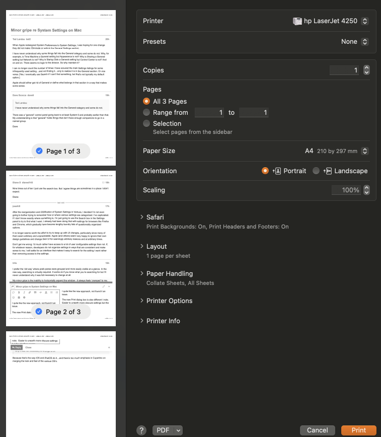
The new Print dialog box is changed, it follows the same long extended box approach. Easier to unearth more obscure settings (and I like the extended preview) but I do wish clicking on each section would expand each subsection rather than requiring a click on the disclosure triangle.