Like, what is this supposed to be? The u-shaped thingy? Is that supposed to emulate some switch in the latest popular thing, gaming or video sharing etc?
Surely a lot of meetings and engineering talent were expended on this at Apple but… wot?
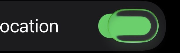
Hm, I’m trying to puzzle out then… these new oval switches, are supposed to be, like, a blob of convex (expanding towards user) water/glass. The black/dark part in my screenshot then, the color should change to reflect its surroundings (wallpaper, light/dark theme etc)? Or is the curved edge of a blob of glass/water drop always dark?
Trivial I know but I guess I am trying to get value out of Apples engineering costs on this, and to figure out what I’m supposed to be seeing in all this new OS26-series interface stuff. For me it’s been more distraction then helpful. A few things are interesting and playful (jiggly passcode buttons for example) but mostly, I’m leaning towards turning most of it off/making it minimal. Oh Well.
(btw not all switches have this yet, the Tahoe Status Menu switches like BT or wifi for example)