Major Changes Coming in OS 26

When I looked at Apple’s screenshots, I thought of Neil Postman’s first question about new technologies: “What is the problem to which this technology is a solution?” Are Apple users troubled that they can’t see what’s behind a menu or dialog box?

On this Apple page, the buttons in the “Screen new senders” screenshot look like black and blue marks. Ugh.

I’ve already advised a friend with serious vision problems not to update his devices. Me, I’ll wait and see how things look with reduced transparency.

2 Likes

I don’t think (at least I hope not) people will expect cloud-level performance from a hand-held device.

On the other hand, you can install and run open source LLMs on commodity hardware. Performance on a Raspberry Pi is abysmal, but it works (and this really surprised me). A powerful PC or Mac desktop shouldn’t have a problem running at acceptable levels.

See these YouTube videos from Dave Plummer (retired Microsoft developer), who enjoys running popular AI models on commodity hardware:

It is always dangerous to install beta/developer builds on production hardware. Not something I would recommend. But since you already did, please keep us up to date (to the extent that any possible NDAs will allow) with your experiences.

And be sure to report any and all bugs to Apple. This beta period is when they will be paying the most attention to bug reports. It will be harder to get things fixed after the OS is officially released.

Does it recognize the “Stationary Pad” Finder attribute? On a Mac, this makes the file (more or less) a template. Attempting to open it results in opening a new document with the file’s content.

If iOS handles that attribute correctly, it may be a better solution than just using file locking/permissions.

I’ve had much better luck watching Apple keynotes on their YouTube channel than with any of Apple’s apps (podcasts, TV). Take that whatever way you like.

It is amusing. But, of course, it’s not the same. Back in the oldest versions of Mac OS, it would draw the (monochrome) icons in the selected color. Later on (PPC era), it would tint icons.

What the presentation appears to be showing, is that the icons are rendered as if they are pieces of glass, with different color backlights shining through it. Which is a different effect. I wonder if it (and the clear-glass appearance) will be applied to third-party app icons, or if it will only be for Apple’s apps (or if third-party apps will need to do something to use this effect).

Ironically, Apple did away with icon coloring in Mac OS X a long time ago, when colors became tags and they needed to support the use of multiple tags for a single file.

Doh! I completely forgot about Folder Actions. I’ll have to try that shortly.

1 Like

I really like the feature cards that Apple makes for its keynotes, but given the extent to which most features now extend across multiple operating systems, I wasn’t able to use them in my article. I share them here as a quick summary of features that go beyond what I covered. (The odd one out is additional features in iOS 26.)

3 Likes

I don’t know what Jupiter Environment means. But what I really wonder is what’s the story with New incident report type in Maps and Password history.

Joanna Stern did a really quick overview of iOS 26. She points out where Apple is playing catch-up with Google and Samsung, and she didn’t hide her disappointment over lack of Apple Intelligence details or any commitment to delivery.

https://www.wsj.com/video/series/joanna-stern-personal-technology

1 Like

More investment in frivolous eye candy that no one asked for rather than making a rock solid operating system and apps. For example, I have reported several TextEdit bugs over the years, none of which have been fixed. Remember when changing all the icons was an earth shattering innovation? Or the “touch bar”? Liquid Glass My A–. Apple is the worst computer company out there except for all the others. Snow Leopard is still my go to system.

“Major Changes” that I’d like to see include reversion to a usable and informative System Log and Activity Monitor, an Uninstaller, restored support for AppleScript, a decent Mail client, Dark Mode for all apps, and the ability to restore bootable back-ups to mention a few.

2 Likes

On an Apple Vision Pro, an environment is the equivalent of wallpaper in other Apple OS’s. It can be transparent so that you see the actual room you are in, or it can be an Apple-supplied scene. So Apple has provided several environments such as Yosemite, Mout Hood, Joshua Tree, White Sands, the Moon, etc. These environments may show some activity when nothing else is active. Jupiter is simply another such environment.

1 Like

Can we not do this again?

5 Likes

This time, I think I’m responding to the proper comment:

It appears that the referenced video has been withdrawn and replaced by one that is an excerpt from a longer (soon-to-be-published) interview of Craig Federighi and Greg Joswiak of Apple by Ms. Stern:
WSJ article, Apple News Version, YouTube

Thanks. The video is still there, but I guess in the meantime they changed the name or URL. I edited my link. Should work now. Right now, her iOS 26 summary is the 2nd video, right after the interview with Federighi and Joswiak.

https://www.wsj.com/video/series/joanna-stern-personal-technology

Cringe - it made me want to vomit. A childishly cheesy, over-hyped, influencer voice telling me how wonderful I am is the last thing I want to hear during a workout. This hype is exactly why I can’t stand to use Fitness + despite having a Premier One subscription.

Apple now seems to believe every new feature has to include AI, even when it’s going to be extremely annoying. It’s analogous to how Apple Music annoys the hell out of me pretty much daily.

The call screening was the most useful thing I saw as I get spam calls every day, often multiple times. As someone who travels a lot, the built in translation may be handy.

Most of the rest was just, uninspiring.

1 Like

In the article, you said (correctly) that “Dan Moren writes that Tahoe will be the final version of macOS to support Intel chips.” However, neither you nor Dan cite the primary source: Apple‘s Platform State of the Union. That would be a worthwhile update to the article.

I’m traveling so just had a chance to finish watching the keynote.

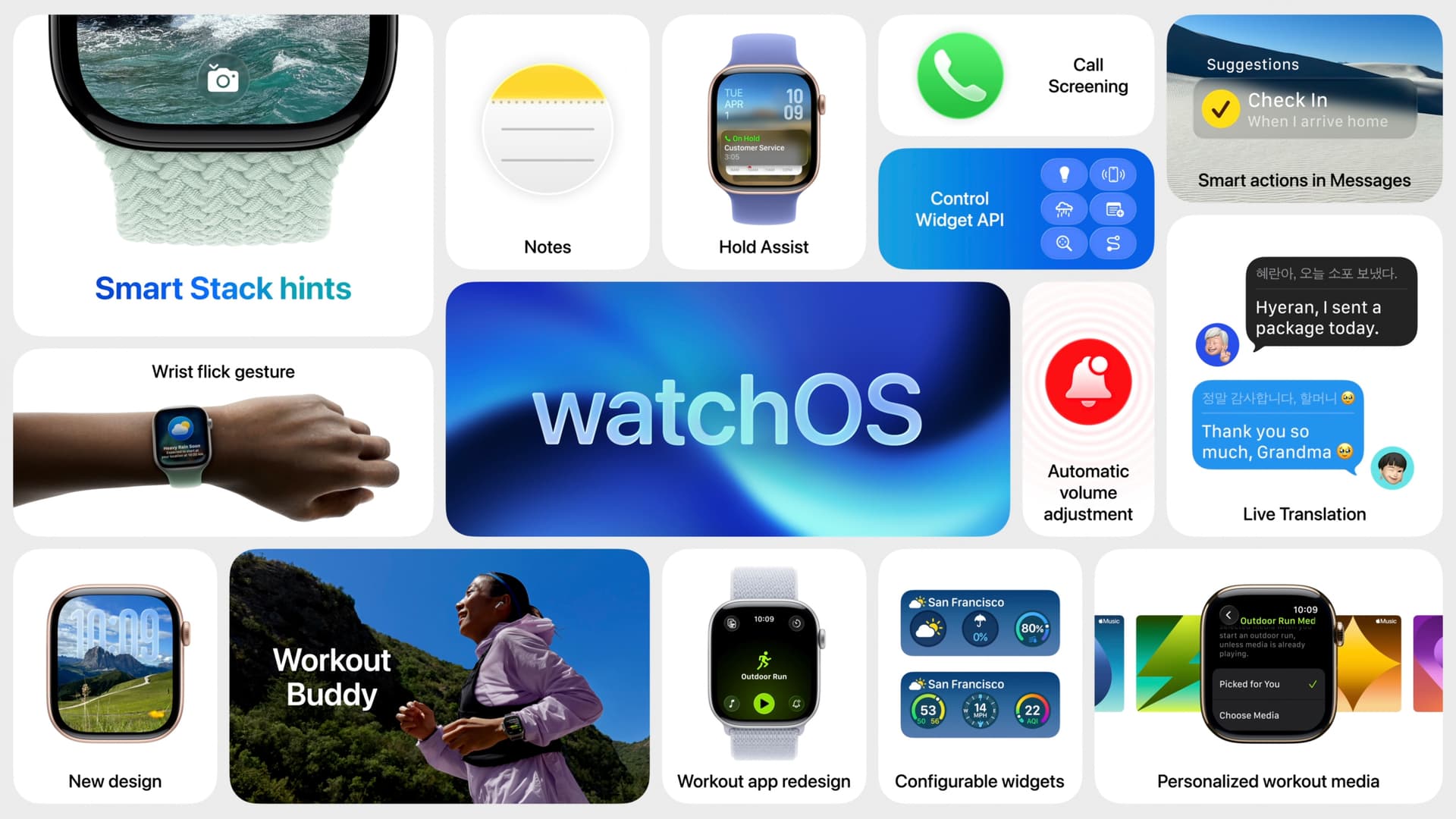
It’s definitely not for me, but I know many people need encouragement like that to increase their fitness. For someone like me it’s just going to push me to work too hard, but I’ve long grown accustomed to ignoring the “go a little further” encouragements, monthly challenges, etc. The good news is that I can continue to ignore them. Other watchOS improvements are welcome - a smarter Smart Stack, custom control center icons, and the workout app really needed the improvements they showed. I’ll be interested to see if watchOS is finally able to realize that I run the same running workouts by day every day of the week, and they are not the same from day to day. So Monday is always a one hour run, Tuesday is always 6.5 miles, Wednesday is never a run but instead cross-training, etc.

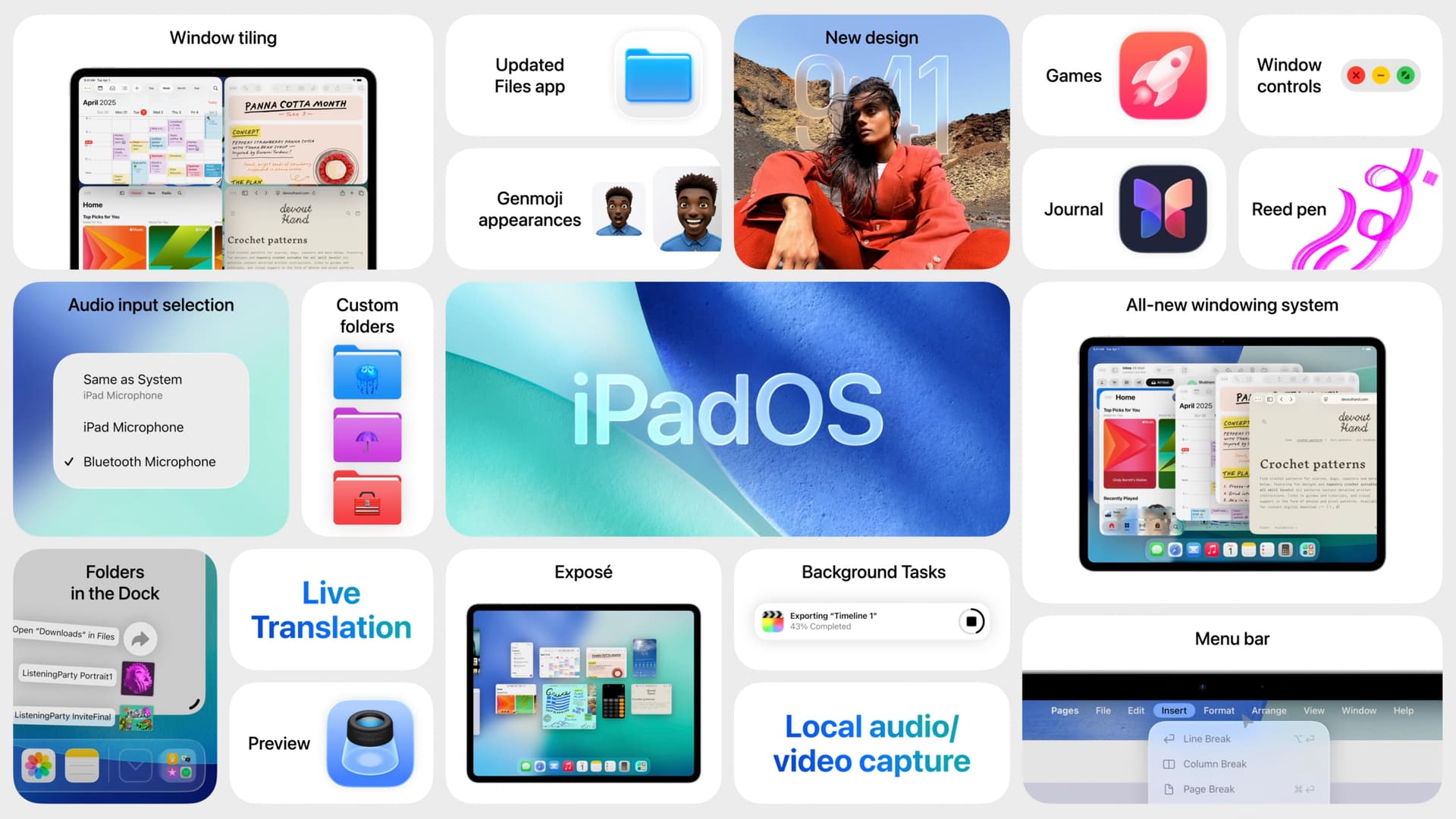
Otherwise, I love the changes to iPadOS, particularly windowing and multitasking, Preview, and the improvements to the Files app.

Improving continuity is great, and especially the improvements to tvOS. I’ve replaced a few Apple TVs over the years and always regret having to log in to everything all over again. My wife and I do watch different shows and use different services, but I’m not sure we’ll need the profiles feature, but maybe she’ll want to try it?

I know I’m rare here, but really like the new liquid glass look they’ve come up with (which I’m sure will be tweaked and improved over time, as the flat look of iOS 7 was). I know my wife is going to hate another change, though.

I think the change to the Photos app on iOS is welcome. I’m ok with the iOS 18 photos app changes, but I think allowing taskbar buttons to access the library and other features is a better interface.

I’m glad to see the improvements to Spotlight - perhaps I can retire Alfred and reduce the number of apps I have installed. I like Alfred but I mostly use it as an app launcher.

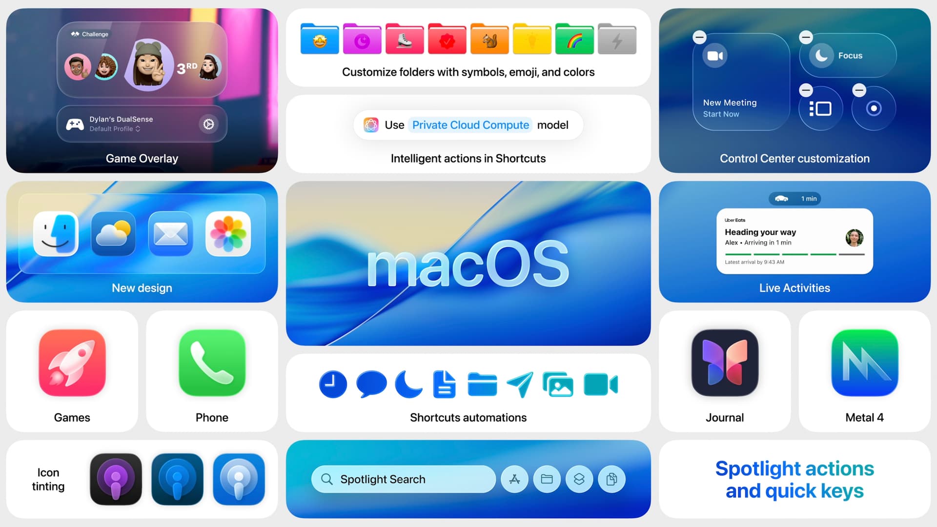
One thing I’ll say, though, is the number of new features this year compared with last is really not high. Lots of people hoping for improvements rather than flashy new features may end up liking the 26 updates.

I’ve been floored to see so many people online complaining about the Finder icon’s colors are reversed with 26. It seems a little nit-picky to me.

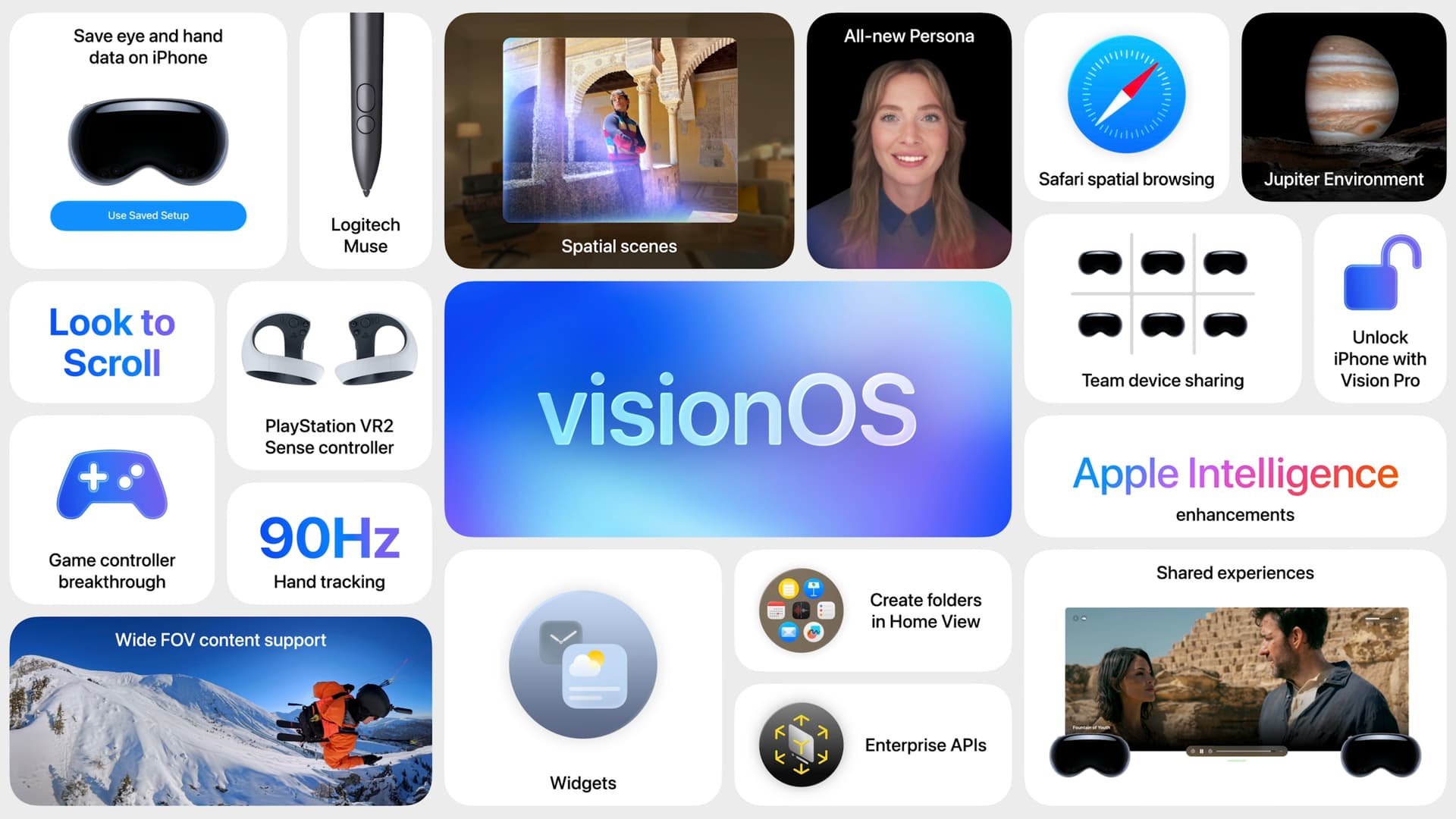
I did skip ahead anytime they did the F1 references, and skipped through the gaming sections - I don’t play games - and also skipped the visionOS, more to save time than anything - I’ll never get one, and I doubt I’d be close to an early adopter of AR glasses, too. It’s a long way before I’ll even consider VR or AR glasses.

Here’s hoping Apple will get the new Siri running next year. I rarely use Siri, and when I do it’s fine for me (since I only use it for simple requests), but it will be nice to get some more power and reliability for a change.

1 Like

The reaction is interesting.

I suspect that some people see it as an example of change for the sake of change, rather than driven by functionality or a larger aesthetic vision. It would be one thing if it were clever or amusing, but it just feels arbitrary and perhaps even a bit jejune.

By itself, it’s a trivial matter, but in the context of a widely believed decline in software quality and usability, it seems like a symptom of a serious problem.

6 Likes

It’s a new virtual environment for the Vision Pro so you can pretend to be on a moon of Jupiter. :roll_eyes:

3 Likes

Yes once there was. But then Apple decided replace with the less visible tags. I vaguely recall Federighi doing a little rave about this ‘improvement’. Fortunately, 3rd party app developers filled in the newly created and unnecessary hole with apps such as the good Folder Colorizer.

I often wonder if Federighi actually uses Apple apps.

I think it’s really Alan Dye (previously Jony Ive) who designs the interface elements. I’m not sure how much say Craig Federighi would have.

1 Like


This is the most comprehensive list of “Sherlocked” features that I’ve seen:

1 Like

I wish someone besides me would tell PreSonus/Notion that. I’ve used Notion for over a dozen years, but the current version is a Hybrid from Hell besides missing deal-breaking features I’ve used constantly in the original that still runs but is Intel code.

Not looking forward to the learning curve of Dorico, but the current Notion’s learning curve is worse, and Apple will be breaking the old one soon.