Originally published at: LittleBITS: Apple Financial Coverage Will Continue - TidBITS
Although our concerns about our coverage of Apple earnings reports were not unfounded, a majority of readers said that they found the articles—and specifically our analysis and commentary, backed by clear charts—interesting and valuable.
4 Likes
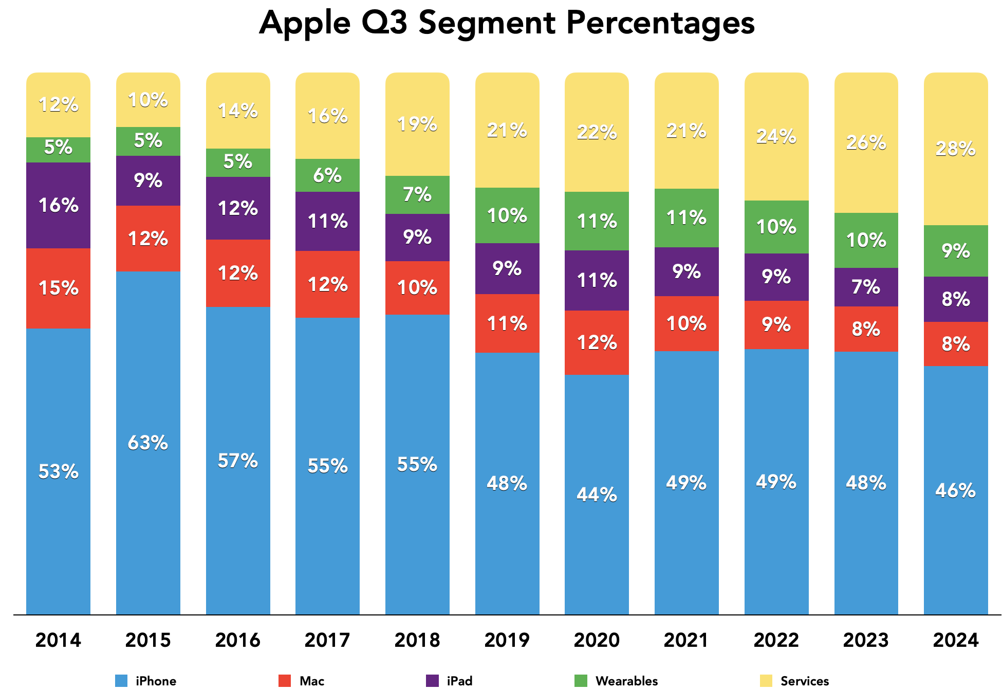
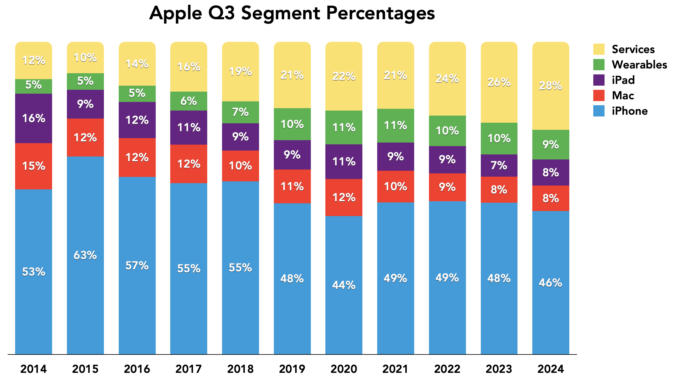
I have a few new chart options to run by the brain trust here. First, several people say that they appreciate the pie chart showing the percentages of Apple’s different product segments. I agree that it’s useful because it gives you a sense of how important each segment is to the company. the problem with the pie chart is that there’s no sense of how those relative levels of importance have changed over time, so I’m planning to replace the current year pie chart with a stacked bar chart showing the results since the segments stabilized in 2014.
My hope is that this chart gives a better sense of how Services has become ever more important to Apple, especially in comparison to the iPhone. The smaller segments don’t vary as much, but even there, you can see them being squished a bit by Services.
Once I built that chart, it made me think that the line chart I usually give showing each region’s revenue over time might not explain the relative importance of each region because Apple’s overall revenue keeps going up too. Compare the current line chart:
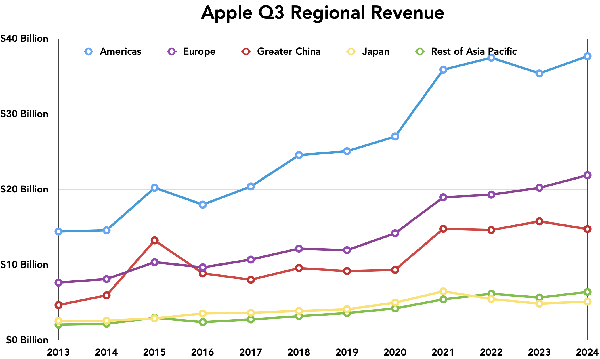
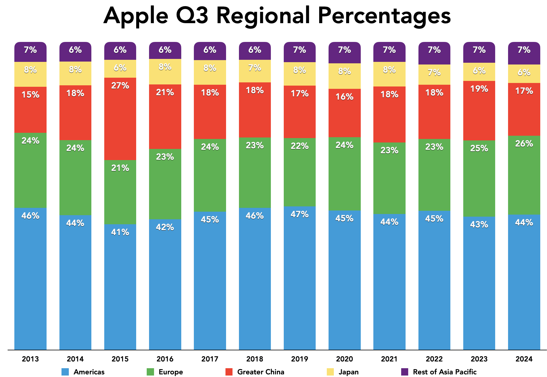
To this stacked bar chart, which, to my mind, showcases the importance of the Americas and Europe and reveals how China’s revenues dropped in comparison to previous years. Does this new one seem more interesting?
Thoughts?
2 Likes
I agree the stacked bar chart showing percentages is more informative for many reasons, including that differences between regions over time are easier to see and because direct comparisons of “raw” total revenue figures can be problematic due to factors such as exchange rate effects, entering new markets, opening new stores, and adding authorized sellers.
2 Likes
I also agree, and I really like the bar and stacked bar charts. I find the organized straight lines make visual comparisons so much easier to understand, whether analyzing multiple products and services, or just one.
When it comes to Apple, a globally and publicly owned company with a multitude of products and services, it facilitates comparisons of products and services are delivering what, where and when, or even what’s going on in the US and countries abroad. There are a lot of categories and products, this makes it very easy to spot trends on bar charts, stacked or not stacked, and when, how and where people are buying Apple hardware, software and services. And maybe to compare what products do for who, what, where and when. It’s a great way to analyze categories.
1 Like
I like the stacked charts, but placing the legend underneath, in tiny type, below the abcissa labels, with the only link to the data being a tiny dot of color, makes my eyes want to glaze over and move past the chart without putting in the effort to understand it thus missing the whole point. Yes, I’m lazy, but perhaps I’m not the only one. I think moving the labels to, say, the right of the last vertical bar would give a more glanceable result even if it means making the meat of the chart smaller.
3 Likes
+1 for stacked vs. line, and +1 for @ron’s suggestion on the placement of the legend.
1 Like
Interesting—I hadn’t considered the right side. Initially, the labels were at the top, but I was having trouble getting them to play nicely with the title. But it turns out that I can move them to the right, which has the extra benefit of stacking them vertically so the order of the color labels matches the bars. I think that works a lot better, and I can do the same with the regions chart.
Thanks for the suggestion!
3 Likes
Awesome!
Now a low-enough effort read that even my lazy brain gets the gist.
3 Likes
Thanks Adam for continuing to cover Apple’s financials. Sometimes you add observations on the results that are not identified by mainstream financial commentators.
2 Likes
Thank you Adam for deciding to continue coverage of Apple Financials. Tidbits voice(s) are just as germane as those on Wall Street IMHO.
Be well,
Mike
Brunswick, Maine
3 Likes