Am I the only one who thinks that Liquid Glass is a step backwards for the iOS interface? In my opinion, it stinks. No yseful functionality is added, and everything is harder to read. Aesthetically, I would call it “somebody’s idea of sonething—a swing and a miss.
12 Likes
I’ve welcomed the fresh look it has given to the iPhone. As for the parts that need refining, I just get on with using my phone and don’t worry about them.
5 Likes
Another thumbs-up for the interface refresh. As a daily reader of TidBITS, an interface snob, and a guy whose eyes aren’t what they used to be, I was expecting the end of the world when I upgraded, but instead I’ve found a more attractive phone that’s easy to customize if something’s annoying.
5 Likes
I also like it, particularly on iOS and iPadOS, and even tvOS is better (particularly the Fitness app). MacOS probably needs some more refinement, though it really doesn’t bother me.
1 Like
I agree! I have removed all Liquid Glass functionality on my devices because it interferes with legibility. I have no vision impairment, but just found the new system distracting. At least Apple incudes ways of disarming it.
3 Likes
I’m not too fussed one way or the other. The overall ‘look’ is ok, but as with most GUI updates these days, there are some changes which rank between annoying and frustrating. My least favourite on Mac is the big window curves which intersect with the scroll bar - absolutely ridiculous.
2 Likes
I agree. Over the years I’ve modified several settings to make things easier to see - don’t have a true vision problem, just getting older & having to switch back & forth between glasses for reading & the phone so want everything set as clearly as possible. I’ve never recorded the changes I’ve made as I’ve assumed the changes would move as set from one iOS version to the next. This time I needed to update some of the settings as they “broke” w/the latest upgrade.
When I have some time, I’m going to go thru my phone settings & make note of the settings I’ve changed so I don’t need to reinvent the wheel w/each iOS update. Bah, humbug indeed!
I like Liquid Glass but it definitely needs high contrast to be on, with reduce transparency. Mostly I like the new icons and rounded edges ![]()
What I can’t stand is the continued gray sidebars that you can’t really modfiy to make certain folders stand out. I have to keep reading their names over and over and over and over and over, and because they aren’t at all flexible in their organization, I seem to always be searching.
The recent personnel change may finally allow usability to take charge over fad design.
2 Likes
I see the designer responsible for Liquid Glass is leaving Apple. Given my disdain for the direction of recent GUI updates, I’m willing to consider this a positive.
8 Likes
Is it time to begin the “bring back the Aqua interface” letter writing? ![]()
2 Likes
I like Liquid Glass, but only in Dark mode.
I’m agnostic on the great Liquid Glass debate. However you will doubtless be delighted that the man responsible for it Alan Dye has just signed up for (no-doubt) millions of dollars to move to Facebook and do similar work there, no doubt on their smartglasses interface, which will I presume be rebranded as Liquid Glasses…
1 Like
John Gruber has something to say about this:
3 Likes
A real artist knows his own limits. IMHO, people like Alan Dye and Jony Ive have no business designing user interfaces for personal computers!
8 Likes
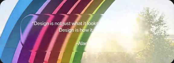
A quote from Alan Dye as he departs Apple for Meta.
(Attribution: this was from a screenshot posted to Mastodon of a Xitter post attributed to “@juanbuis” – I was unable to follow it back to the original post.)
18 Likes
The biggest problem with designers like Dye and Ive isn’t that they’re “bad” designers—they’re visionary, imaginative, and highly skilled. Their problem is that they give themselves over completely to particular aesthetic dogmas, refusing to acknowledge that sometimes you simply have to sacrifice the purity of a design ethos for the sake of functionality.
For an infamous example, Ive’s hostility towards visible ports led to two of Apple’s most egregious “aesthetic over function” designs: the Magic Mouse and the G4 Cube. Both are absolutely beautiful objects, aesthetic triumphs, but compromised by the fact that the ports are so hidden away that it’s cumbersome to use them. Liquid Glass seems destined to join these two in the Design Hall of Shame.
If you want to create art without practical concerns, you should become an artist, not a designer. Design is art in service of a function, and compromising the function for the sake of an artistic or aesthetic ideal is poor design.
11 Likes
I use dark mode exclusively. To my eye, Liquid Glass creates some real eyesores in dark mode—I.e. elements that needlessly call too much attention to themselves. I think Apple could have done much, much better if they wanted to update the look of iOS.
1 Like
Agreed. Maybe “like” was even too strong of a word. But it is tolerable to my eye in dark mode.
This is the crux of Apple’s interface problem. In the world of good design, the expression “form over function” refers ti a design outcome to be avoided at all costs. There are too many instances of this to count in Apple’s user interface designs. One very simple example is Apple’s “peekaboo” interface elements, which are invisible until the user moves the cursor to exactly the right spot. What a stupid idea!
4 Likes
To mine too if I ignore the elements that call unnecessary attention to themselves. A design doesn’t have to be terrible to be distracting.