Maybe what we are seeing in Tahoe’s many interface changes, is a new generation of employees in the responsible section of Apple, who grew up with these gadgets and not with books, typewriters, radio, etc and these are their first mistakes, from which they will hopefully learn.
I barely noticed the icons, but it seems the number of items has gotten longer and less organized; but to some extent I probably conflating right click options in the Finder or other apps.
Wish that this were true, but this is about leadership. Jobs paid attention to these details and the people he hired to get the results he wanted—and generally that works for all of us .
2 Likes
I appreciate this TidBITS article and the article that it references. I have noticed nothing as being better in the Tahoe and iOS 26 interfaces, and countless things that are worse for me. At the age of 71, the interface changes amount to an element of age discrimination. The changes make it harder to use the Mac and iOS/iPadOS for anyone with any kind of vision impairment, including aging.
3 Likes
It’s an interesting thought. Intentionally or not, the changes cause real accessibility issues for many people, and the result indeed may amount to de facto age discrimination.
2 Likes
It would be really funny if some retired lawyers got together and sued Apple on UI age discrimination grounds. :-)
8 Likes
Rogue Amoeba has an interesting post about how Apple has uglified RA’s apps with the new icons:
We have not added any menu icons of our own on Tahoe. However, Apple has forced dozens of icons into our applications’ menus. We don’t love the result. The random icons Apple littered about haphazardly made our menus uglier and less usable…In Audio Hijack, Apple placed an icon on the “Export” option, but not on the “Import” option. Meanwhile in Farrago, neither item got an icon at all.
They’re implementing special code to remove the icons in the next versions of their products.
5 Likes
Just a follow-up that the shortcut did not survive a reboot, and deleting and reinstating the shortcut is also not working.
1 Like
With the exception of a few major Apple settings (like always showing scrollbars, reducing transparency, etc.) I’ve all but given up customizing Apple environments. I used to customize happily, but Apple has shown again and again that preserving user preferences is not a high priority.
2 Likes
Out of curiosity, have you tried using Keyboard Maestro to assign the shortcut? (I went back to your original comment, and I don’t think you mentioned KM–apologies if that is what you’re already using.) It would be interesting to know whether it can overcome the issue causing your shortcut to fail.
No KM - I do not own it. I try not to use too many third-party utilities like that.
Here is the weird thing - if I open Preview without a document open, the shortcut shows in the menu next to “Rectangular Selection” (grayed out, of course).
When I open a PDF document, it disappears.
1 Like
Cannot resist throwing in a link to an article written by Don Norman and Bruce Tognazzini in Nov 2015 for Fast Company. As two people who worked on HIG (and in Tog’s case literally wrote the book at Apple), they have a lot of experience… Especially in regards to “The Missing Principles” they saw absent/lacking then:
The most important principles largely or completely missing in iOS are discoverability, feedback, recovery, consistency, and the encouragement of growth:
They go into detail on each of these principles, discussing how they developed based on and in response to human interaction, and how they were crucial to the success of the Mac. How much have each of these areas changed, improved or stayed relatively the same?
“How Apple Is Giving Design A Bad Name” by Don Norman and Bruce Tognazzini, FAST COMPANY, Nov. 2015
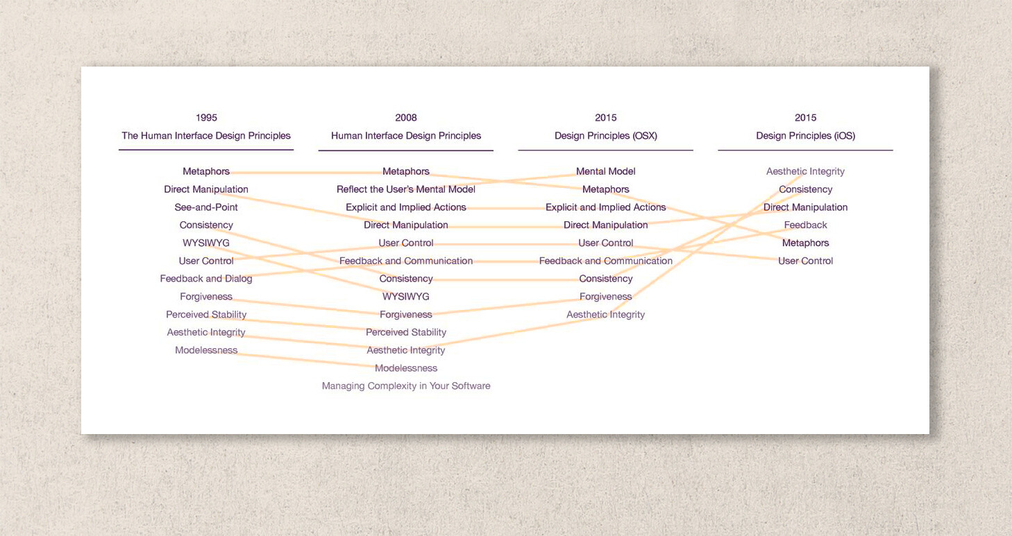
I was fascinated by the diagram by Michael Meyer showing the change in Apple’s user interface guidelines over 20 years (1995 to 2015):
6 Likes
Although I appear to be in the minority, the icons do not bother me, and indeed I sort of like them. I also think they might even be helpful to infrequent, inexpert, or new users as many of the little graphics indicate the purpose as well or better than the words.
(For information, I am 75, my vision is not perfect, and the icons seem okay to me.)
1 Like
Agreed that icons can be helpful, but a big part of the problem with these is that they’re inconsistent in both directions: one menu command may be represented by different icons, and one icon may represent different menu items, depending on the app and sometimes even the context within a single app. That’s not very helpful.
2 Likes
This reminds me of DOS back in the day (early 1990s?), when one program might have ctrl-X for exit (i.e., what we now call quit) and another might indeed have ctrl-Q for quit. The story I am remembering is when a friend of mine excitedly showed me some DOS apps (in Win 3.11 or uh whatever it was, pre-Win 95 though) that had this issue (that was not why he was showing me, I just noticed that along the way since we had to quit one app to load another) and I tried to explain that, no, there was a better way to do the interface, there were interface guidelines, and that standards could help you focus your mental resources on other items and help flatten the learning curves. It was lost on him. I was immensely annoyed. Still am, 30+ years later.
So, Apple had these fantastic guidelines for interfaces, and it appears the people in charge have forgotten those guidelines. This is sad.
3 Likes
Funny, I had almost exactly the same recollection. As a college student, I had a part-time job manually transferring accounting data from the university’s mainframe to Lotus 1-2-3 spreadsheets on DOS to do custom reporting and close out the books. (It was more cost-effective to do it that way than to work with IT to run the reports directly on the mainframe.) Anyway, it probably was 1986 or 1987, and I remember explaining to the head accountant that the Mac’s interface allowed more efficient transfer of data between spreadsheets, word processors, and presentation programs because of shared conventions around copy-paste and other commands. By 1988, the department was using Mac II computers, and I had my first computer consulting business.
2 Likes
Has anyone tried this Terminal command yet?
512 Pixels is I think a fairly reputable site, but I’m unfamiliar with their source, an as I am a real novice in Terminal activities, I like to check multiple sources before using unknown commands.
2 Likes
I have, and Stephen Hackett is one of about 3 people I trust for something of the sort (Adam is another). Steve-Troughton-Smith is a solid developer, with deep roots in the iOS & MacOS communuties.
I really notice the difference espercially with apps I use regularly but not daily, so rely on menus more. They are much less cluttered and easier to read.
I have a note to myself to write and thank both.
1 Like
Excellent, thanks @LisaS ! I’ll give it a whirl.
I think this video probably sums up what is going on.
Not just at Apple

3 Likes