Some apps have long menubars with lots of entries, BBEdit is one example, that extend from the Apple menu in the top left, into or even past the space occupied by the notch. What happens in this situation? I can imagine:
The menubar scrolls horizontally. Yuck.
The menu entries just skip over the space occupied by the notch. Also Yuck.
The application just doesn’t use the top space that is usually reserved for the menubar. This may be the least awful alternative, but the effect of switching between apps that do/don’t use that space would be jarring.
Yuck would have been having one big fat top bezel to accomodate a camera when only ~ 375x75 pixels are actually required for that purpose. The notch will not be a problem during actual use—I don’t care what Facebook/Twitter/Instagram says.
We’ll see when they ship, but based on what I’ve heard so far, I assume macOS will insert whitespace as necessary to move any overlapping menus to the right of the notch.
If there are so many menus that they can’t all fit, the system will try to squeeze them closer together, then will hide lower-priority widget menus (e.g. the Bluetooth or audio volume menus). And if necessary, it will truncate the menu titles to make them fit. See also Menu Bar Menus - Menus - macOS - Human Interface Guidelines - Apple Developer. (h/t @ddmiller for the links).
But given the size and resolution of these displays, I think it would be a pretty poorly designed app that put up so many menus that this became an actual problem.
My main Mac has an old 1200p (1920x1200) display and I can’t think of any app that puts up so many menus that they reach to the center of the screen. The widest I’ve got is Photoshop Elements, and that’s primarily because they violated Apple’s rule and made the app menu (which is supposed to be a short form of the app’s name) “Adobe Photoshop Elements 2021 Editor”. (Apparently, “Photoshop Elements” wasn’t good enough for them. )
The developer guide for the notch focuses primarily on full-screen mode, where there might not be a menu bar. For compatibility with old apps, the entire height of the notch-area will be beyond the edge of the app (presumably with the menu bar filling in the space when it appears).
“If you have a TON of stuff, some of the system menus on the right may hide and then your menu titles truncate”
I’ll reserve final judgement until I see it, but sounds awful. Contrary to what is implied, LOTS of apps have menu entries that will intrude into the notch area.
Also the “updated” Human Interface Guidelines literally don’t even contain the word “notch”.
It’s exactly what was claimed on the Twitter thread. The menu items avoided the camera notch. Since they all fit, there was no reason to truncate or remove the items on the right side.
Not to mention the right side of the menu bar – apps that only show up in the menu bar, or else have useful widgets in the menu bar: iStat menus or menu meters, photosync, vpn, sync.com, chronosync, keyboard maestro, airfoil satellite, little snitch. Plus apple’s widgets, which for me includes the date and time with day name and seconds and 7 or 8 single icon ones. My non-main app menu bar is approaching half the width of a 27" imac display at the default resolution (2560x1440).
Here is what the author of Bartender says about the issue in his blog:
I have not been able to test on a MacBook Pro with a notch yet, but using all information I can gather, I have made any changes I can think of to hopefully provide launch day support with Bartender 4.1.6.
I will be testing on a MacBook Pro with a notch from 26th October, and releasing test builds from then to provide any additional compatibility changes etc.
You must have a small screen, or you’re scaling the text pretty large. Of the apps you listed, I only own Numbers, and its menu bar doesn’t reach halfway across my 1920x1200 screen:
I assume you mean a 13-inch 2020 M1 MacBook Pro. Its native resolution is 2560x1600 but as a Retina display, it uses more than one hardware pixel per effective pixel. I’m not sure what that laptop’s “Default for display” resolution is, my guess is it’s scaled to 1440x900 (the screenshot is 2880 pixels wide, exactly 1440 x2, which supports my guess).
The 14-inch MacBook Pro’s native resolution is 3024x1964, I’m not sure what scale it will default to but I expect it will be no lower than 1512x982 (exactly half its native). We’ll have to see what happens on notched displays, when menu items will be moved closer together, put to the right of the notch, truncated, etc. The 13-inch M1 can have its resolution set to as low as 1024x640 at not so long ago the 11-inch MacBook Air could be set to 800x600 so the operating system having to deal with not having enough room for everything in the menu bar isn’t new.
I can’t see myself splurging on a new Mac for some time yet, but I already use and love Bartender. We all tend to accumulate widgets on the right side of the menubar, and Bartender lets me set which show, and which are hidden (and easily revealed and re-hidden with a click on the menubar).
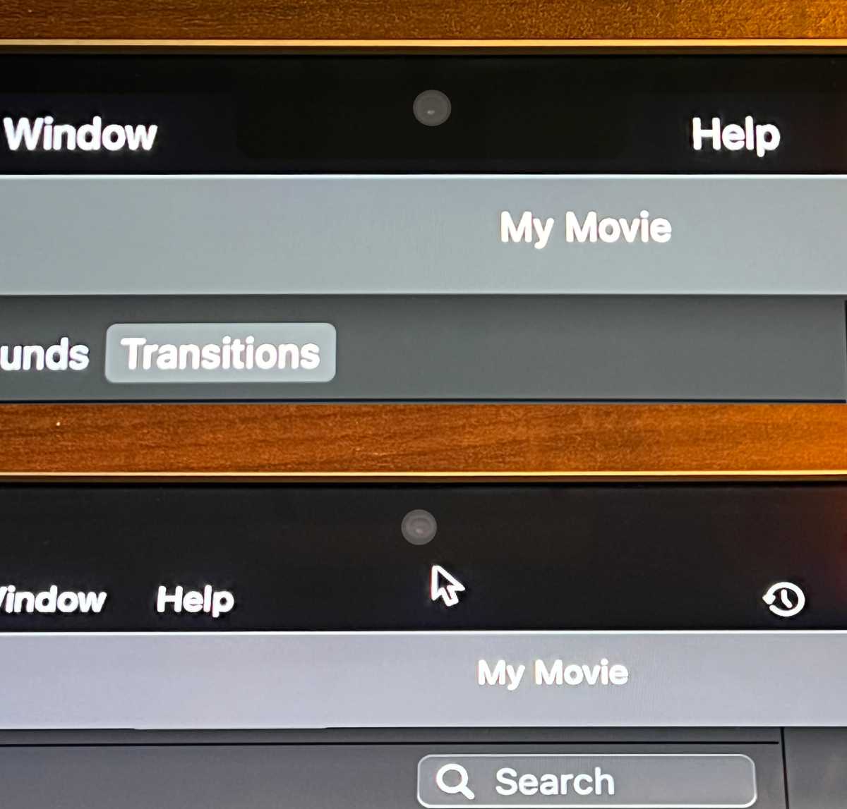
As expected, menus wrap around if they extend that far. Top is default. Bottom shows full screen mode, or likewise, what happens when “Scale to fit below built-in camera” is selected in Finder’s Get Info panel.
MacOS handles the menubar issue. If your menubar extends so far that it hits the notch, it’ll just wrap around the notch — unless the app itself has decided it can handle the damn menu better than the operating system can. This use to be an issue in early Mac apps where developers decided they wanted the menubar to look just so, and redid the whole thing themselves. However, I can’t think of an app that now does this.
The notch does take out a chunk of menu bar. If you have lots of menubar items on the right and the menus on the left hit them, I suggest you to get Bartender. I use it on my 13" MacBook Pro because the small screen does make the two sides of the menu bar collide.

 )
)