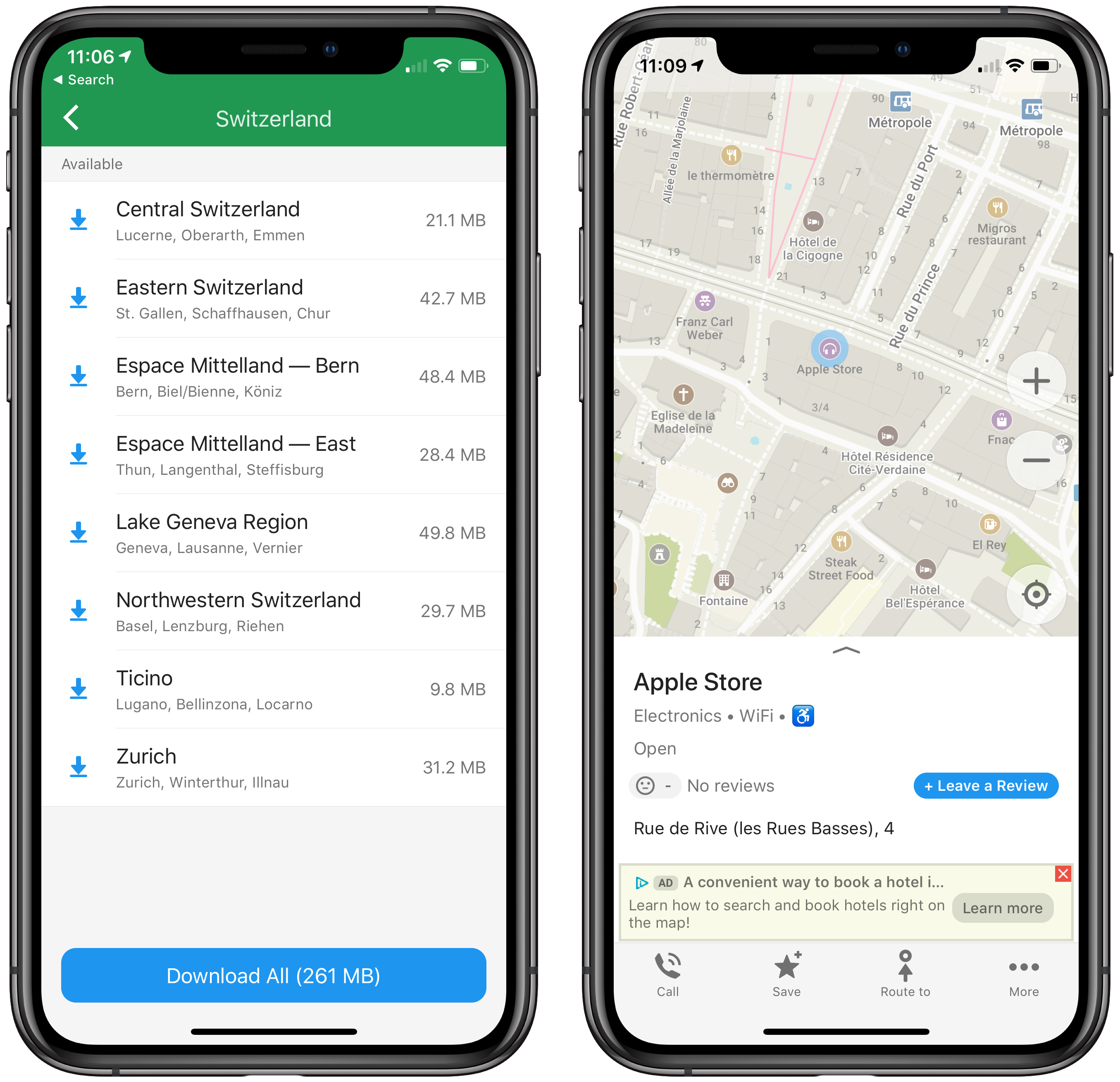
If you’ve read my article about mapping apps, you undoubtedly noticed that I used it to experiment with Federico Viticci’s Apple Frames Shortcuts extension, which adds device frame around screenshots and combines multiple images. They look like this:
Had I been asked without benefit of example, I would likely have said something like “simpler is better.” I do find, however, that the framed screenshots are easier for me to read and provide good visual context.
Screenshots being abstracted from any particular device is a feature, not a bug; the map app article is relevant to people with older iPhones and will be relevant to new iPhones that may look different. I think the framing will make the screenshots appear dated more quickly (“remember ‘the notch’?” “remember when phones had bezels?”). For web apps and native apps that maintain their own, cross-platform design standards (e.g. Google’s), they may inaccurately convey that they’re iOS-specific.
Most desktop screenshots are of details or a single app window but even for a full screen screenshot, wouldn’t it seem weird to frame it as if it’s a photo of a particular Mac display? To me, such framing only makes sense if you want to call attention to a particular hardware feature in relation to the screenshot contents, e.g. pointing out an iPhone side button to use with an app feature or a MacBook’s camera in relation to an app.
When comparing the framed and unframed screenshots above, the unframed may benefit from having more padding between them, as the framed ones do.
I agree with Curtis. I don’t think you want that connection to a specific hardware in most cases. Plus, simpler is better IMHO. So unless you’re attempting to draw specific attention to the way the GUI and a specific hardware combine, I’d go unframed.
Alas, screenshots are seldom really abstracted. All the iPhone X screenshots have the bar at the bottom, for instance, and the size and aspect ratio usually reveals roughly what era iPhone was used to take them—screenshots from an old iPhone 5-era device are really obviously different.
And we do consider our articles to be fixed in time, which is one reason we never change them after they go out in email. So as much as it’s a nice idea that it would make an article seem less dated, we’re OK with it being explicitly dated.
I think the framed ones look better, both in your comparison above, and in the specific article. I remember when reading it thinking how it seemed a bit slicker graphically, without realising why.
If for whatever reason you decide not to continue using device-specific frames around iOS screenshots, one thing I would suggest is that you use some sort of frame. Particularly with phones, iOS screenshots often feature a lot of white, and having the clear visual boundary helps with visual clarity. I’m aware the non-framed screenshots have a narrow grey border, but that’s not enough in my opinion. I think they need some thicker, more obvious framing – and more space between them as @cwilcox notes.
I agree with other posters that the framed images look better. Nonetheless, I vote for the unframed images. There is too much emphasis on “pretty” on the web. I doubt that TidBITS would ever succumb to the tendency to replace content with eye-catchery, but I would still go for simplicity.
We have an Automator workflow that puts those borders on, and a set of Keyboard Maestro macros that we use to combine screenshots of known sizes. So it would certainly be possible to increase the thickness of the border and the width.
But I will admit, now that I’ve gotten Apple Frames working, it’s just as easy or even easier, since all these sort of screenshots have to originate on an iOS device anyway.
We’d never dumb down content for the sake of making something attractive, but I see no reason thoughtful, useful content can’t also be attractive.
We’re certainly not digital ascetics—we like a good interface as much as the next person, and appearance matters in that. Otherwise we would have been happy with DOS and Windows way back when.
I find this approach puzzling – why deny yourself something you prefer? We’re not talking about something that would have a meaningful impact on file sizes or speed load times, and I think TidBITS should try and make the articles look good. As @ace says, I’d we didn’t get about appearance and design, we’d be back on the blinking green DOS cursor of yore.
I didn’t say I preferred it; I said I agreed that it looked better. But it was a small leap to infer that I preferred it—except I said that I voted for the unframed images.
What I do prefer is to put the brakes on any movement toward prettiness for the sake of prettiness. I surmised, and Adam confirmed, that TibBITS “never dumb down content for the sake of making something attractive,” but I still resist a change that does not enhance content. It’s more a protest against what I perceive as the degradation of other sites, and is not a criticism of TidBITS.
Adam asked and I answered, and I’ll support TidBITS either way.
I find this approach puzzling – why deny yourself something you prefer? We’re not talking about something that would have a meaningful impact on file sizes or speed load times, and I think TidBITS should try and make the articles look good. As @ace says, I’d we didn’t get about appearance and design, we’d be back on the blinking green DOS cursor of yore.
I do like framed pictures when they are just framed pictures. But a frame around a large graphic at the head of a TidBITS article initially draws the eye away from the focal point and is a distraction from the byline, the headline, the date, the lead, and the article itself. The large images in current layouts give the reader something to think about that leads visitors’ eyes down the page.
TidBITS articles tend to be news, hardware and software reviews, how tos, and advice and trends presented on a web page. And although a huge proportion of works of great art are framed on museum walls, like Monet’s Water Lilies in the Met Museum or Van Gough’s Starry Night in the MOMA, or The Woman In Gold at the Neue Museum, they are not framed on the museums’ website. The images are accompanied with significant and informative text. There’s less space on a web page than on a gallery wall.
It seems silly, but I think the framed ones appear more relevant. Maybe it’s just the frame that helps separate the shot from the background. Maybe the phone frame puts the shot in context.
I don’t like pretty for pretty sake. I’m still mad that HTML replaced Gopher. However, there is something that the framing adds to the screenshot.
I like the look. And some context is good. I wouldn’t worry about a post looking dated as there are other reasons that might cause that to happen such as the next iOS update.
As a minority view (maybe a silent majority?) I didn’t notice the frames at all until you asked. They’re widely used these days. As for showing a particular model of phone, how could that be a problem? Unless the model chosen doesn’t match the text or the feature being shown, anything (or nothing) is fine.