Everything You Need to Know about the TidBITS 2018 Infrastructure

I’ve heard this from a couple of people, but I’m curious, what do you do in nearly all Mac apps that use black text on white backgrounds? Charles Maurer addressed this in “Better than the Printed Page: Reading on an iPad” and followed up with more in a comment.

If the white of the Mac screen is too bright, I wonder if the solution is to tweak your display settings so it’s never so glaring.

Thank you! As I’ve said before, TidBITS members really are the only reason TidBITS still exists. We couldn’t possibly have survived otherwise.

What version of macOS are you using? In 10.13.4 High Sierra on my iMac, clicking the links in Mail does scroll me down to the actual article start.

As I said in the article, we’ve seen sporadic support for this basic HTML feature in email clients, but it does seem to be working in Mail for at least some people.

Since we sent email about the accounts to roughly 25,000 people, it’s not too surprising that some email messages might have gone missing. Hopefully it will all settle down in the next few days.

Wasn’t this a problem in Mail.app in… oh, maybe 10.10? I seem to recall some discussion about this a couple of years back, maybe more.

Congrats to all involved, the new site and email format are fantastic!

If you have suggestions for how we could format the issue better for your situation, I’m all ears.

My one complaint with the new email issue is that the links use some sort of SendGrid redirection. Two significant issues this causes (to me, in the context of how I read TidBITS):

  1. I can’t hover over a link to see where it leads to (which I often do to decide if I want to follow it).
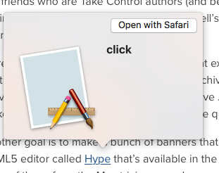
  2. I can’t use the QuickLook feature on the Mac (little :arrow_down_small: to the right of a link) to quickly preview the link:
    image

Is there any way the links in the email issue could be made to function a bit better?

Thanks!

1 Like

There are many applications in MacOS that use white background, but once in a while one makes it too much. There are more attenuated and brighter whites, and some more matt. Like everyone, I visit many pages with white background and the new website has seemed especially blinding. The problem is not to regulate the brightness of the screen because that problem is not with all the luminous websites. Maybe they just did the test only on Apple screens. I use a Benq 32’'. A little attenuation wouldn’t hurt. And maybe a dark skin for registered users.

Love the look of the new web site. I am seriously going to miss the text-only version of the weekly TidBITS issue, however. It was the epitome of what plain text email should be. No need to load images I didn’t need to see, which is particularly important for me who either has no data plan on my mobile devices or a prepaid one (where data is $10 per 100 MB). Links were gathered at the end of each paragraph, making them easy to selectively load (or ignore or file for later use).

I find the font in the new HTML version far too large in Mail on macOS and the formatting very awkward if remote content is set to be manually loaded (which I do on all platforms for security reasons as well as bandwidth). Also, some images are not alt-tagged and some of those images do not have a frame, making it almost impossible to determine what you are missing (or what you would gain if you load images). This is clearly a poorer experience than the previous plain text version if you do not routinely load images.

I suspect I will dump the weekly email edition that I first subscribed to back in the early 1990s and see how the RSS feed does for me. It’s been a while since I donated to the cause (far too long, actually), so I’ll probably try a membership, even if I find the RSS feed doesn’t serve me well. (I don’t use an RSS reader on my iPhone, so part of the test will be whether I miss having access to TidBITS when I am away from broadband or WiFi.)

I like the idea of a dark (think, daringfireball-esque) view, and sure, make it a member perk!

1 Like

Yes, indeed, see “Mail in El Capitan and iOS 9 Ignores Named Anchors,” 5 January 2016

It improved but took quite a while.

Yes, that’s built into SendGrid, and enables us to see what people really click. I don’t know if it can be turned off or not, but I’ll look into it.

You guys are killing me — all this just after we publish an article from a vision expert explaining why white on black is hard to read and include a JavaScript bookmarklet that makes sites like Daring Fireball black text on a white background for better contrast. :slight_smile:

I’ll add it to the list, but I worry it’s one of those designs that sounds simple but is really a rabbit-hole.

3 Likes

I do miss the days when 7-bit ASCII email was appreciated by more people. :-) It did require quite a lot of work each week, though.

Should be easily dropped with Command-minus, though, right?

We should be ALT tagging everything, but we never did any of that before, so I fear we’re likely to be inconsistent. I do wonder how many people turn off remote loading of images at this point — bandwidth constraints are the only reason I would since it’s just a hassle otherwise.

That works for us — there’s no way to meet everyone’s needs in every channel, but we hope the different channels will stand in like that.

I read, that. I think I replied to it.

I entirely disagree; I could not possibly disagree more. I can read my iBooks all day long; my eyes start hurting on a retina Mac after maybe two hours. Huge white screens are the bane of my existence in computers. Everything that I can set to black or dark-grey backgrounds, I do. Paper and computer screens are entirely different. Paper is not a radiant light source, and the reflected light on the page means that a white (or mostly white) page is much better for contrast. the opposite is the case with a luminous surface like a screen.

There’s a reason that all screen used to be dark with bright letters.

In fact, I have a javascript droplet for daring fireball the makes the background DARKER.

The reason for alt-tags on images is for accessibility, anything else is just gravy.

I have remote loading turned off in all my email clients to control which companies can track the emails I look at (since images can be used to track when someone opens an email). It’s no real hassle to tap/click the ‘load images’ button for emails (like TidBITS) that I want to see the images in.

1 Like

You might not be aware, but there is a dark theme for this forum. Go to your settings (cog icon under you avatar in the top right) and choose Interface from the left-hand sidebar. Top option is the Theme.

1 Like

I get this, and understand why it’s useful to you. Just a shame that they can’t figure out a way to do this without breaking the loveliness of hyperlinks. :wink: I wish they could pass the URL as some sort of parameter (e.g. sendgrid.net/[trackingstring]?tidbits.com/my-great-article or something) so that it was still possible to see the destination URL and that it would maybe work with QuickLook. I realise this could be impossible/out of your control, but thanks for checking. :+1:

Took five tries to reset my password; the reset link(s) you sent returned ‘invalid token’.

You’ve also broken Safari passwords, as far as setting a new one; yes it’s helpful you suggested one; yes, I know you like 1Password better; but Safari is just fine for most everyone and presents zero barriers (or cost) in syncing across all macOS and iOS devices; I had to jump through hoops to generate my own and install it in Safari.

The new website is gawdawful slow; I’m getting a 10-15 second delay on every click, before it even attempts to load a new page, then another few to several seconds to complete.

Text replacement also appears to be broken in this comments field; common text replacements I’ve set are not working.

I, too, will be unsubscribing from the email and hoping RSS works well enough (assuming you get your speed issues resolved).

I’ve loved the content and service since shortly after you launched way back when; I’m all for updating to keep up with the times, but sometimes a step forward for forward’s sake can be backwards if you’re just adding complexity to what was (infamously) great for its simplicity.

Complaints notwithstanding, congrats on your efforts; I hope they deliver the benefits you’re expecting.

What version of MacOS are you running? I’ve not had any of these issues on the new website running MacOS 10.12 Sierra on a 2013 MacBook Air. Site is snappy and responsive, text fields worked as normal, and Safari saved my password as expected. Could it be a software issue on your end?