Originally published at: Do You Use It? Finder Tags See Focused Use - TidBITS
The results of our poll asking how often you use Finder tags are in, and while tags aren’t broadly popular, being reminded of what they can do for you might encourage you to use them in appropriate situations.
The results were largely what I expected.
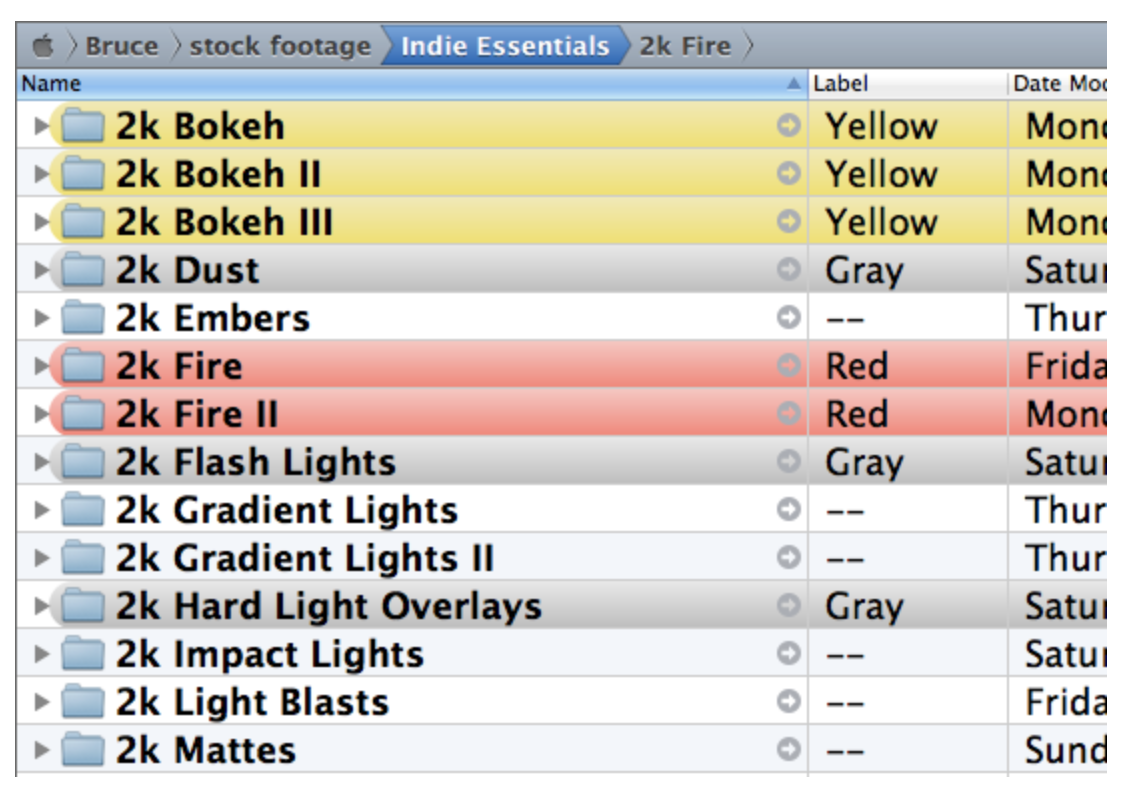
A lot of people using them in the same way they used the original Labels - essentially labelling files and folders as “in Progress” or “Done” or whatever.
Not a lot of people using them to their fullest extent, but from my experience they’re a bit unreliable and this could be why they haven’t been more widely adopted.
1 Like
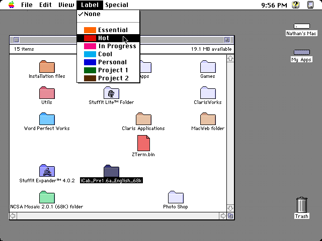
Prior to OS X Mavericks we had conspicuous, easy to identify Finder labels that colored folder and file names. Apple changed this behavior in 2013 and gave us the dinky color dots we still use today.
Some of the Finder-replacement apps, like Path Finder, XtraFinder and TotalFinder, brought back Finder labels.

1 Like
2 Likes
Finder labels could easily be added. The current dots or circles would be kept, but the color of the first one would also be applied to the finder name and/or the icon. The choice of having the label colored, or the icon, or both, would be relegated to the system Settings. Not a difficult programming task.
1 Like
I just realized, reading this week’s TidBits, that I do use Finder Tags. I didn’t realize those were the colors you give to file names.
Every two years I manage a Management Compliance Review. I send the data to a CPA once it’s complete. The tags are useful: red, not ready or lacking information; green, ready to be uploaded to the CPA firm.
I agree that the tags are less useful as dots vs completely highlighted file names. Dots are harder to spot.
I also missed this feature of the System 7 Finder since OS X 10.0… so I wrote a little utility to bring it back (well, as far as I could while respecting Apple’s guidelines). You might find it interesting - search for “Hue Dada !” in the AppStore…
3 Likes
Here’s the link for those not reading on a Mac that want to see Hue Dada !:
Looks really nice, and like it would address the issue for those that want the whole icon coloured.
Does it handle multiple tags per item (and if so, how)? I can’t see an example of that in the screenshots, but maybe I’m missing it.
Hello,
The behaviour is similar to the Finder : the “main” little dot is used (the latest added tag)… but explicit colours have priority over labels.
Best regards,
Fred.
I just upgraded from Big Sur to Sonoma and realized with shock that the finder tags got really ugly with hard to discern dark colors. What used to be bright yellow is now dark brown, which is hard to distinguish from the dark red and the dark green and the dark purple. Everything is dark. It’s just awful. Actually the same for the buttons in the top left of windows (the minimize button also morphed from bright yellow to dark brown – seriously?).
How do I get those colors back ???