I am close to scratching out my eyeballs trying to work with Motion 5.5 on a Retina iMac.
Reading @ace Adam’s analysis of Dark Mode from May 2019 The Dark Side of Dark Mode reveals that some folks absolutely find working in white-on-black a necessity. Most of us find it slows us down and/or is intolerable.
The problem, from my perspective, is that Dark may be indeed a Mode on Apple systems since Mojave, but it is implemented with a vengeance in Apple’s pro apps, and preceded the creep of Dark Mode into the general System.
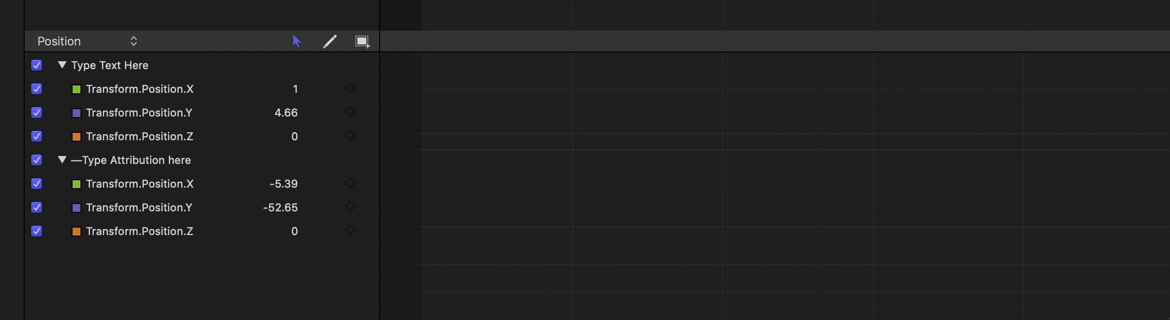
The screen shot is from Motion, and shows a blank animation timeline. See that big blank area to the right of the parameters? That’s the timeline, complete with grids and divisions. They are single-pixel marks in almost-black (I’d guess greater than 95% of black) superimposed on a jet-black background.
How is an actual person supposed to work with something like this? It’s not even a discovery-style interface where elements reveal themselves when moused over or context demands it. It’s just plain invisible.
I resorted to reporting it to Apple as a bug. If your interface seems to have disappeared, that couldn’t possibly have been the intended function, could it?
I’d love to know if there is anything I can do to mitigate the effects of this problematic interface, or your comments in general.
There was a problem in Markup on the iPhone for a while that Apple finally fixed. When you went in to mark up a graphic, if you wanted to change the color of the object or pen, you needed to tap a color box. The problem was that the default was black, and the screen behind it was black. So apart from tapping randomly, there was no was to discover it. Happily, they finally fixed it, perhaps in iOS 13 if I remember right.
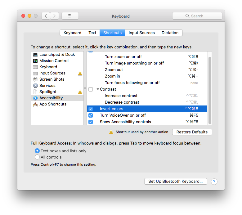
Just an idea - does using “Invert colors” help? On my machine (High Sierra) I have this enabled at System Preferences > Keyboard > Accessibility > Invert colors, and then I can press ctrl-alt-cmd-8 to negate all the colours on the screen, which can help in some situations.
Oddly I went to take a screenshot of the result and Skitch ignored the Accessibility-altered screen, rendering it “as intended” by Dark Mode.
But it absolutely did make at least the target area legible, rendering the background in ~5% gray and the hashmarks in color.
Thank you for that tip! This makes it workable for me, and you saved my bacon (or my eyesight).
And perhaps many of us will now reflect for a moment on the irony that a marketing choice on Apple’s part requires accessibility controls to make a pro app’s interface legible to most of the working population.
I want to be clear that I’m not crabbing so much about Apple’s choices for interface. What works for me in the general interface is the option to choose. I actually like Dark Mode on iOS, because it seems to color-code text in the same ways a programmer’s tool does.
It’s when you have no choice that it becomes an issue for me. It’s as though you were watching your favorite streaming service, and the interface required you to watch a preview of every single tile you clicked on, and maybe even launched the underlying stream… If a streaming service ever dared to do that, I’m sure there’d be some fuss about it. ;)
And compulsory Dark Mode on pro apps seems like a similar case, to me.