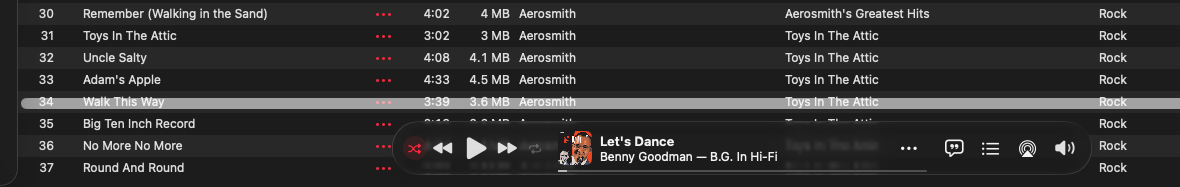
This is from my Music app… the highlight is not my choice, it looks like where the list SHOULD end.
Interesting. You’ve got the player controls floating over the track list at the bottom of the window. Is that a new option for macOS 26? On my Mac running macOS 15, I can’t configure that even if I wanted to. Maybe it’s a liquid glass thing.
Anyway, it appears that that’s a scroll-bar, not a highlight. It looks like Music put it just above the player controls. It probably looks great if you have scroll-bars hidden, but you (like me) want to see them all the time.
Can you move the controls back to the top of the window, as they were in older versions? If so, I suspect that scroll-bar will move back to the bottom of the window where it belongs.
I’d go to Apple Feedback and leave a bug report here.
That mini player is immovable. Looked through settings, I did find a “keep player on top of other windows.” For the hell of it, I selected that option, but in fact the player did not sit over other windows. Do you mean post something in the “Community” forums at the fruit?
It’s not the mini-player, but the normal player-controll bar. On previous versions of Music (e.g., 1.5.6.11, on macOS 15), it’s on the top of the window, above the track list:
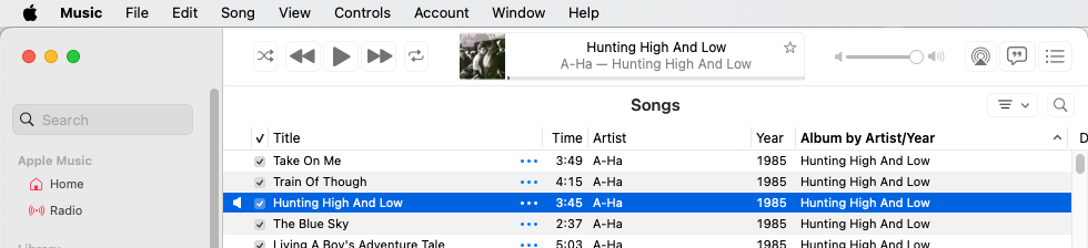
Notice how the layout of controls there matches the layout in your screen-shot, but it’s transparent, covering the bottom of the track list instead of opaque above the top of the track list.
It looks like this is yet another victim of Liquid Glass. Annoying that you can’t put it back where it used to be.
No. Those support forums are useless for this sort of thing. You can explain the problem, but don’t expect anyone from Apple to help or even respond.
But you can go to Apple’s Feedback page to leave a bug report. Select the app/product in question and fill out the form.
I don’t see a link for the Music app (the “Apple Music” link is for the streaming service), so I’d leave it as macOS Feedback.
You probably won’t ever get a response from Feedback, but if a lot of people have the same complaint, Apple may do something about it.
1 Like
will do… again thanks.
What happens if you quit and relaunch Music, or restart your Mac?
This is an artifact of Liquid Glass. The ‘highlight’ you mention is actually a horizontal scroll bar, but it doesn’t look like one because your window is wide enough to display all your columns. If you make your window narrower you should see part of the highlight bar turn dark and become the slider and look more like a horizontal scroll bar.
2 Likes
You are correct, it was the horizontal scroll bar. I narrowed the window, then brought it back so it disappeared.
So they KNOW where the list of songs should end, they just don’t do it. AND I discovered if I make the window wide enough to have it disappear, it comes back on the next launch. Still, I have trouble relating this to liquid glass. One of the big, touted “features” with 27 is that one can turn it off… can’t do that in Tahoe. Tried both choices, clear and tinted, no difference.
And Adam, this has been going on for months already, through countless quits and reboots. I think a couple of os updates as well.Yes I reported it as you suggest, only issue is there is no provision for attaching an image, so I tried my best to describe it.
Part of the reason to post it here was to see if I am the ONLY one with this issue… nobody else saying they see the same thing is troubling.
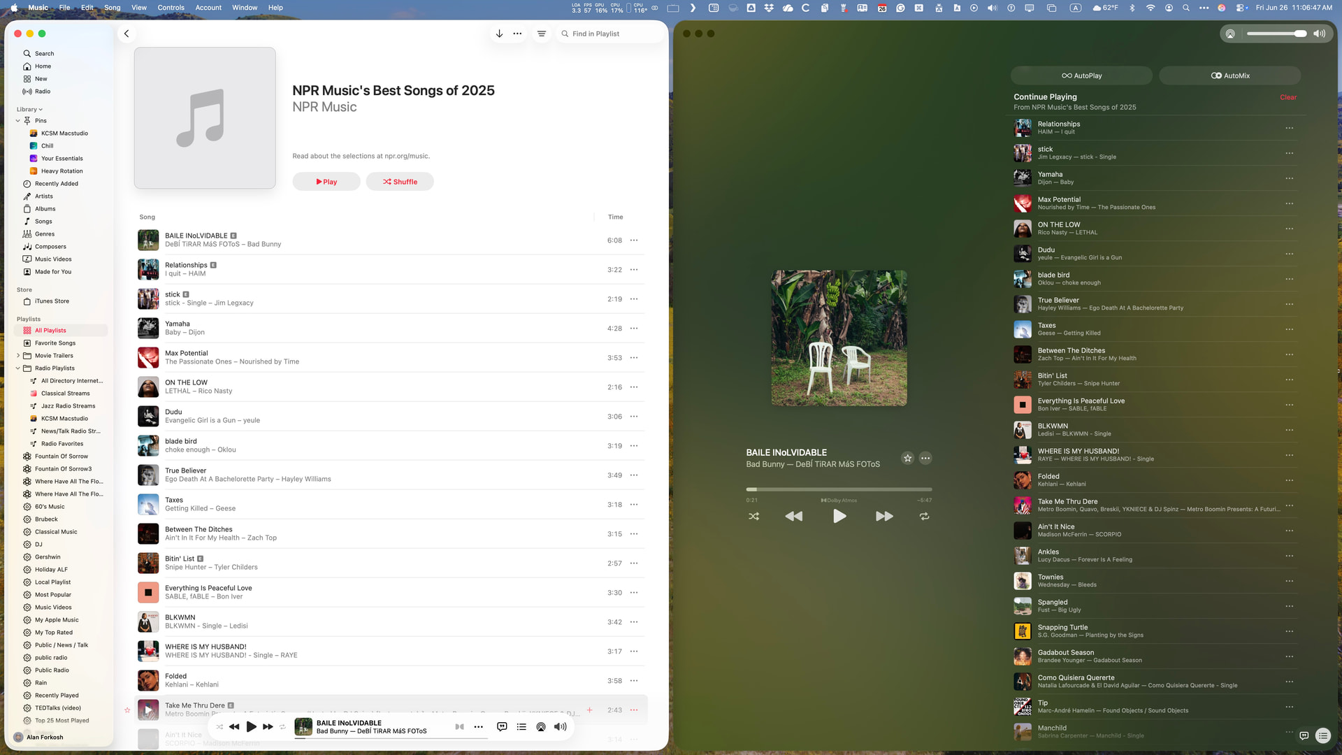
Yes, Apple has totally redesigned the Music app window for the worse. Rather than showing the current status in the Apple space at the top, they have chosen to squeeze the information into a too-small bubble overlaid over the bottom of the playlist or album window. So, I have changed how I work with Apple Music.
I have always used Mission Control to run a dedicated music desktop that used to contain only the Music app window. Now, I have the main Music window pinned to the left half of the desktop. When I start the playlist, I right-click the image in the bubble to open a Now Playing window, which I set to occupy the right half of the desktop. It looks like this:
2 Likes
Ah, sure looks like you have the same issue (so it’s not just me). I DO remember some language that suggested that “player” window could be dragged off, but on closer look it said something about keeping it in front of other windows. Tried that, it didn’t even do what it said it would.
WISH I could go back to Eudora & SoundJam!
Apple essentially replaced the desktop Apple Music setup with the iPhone version. On the iPhone, the Now Playing window is the one you use once you start playing. Unfortunately, when it comes to getting information about selections, Now Playing lacks the ability to check the album for the track, among other things. The key point is that once a selection starts on an iPhone, you don’t need the Music window, whereas traditionally on the Mac, you do everything from the Music window.
1 Like
I do 98% of my listening from my phone. But I almost ever actually launch the app as my style is shuffle as I have MANY different genres of music on there. 95% of the time where I had stopped is still there, so I just go with it.
I also know 100% Jobs would never, ever stand for this crap… if it made it out the door, it would be fixed real damn quick. Anyone want to put money if this continues into 27?