Originally published at: https://tidbits.com/2020/06/22/big-sur-makes-changes-to-many-apple-apps-and-basic-features/
Apple unveiled macOS 11.0 Big Sur during the WWDC keynote, showing off overhauls of Messages and Maps, while improving Safari, Photos, and other apps. Mail was conspicuously absent for now.
Too bad they didn’t talk about Mail. Possibly because it’s the most frustrating Apple app to use and it’s the one I use the most. I don’t care what else they do, as long as they get rid of the damn hide-and-seek interface (not just in Mail, but that’s where I notice it the most). As a Mac consultant, I find myself having to explain to clients that they must magically know to hover the mouse in a certain area to see a control they know must be somewhere.
I long for the days of Jef Raskin. We are deep in the territory of form over function.
1 Like
They may not have been ready. I expect it’ll look like iPad Mail, which was demoed and I was not that big a fan of the new look.
Like you, Colleen, I would have also liked to hear and see more about Mail. Ironically, it’s Mail they chose to show the refreshed UI. But just very little detail, unfortunately.
2 Likes
Thank you for sharing your clients’ problems with hidden controls, Colleen.
Does the user perceive that clicking on that location [on the screen] is a meaningful, useful action to perform?
If an indicator of such a “meaningful, useful action” is hidden unless the pointer is close to it, you obviously cannot easily answer that question. Especially in highly complex applications, there can be good reasons to hide some less-commonly used controls to reduce the perceived complexity of the overall UI (“progressive disclosure” is the technical term).
That typically applies to applications for expert, and well-trained, users, but not for something as mundane and widely-used as a mail client. Or a browser. Or a to-do list. Etc.
In other words, the ubiquity of such hover-only controls across all kinds of applications just isn’t justified. It’s simply bad design.
That’s why I appreciate hearing first-hand from people who disagree that “everybody knows how this works these days,” as so many designers claim these days.
1 Like
Actually, my complaint goes back to the beginning of the hide-and-seek interface, which has been around for lo these many years now, and I’m not any fonder of it, not one bit. Jonny Ive was brilliant at hardware, but as I said before, the software is now so form-over-function that it’s really hard for a lot of people to figure out. Apple’s user interface is just not so friendly anymore. My first Mac was a 512K Macintosh, so I guess I’m getting old and cranky.
I read this on my iPad, with the large blank area on the bottom, and the cryptic curved arrow that brings up a dozen options. Let me put some of those options on that blank space rather than having to click on the arrow, then click on…
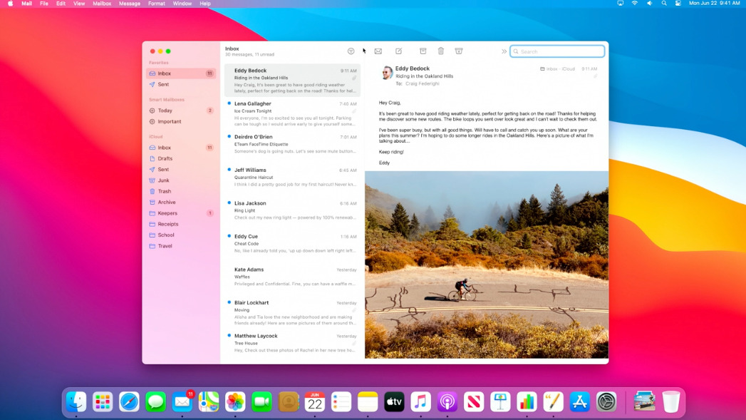
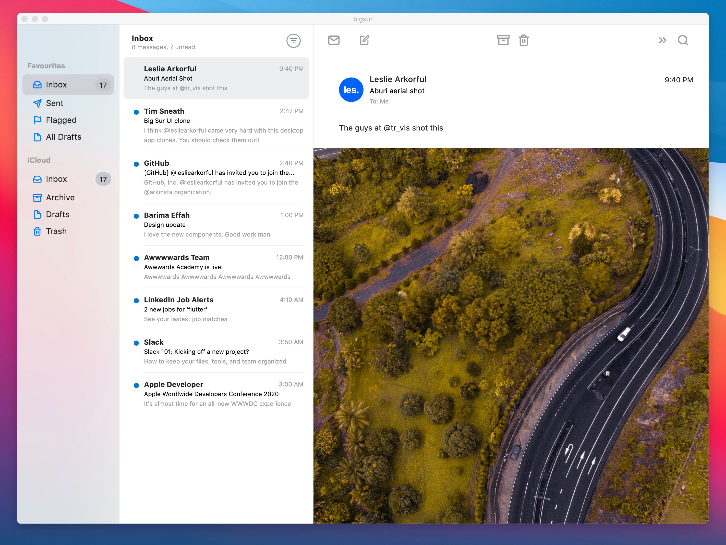
Here’s a very nice collection of macOS and app windows. Catalina on the left, Big Sur on the right. (Unfortunately, Mail is missing).
And if you want to see a comparison of just icons, that’s here.
1 Like
While Apple pioneered the standardization of GUI and even wrote the book on it (Macintosh Human Interface Guidelines from the '80’s), the younger software engineers were essentially instructed by Jony Ive to not read the book (as he never absorbed its intent). But let’s think for a moment about how “progressive disclosure” is potentially a death-dealing philosophy.
The Boeing 737MAX debacle was a result of Boeing altering the 737 design to accept larger engines in an effort to increase the range of the aircraft. But this re-design changed the center-of-gravity of the plane and required some goofy software hacks to the control systems in order to correct the deficiencies. Then Boeing decided to completely automate that system hack and hide it from the pilots so they (Boeing) could claim that retraining wasn’t necessary in order to transition pilots from the 737 to the 737MAX. Then the system catastrophically failed in two planes and the pilots, who had a few minutes to correct the system, had no specific instructions to enact the corrections; instead, they had to rely upon progressive disclosure - they had to learn on-the-fly (pun intended) how to alter the flight characteristics of the aircraft having never been specifically trained how to do so…and they failed.
So, Apple, you can take your progressive disclosure and shove it up your USB port.
BTW, the deficiency of the 737MAX was bad design and Boeing’s attempt to fake out the control systems is completely wrong. The airframe is inherently dangerous and I will not fly in one again.
1 Like
Do you have any reputable sources for this? I couldn’t find any. But I did find a lot of references about how HCI was added to Ive’s portfolio after the skeuomorphic interface design disaster, and how he cleaned up the messes and brought back a clearer and less distracting and confusing interface:
All one has to do is read the Human Interface Guidelines books (I still have mine) and then simply examine the horrors inflicted upon us with Ive’s “peek-a-boo” process of discovery. It’s been insulting to the users and stresses some sort of “cleanliness” of design by withholding useful knowledge in an homage to Ive’s clean sheet of paper approach. Note that I am not referring to “starting with a clean sheet of paper”; Ive’s design aesthetic ends with a clean sheet of paper. Anything beyond that detracts from…whatever it is that Ive tries to push on the masses. Lose the keyboard, lose the ports, lose the mouse; if the apps require those details, well, then, cripple the apps.
1 Like
UGH. It isn’t just the hide-and-seek problem I object to; they have removed important borders between toolbars and content. Borders and backgrounds help us locate and recognize important screen regions; lack of borders and backgrounds makes this more difficult. It’s hard to believe Apple’s HI team has sunk so low. I really hope there is a huge outcry against these pointless form-over-function changes.
If you enable Reduce Transparency and Increase Contrast in System Preferences > Accessibility > Display, the borders and edges become a LOT easier to see. So a lot of it will come down to what your eyes prefer.
What if you use your computer to edit photographs as I do?
What I see and what others see will not be the same, correct?
I think these settings just affect the interface, so things like toolbars and window borders and the like.
But vision is highly individual anyway, so there’s no way to know if anyone else will see what you do anyway. ![]()
I’ve said it elsewhere, and I’ll say it here: Jony Ive was simultaneously one of the best and worst things to happen to design at Apple. Best because he made groundbreaking hardware designs that, like them or hate them, you could not fail to notice them. That gave much-needed media coverage to Apple during a critical period.
Worst, though, because everything was a distraction in his mind. Hide everything that isn’t immediately important. Make the user inconvenience themselves to do things, simply because making it convenient is “ugly”. This is the design philosophy that puts a Bluetooth mouse’s charging port on the underside, where it can’t be simultaneously charged and used, because the user shouldn’t have to see the port.
I can’t even honestly call this design philosophy “form over function”—it’s more like “form replaces function”. Borderless buttons. Invisible-until-hover controls. Hidden scroll bars. Bezel-less all-screen phones that you can’t grip without touching an active screen area. These attempts at aesthetic minimalism actually inhibit functionality and make devices less useful.
To be perfectly honest, I miss the old skeuomorphism. It may have been cheesy-looking, but it made it much clearer what was functional on your screen. I’d take the look of iOS 6 with the capabilities of iOS 14 in a heartbeat if I could.
1 Like
Thanks for the tip. I’m not talking about ones that are low-contrast, but ones that are missing altogether. It is trendy now in Silicon Valley to remove borders everywhere, so that areas of the screen which have different purposes, control types, and content types bleed together visually, and unfortunately Apple is starting to copy Google and others in this as well as in the hide-and-seek design fad. (Maybe they show up if you turn on settings in Accessibility—but we shouldn’t have to correct bad design decisions through Accessibility settings.)
The famous architecture/Bauhaus design theory, posited in 1866, is 'form follows function," and it’s a huge difference. There’s an excellent summary about how this plays out differently in the digital era, with Jony Ive’s iPod Shuffle interface and hardware design being the shining example of how “when function is hidden, there is free space for form to vary.” And “In some cases, function is concealed by the outer shell. I will not blame you if you cannot guess what this thing is supposed to do – playing music.” The author posits: “function is a reflection of requirement or purpose of the design which comes from human needs and wants.”
And I also give Ives lots of interface design credit for getting rid of skeouomorphic interface design.