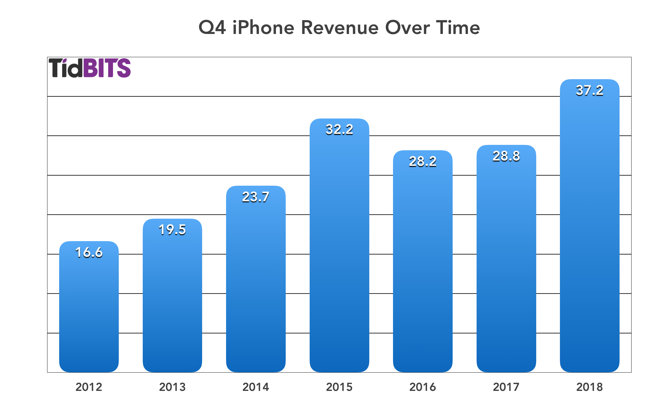
We’re working on better charts for our Apple financials articles, and the question has come up as to whether we should be using an area chart or a column chart to show the change in revenue for the particular quarter in each successive year. (It’s important to restrict the chart to the particular quarter rather than show all quarters because Q4, for instance, is always higher than all the rest. Apple is always very careful to compare results only to year-ago quarters.)
Take a look at these two approaches and tell us which you prefer in the poll below the screenshots. (I’m not sure if you can vote in polls if you’re reading in email. If not, just click through to the site to vote.)
Looks like the column chart is a lot more popular, so we’ll use that approach.
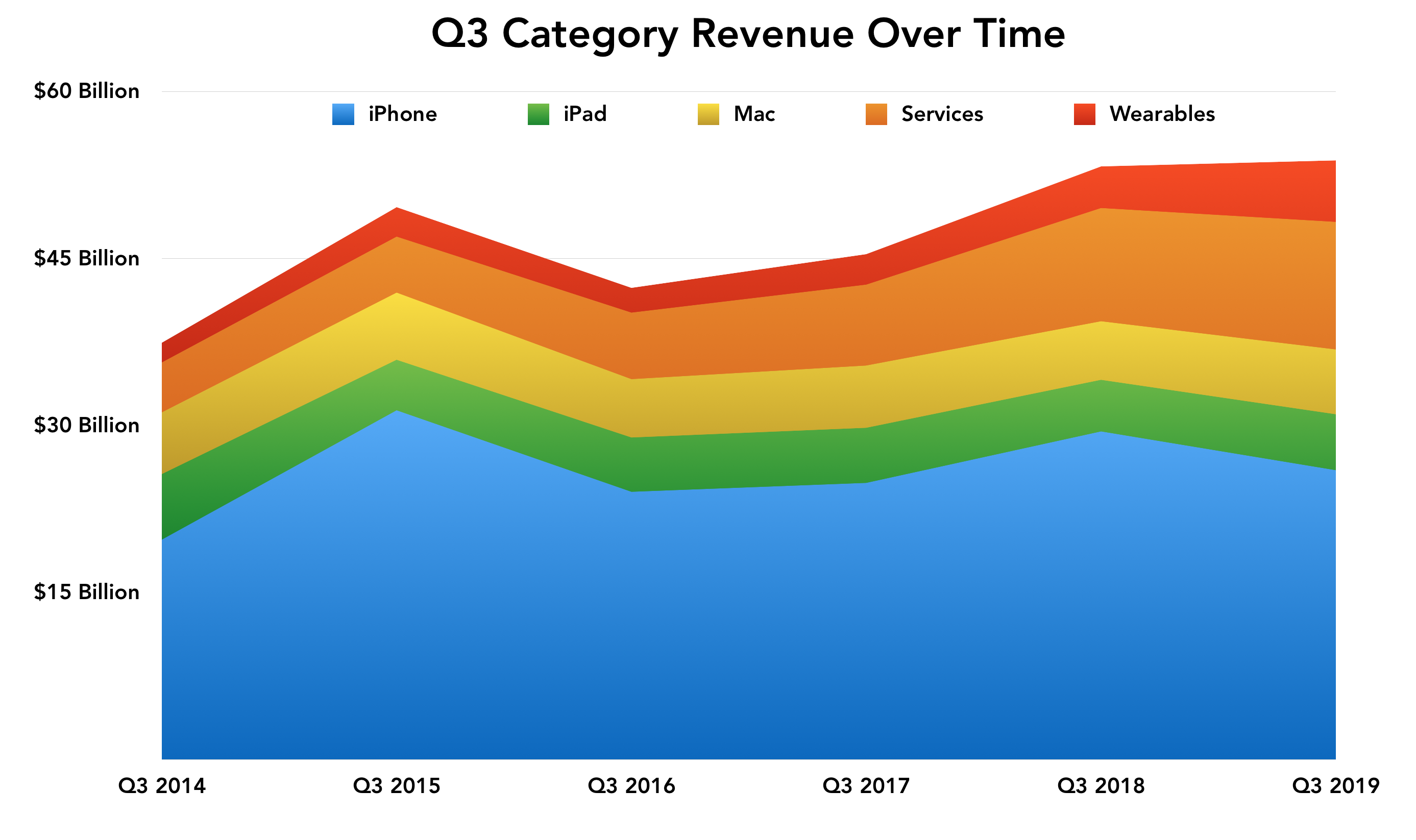
We also have one stacked area chart showing the relative contributions of each of Apple’s product categories, and we found that much better than a stacked column chart for showing the trends over time. It does a good job of revealing how Services and Wearables have been expanding over time in comparison to the others.
May I ask if you might be able to use less orange/red distinctions? As one out of every 15 males I’m color blind. In the example you post above, the green has nice contrast against the blue and yellow, but the contrast between the chosen orange and red makes them hard to distinguish for me. It’s not a big deal, but if you could keep contrast in mind (darker red maybe?) it would help those of us affected a lot.