just updated my ancient imac to osx16, its last update ever apparently. almost time for a new machine, eh?
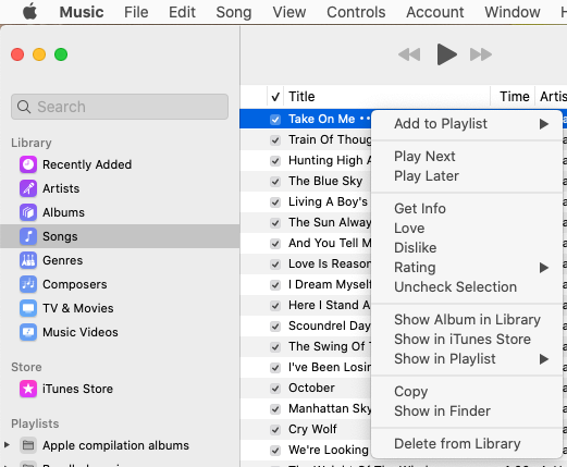
got a question for the braintrust: in the music player, the track title column has three dots beside each entry, right justified. anyone know what that is? is there some toggle that gets rid of it?
If these are the three dots I’m thinking of, they should only be seen for the currently-selected track and for one that your pointer is hovering over (at least that’s what I’m seeing in macOS 10.15, Catalina).
Clicking it brings up the track’s context menu:
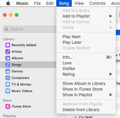
This is the same context menu you get if you right-click or ctrl-click the track. It’s also very similar to the Song menu on the menu bar, removing disabled items and adding a few items from other parts of the UI:
I’m not sure why it the three-dots UI element is present, since there are two other ways to bring up the same menu. Maybe Apple decided that this was one case of a hide-and-seek interface that they didn’t like and made a visual indicator for the context menu.
sure enough, that appears to be the answer. if you click on the dots, you get the menu. if you right click anywhere on an entry, you get the same thing. didn’t even notice this menu before.