New TidBITS site feedback

A full article expansion there might be pretty weird, since it would need a closing control at the bottom. I’d need to see an example elsewhere of how this could work.

I could imagine some “previous/next article” display at the bottom of each each article, but the bottom of articles is already getting very cluttered. Again, show me an example of where this is done well.

Personally, I just open things in new tabs with Command-click.

Those links are completely local, as you can see by hovering over them — there are NO trackers or off-site code involved. That said it would be easy to hide them for members.

This is a tradeoff, I think. The problem is that Discourse offers a very rich commenting environment, and there’s no good way to embed that on another site. I’ll look into it more, but I don’t have high hopes.

Logging in frequently shouldn’t be necessary, since our WordPress site will remember your login, and Discourse is using single-sign-on with WordPress.

That’s an interesting idea, and would provide easy access to articles. And it would be simple to implement, I think.

Huh. Our developer is extremely cognizant of performance issues, but obviously the site is still new so we’ll keep an eye on it. I haven’t seen that sort of problem before.

There are a few things going on here.

  • We don’t publish that many articles per week. Besides Watchlist items, which have their own horizontal list, we seldom have more than 3-5 articles per week. This last week was an exception, in fact, due to all the Apple announcements. So it’s not like there’s a lot to compress in, like the New York Times.

  • We’re intentionally trying to focus on content, and make it easily scannable. Those decisions resulted in fairly large fonts, relatively short line lengths, and lots of white space. You can always shrink the font size in your browser if that feels better.

  • The featured images in articles are of course a “waste” of space, but after having very little imagery, we wanted to try going in the other direction. Once you’re in an article, you’re going to be scrolling no matter what, so I’m not sure the image makes that much difference.

  • All that said, we can perhaps remove some of the white space to tighten things up a little, particularly on the headline pages.

We’ve tried getting headshots of authors in the past, and it’s a royal pain. It turns out to be very hard to get everyone’s head in roughly the same size, and have the color (or greyscale) be equivalent in each one. And as soon as someone new writes for us, it’s a lot of extra work that we have to decide will be warranted (will they ever write again?).

We can revisit the author colors — it would be trivial to lose them entirely — but we moved away from categories because it didn’t seem that anyone paid any attention to them. Again, since we only publish 3–5 articles per week, no one was using category as a way to decide what to read. And the title of the article usually makes clear what the category is anyway.
1 Like

Try reducing the font size in your browser. Browsers should remember that setting.

I’ll look into increasing the information density where reasonable, but I don’t want to hurt overall readability, which is what would happen if we increase the line length, reduce the line spacing, or lower the font size too far.

The trouble with reducing the font size it is shrinks the width of the view frame. Exactly the same number of characters on each line, just smaller text and shorter lines (unless there is some way to change font-size on the site other than ⌘- +/-). Yes, it gives slightly more vertical info, but the tradeoff is pretty grim.

I can’t get Discourse to behave like the old system. I can set threads I’m interested in and then I get an email when there’s a new post to those, but the system also sends me a email when a new thread gets started even though that has nothing AFAICT to do with the threads I’m interested in. How do I tell it to inform me only for those threads I have selected myself? What I’m trying to do is of course emulate the old check box at the bottom of TidBITS article pages right above the comments.

In theory, Firefox can zoom just the text, but it doesn’t seem to work all that differently.

I’ve asked Eli to remove some of the vertical white space to tighten things up a bit.

Try clicking your avatar in the upper right corner, and then the gear button to get your Preferences screen. Then, click Notifications in the left sidebar, and fiddle with the settings there. Also be sure to click Categories under that and make sure you’re not automatically watching entire categories.

I don’t yet know how all the settings interact, but I’m pretty sure you’ll be able to control the notifications in a useful way.

I have to say I quite like Discourse. The training was useful, the gamification…might work for some people, and not for others. But I find it engaging…

My one thing would be that I keep thinking that clicking on the TidBITS in the top left corner will bring me back to the main site. It’s fine that its the home page of TidBITS Talk but it would be good if there was a link back to the main site somewhere obvious.

I already tried setting those things, but obviously I’m confused. So does notification = send email? This message board seems to like to show me all kinds of notifications and likes and badges and such stuff. But all I’d really like is to be able to set certain threads (that I chose manually) to send me an email when somebody posts to them. Nothing else needs to be sent to me or advertised or liked or whatever. Is that possible with this system?

I realize there’s the watching flag, but it’s not clear to me where I tell it to send me an email when (and only when) something new gets posted to threads in that watching category.

I was thinking the same thing. Perhaps use TidBITS Talk and then clicking on TidBITS takes you to the main site, while clicking on Talk takes you to the forum home. Not sure the usability experts would be thrilled with that suggestion though. ;)

1 Like

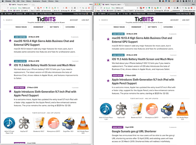
Those who were concerned about the information density, try reloading the main headline page. We’ve tightened up the white space a bit so on my 27-inch screen, I now see the top three articles, the Watchlist row, and then a fourth article underneath.

1 Like

I reloaded and even relaunched Safari, but I still don’t think I can recognize any difference. I need to reduce the font size to at least 75% to get the type down to something that matches what I see on most other sites (including this TidBITS Talk forum).

But the fundamental problem with trying to solve this by having users adjust their browser font size is that changing the font size does’t really reduce the white space (not to mention that click targets for links get really tiny). Half of my window width is white margin devoid of any content! IMHO definitely a waste of valuable screen real estate on my 27" screen at work.

It’s really quite a lot different. And the formatting here at Discourse is completely default — I haven’t tried to change any of the look and feel. Personally, I think the font is a little too small.

Window width is irrelevant — for ease of reading, line lengths can’t be too long. Charles Maurer explained this in relation to the iPad just recently, and it’s why newspapers use narrow columns. It wasn’t like our previous site had a wide column either; it’s just that the fonts were tiny.

And as I said before, what do you think you’d be able to see? We’re not like the New York Times, pubilshing tens of articles per day. We seldom publish 10 articles per week, and that’s including ExtraBITS. So what do you think we should put in that white space?

I think you might not be seeing the issue because you have a narrow window, like on an old Apple Portrait monitor. I have a browser window that has roughly the same dimensions as a standard 27" screen.

Well no, because depending on how you set your window this becomes an issue for some users.

That on the other hand is absolutely correct (long time LaTeX user here). But then again newspapers give us several columns side by side. The new site doesn’t – at least not as far as I can tell. I’d have to set up my browser window like you and then have several such browsers running side by side to emulate what newspapers do.

I’d have no problem with using narrow columns if you’d give us side-by-side columns. But if we cannot have that and what we get instead is an iPhone-site like single stream, then I need to be able maximize its width. After all, why should I scroll through headlines, if I have plenty of screen real estate to see everything at one quick glance. That’s why we buy expensive large screens in the first place! If I want to see what’s new, in principle seeing the top most article would be ok, but since the latest articles do not necessarily end up on top I need to see more. That’s what I want in that white space: more articles. Content instead of white space.

If there is no decent one size fits all solution, I would argue for giving people options. Let users chose a high-density layout, of course it’s perfectly ok to keep the low-density as the default. Something like that. There must be a better solution than forcing all people on various kinds of screens to adapt to somebody else’s single preference.

It looks more data-rich for sure. Thank you!

I’m not here to design it, just would have reduced the font size and kept more white space. But That’s Me. And it’s your site to design. Glad it has more stuff on it, for sure.

Umm, yes, because a full-width screen makes little sense. Either site will set a column width, like we do, and you’ll get a ton of white space, or they won’t and you’ll get line lengths that are insane. Go look at The Verge, or Ars Technica, or nearly any other publication, and they’ll fail on that wide of a screen too. And this isn’t new — our previous site had an even narrower column width.

Give me an example of a few publications that are done the way you suggest.

I’m sorry, I should have been more clear. I meant to say same ratio, not dimension. It appears the current site works well for something like 1:2, but my bowser windows (like my screen) are usually closer to 2:1.

I think the old site layout was actually quite close to the newspaper situation you described. You had narrower columns to make it easier to read, but then you had three of those side by side spanning the whole width. The center was for the articles, left had frequently used links, while the right had links to related articles or software IIRC. The new site almost feels like you left the center the way it was and replaced left and right with white space.

Yes, there were pixels there, but they weren’t useful, or particularly used, so we removed them.

Eye-tracking studies show that no one ever even sees a right-hand column, and if there’s a left-hand column, it occupies the most-looked-at spot with either static content that’s worthless (like on our old site) or dynamic content that distracts from the primary content column.

From the main tidbits site there is no way to get to the talk.tidbits site without

  1. clicking on an article
  2. scrolling to the bottom
  3. clicking the link to discussions
  4. clicking the “Tidbits” logo on talk.tidbits.com.

New email looks great. The length was always impressive, now even more so… Nicely done.

Echoing @lbutlr I do think it would be good to make it easy to jump from main site to talk and back.

Yes, I agree, and I’m looking into the best ways to provide those bi-directional links. Since we were trying to keep the interface from getting cluttered, we erred on the side of fewer links (such as only at the bottom of articles).

One of the problems with testing Discourse is that we didn’t have real-world usage patterns, so things like this were hard to detect. And of course, it was impossible to get a sense of how heavily Discourse would get used.