I’m surprised that no one has mentioned existing sites with the same focus (market research opportunity).
For years I’ve used the macrumors buyers guide. What I find most useful personally is the time since last update, mostly for a quick check on my own memory and the update timing history. Otherwise, as someone who follows tech news I have a general idea of what I’m looking for, but do use it to refer other people to. So definitely think a resource like this is useful, and the more specific recommendatins than just providing the info are great.
I do find the main page to be hard to parse quickly, the different sections all visually run together for me. Perhaps more people will use the tabs at the top to go to the specific pages, but still believe the landing page is a good resource if easier to navigate.
I hate to beg for donations, but since so many people have requested it, I’m going to look into the best way to implement this. Ideally, something that accepts Apple Pay and maybe even crypto, plus handles the tax stuff.
I think I may have solved this problem. I use AutoOptimize to maximize site speed, and that may have been auto converting the PNG into a WebP (a format I hate). I turned that off and have switched to the JetPack image optimizer. When I loaded the site in Brave, the logo loaded as PNG, so hopefully that fixed it.
If that doesn’t work, I’ll convert the logo to JPG, but I like PNG for the transparent background, which plays nicer with Dark Mode. (I have not enabled or tested Dark Mode for the site, but I know some folks use extensions to enable it anyway and I try to respect that.)
There’s always Midnight Commander, which should be installable on the Mac via Homebrew.
I’ve used the Macrumors guide for years and it’s an invaluable resource to the community, but I wanted to offer a little more hand-holding. It tells you when to buy, but not why to buy. But it’s great if you already know what you want.
Do you have any specific recommendations? I parse it easily, but I’m one of those Millenials. I could try to put horizontal rules at the top and bottom of each section to better distinguish them.
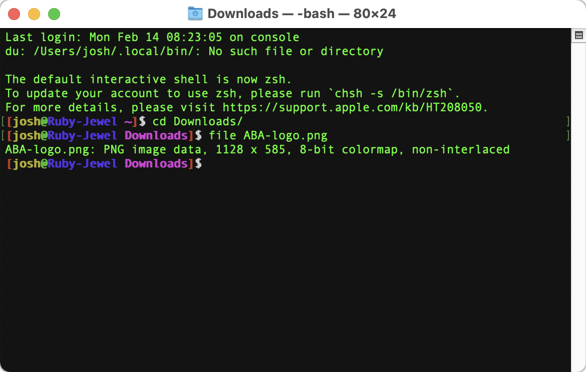
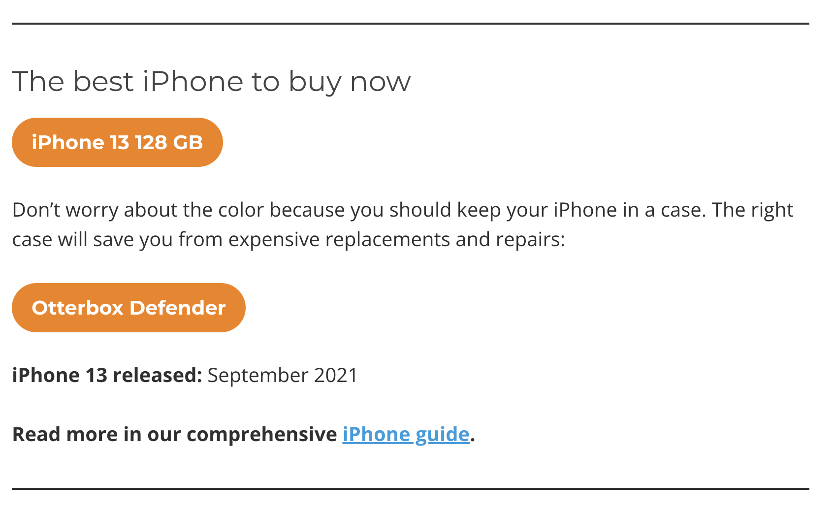
Lest Adam think he’s paying me to work on ABA all day now, I’ve implemented a very quick fix for the front page by adding separating lines between sections. Let me know if it’s an improvement.
The lines between seconds help, that was part of it. But even the info in each section my attention is a bit haphazard. (big caveat that I’m not a designer).
Section title: larger font but not stronger. It doesn’t stand out much compared to the larger orange boxes. So I see the rounded box, but the text listing what it is representing comes later. Feels backwards to me.
Recommndation links: My eyes are drawn to these first, but what they are comes a second later, by reading upwards in most cases. Are these buttons? Links? Styled like buttons, but wasn’t clear what would happen when I clicked, even though I guessed it was a link (but also not clear). Details on why that’s the best, or link to buy the product?
Bold lines: This is additional info, but not inset or differentiated in any way. Also bold, so seems like it’s supposed to be more important, but isn’t really. I’d use placement (right justified or indented maybe?) to differentiate vs the bold.
Again I’m not a designer, so not the best to offer alternatives, but I would find other visual ways of differentiating the different types of info than the ones used. I should also qualify I’m reading on a desktop, haven’t checked it on mobile.
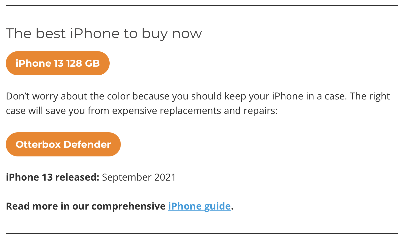
Good news: I have enabled donations. I remembered I set up a Stripe account over the weekend for my non-Apple-related Substack, so implementing that took all of about 5 minutes. I’ve set the price at $10 per year. Let me know if that seems like a reasonable amount. Unfortunately, Stripe makes me set up a different “product” for each possible donation amount, so I wanted to keep it simple.
However, I must say: please become a TidBITS member first. Your membership funds everything we do here, including my salary as managing editor, Adam’s salary, fees for contributors like Julio, etc. Your TidBITS membership will have much more impact than your Apple Buying Advice donation.
That said, you can donate to Apple Buying Advice here. That link is also available on the home page. If you are a crypto person, you can find BTC and ETH addresses on my about page.
Bad news: Stripe’s Apple Pay integration is not yet enabled due to an error. I have been in touch with Stripe support and they are as flummoxed as I am. I am hoping they can fix it soon (Stripe has an excellent reputation). But in the meantime, it’s a huge bummer since Apple Pay is so painless, at least from the user end, and you miss out on that extra 10 cents of Apple Card cashback per year.
Before you donate, please understand:
This is a donation and I can’t offer anything in return other than trying to keep the site running. I work on this site in my spare time so I can’t always fix and update things as quickly as I would like.
While I’m always open to feedback, and I’ve been responsive to it, all decisions about the site are ultimately mine and mine alone.
Again, thanks for the huge response! Traffic has been crazy and I’m shocked and impressed Bluehost has managed to keep up.
One thing that is always helpful on a site that wants to be seen as current is the date the page was last edited. It is reassuring when the date is relatively recent, and a warning when the site has been left to languish. Either way, the date is useful. Thanks again for this, I will be pointing friends and relatives your way!
Hi Josh, thanks for the fix. Your logo image now loads and looks fine here too, both in Safari and in iCab. (And in Chrome, too, of course.) I like the 6-color design, using 2 pairs of complementary colors, a la Apple logo originale.
100% agree. When my wife decided she wanted an Apple Watch (before I got one!) I was frugal and got the GPS version. But I never considered that my iPhone is always in my pocket which isn’t the case for her. So after a few months of it being fairly useless for her, we sold it and bought her a cellular model. Now she’s getting the most out of it.
It’s easy for us as men to not consider what it’s like for someone who doesn’t have ample pockets. I think it would be a big service to at least mention that in the paragraph that recommends the GPS model.
I’m also not a professional designer but I agree with all of Angus’s observations. The relative lack of visual distinction between sections was the main thing I noticed; the h3 headings are the right choice to semantically separate and describe each section but I find their font, size, and placement too similar to the body text.
Adding the hr between sections helps a lot. Other ideas would change the appearance of the headings more; a more distinctive font for the headings, maybe something “chunkier” and/or serifed, having them “outdented” from the rest of the text (though this should be different on larger and smaller viewports), and/or a background-color.
It’s almost always best to let users be in control of when they open a link in a new tab or window; I’d remove target="_blank" from the call-to-action shopping links.
A bit of cool news: Apple Buying Advice is now on the first page of Google results when you search “Apple Buying Advice.” The TidBITS article link is #2, behind the MacRumors guide.
I clearly am not either! Playing with the front page design is on my list of to-dos when I find the time. What it really needs is images, but I’ve prioritized site speed above all else. Unfortunately, this week has been absolutely bonkers, which is both good and bad. Here’s my current to-do list:
I’m not quite sure what to do with the newsletter. I’ve had way more sign-ups than I anticipated. Of course, I’ll send something out when new Apple products drop, but I’ve also considered sending good deals I see. But I’m hesitant to clutter your inbox because mine is like a war zone.
Thanks for that feedback. I didn’t quite know how to handle those. I personally like it when a link opens a new tab, but I didn’t want key stuff buried, so I used that more for background information. It’s on the to-do list.
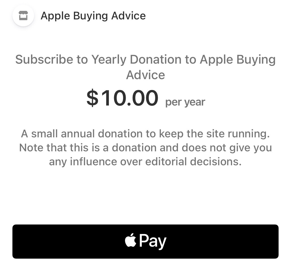
Good news, Apple Pay is working! You can donate here. Of course, you must be in Safari for this to work.
If you’re interested in nerdy details about the problems I had:
First problem was site verification. I had to upload a file, but I first put it in the wrong place. I fixed that but it still wouldn’t see the file. Support was stumped. I tried it again last night while cleaning up browser windows and it suddenly worked. But I still had no Apple Pay button so I emailed support again.
Support explained this morning that it won’t show up if you have automatic sales tax collection enabled, which was not mentioned anywhere. They sent unhelpful developer docs, but I figured out how to turn it all off. Unfortunately, you can’t edit much on a payment link after the fact, so I had to create a new “product” and a new link.
Thankfully, no one had donated yet, so no trouble there. I also updated the link above so it’s correct. Also, it seems like I don’t fall under sales tax nexus until I’m collecting six figures, which I don’t see happening, and if it does, that’s a good problem to have.
Thanks, @jcenters. I don’t want to sound like a nag here, but do you also have an option for one-time payments? I try not to do subscriptions, not with content, not with software, not with donations either I’m afraid.
Name a donation amount that sounds fair to you. Of course, you’ll have to realize I then have you nag you every year for another donation ;-). If I had my way you could enter your amount and chose whether it’s recurring or not, but Stripe doesn’t make that easy.
Hi Josh, just an FYI — two days after you went live I still can’t see the site. I use a Raspberry Pi on my local network for DNS (Pi-Hole ad blocking), and its upstream for DNS is Quad Nine: 9.9.9.9. That service still does not know about applebuyingadvice [dot] com.
I wonder if the various blacklistings you are running into might be because Bluehost had put you in a bad “neighborhood,” IP-wise. The server I rent from Digital Ocean periodically shows up on badlists, including Google’s, although the behavior of sites I host there is exemplary.
 . I’ve sent them a message.
