Sorry, but that makes no technical sense. Even if you could make an argument that an icon somehow used fewer pixels than an equivalent word, there’s no way to attach power savings to using individual pixels in different ways (with the exception of totally black pixels on the OLED screens used by the iPhone X, XS, and XS Max). See the first answer here:
1 Like
When you reduce the line thickness of the display font, you save processing power. When you replace dimensional, well designed icons with flat squares with ugly mono colors, your save processing power. When you remove the useful ports and the electronics they need to operate, you save processing power. The list goes on, but when the useful features and user pleasing graphics are removed from Apple products, Apple advertising touts, “More power and longer battery life”.
Phil
I really don’t think any of that is true. What pixels you draw to the screen are really irrelevant as long as they’re static. Actions like navigating with GPS, talking on the phone, and streaming a movie impact battery life in a big way. Even screen brightness is a big deal. But whether iOS is drawing an ellipsis button or the word More doesn’t make a difference.
1 Like
So they made the UI sub par just for kicks?
In essence, yes. Design isn’t a situation where there’s a right answer. It evolves with the times and the products, competes with alternatives, and sometimes leads to places where no one has gone before. Changes aren’t always successful, particularly for those who were expert with a previous design, but they’re always intended to make things better in some way. Designs are also aimed at particular audiences, so a younger or less experienced audience might have different opinions than an older or more experienced audience.
It’s tricky to criticize a design based on aesthetics, which are largely subjective, but what Josh did here was point out how Apple’s overuse of the ellipsis button might be making iOS apps harder to use. At least in theory, design should never do that.
1 Like
I agree that the ellipsis is not an improvement. I disagree that Apple is ignoring the years of having regular humans determine what apps and hardware are easily navigable. Like too many clicks to accomplish a task that only requires one.
Eliminating all the ports and the optical drive wasn’t done to improve the usefulness of Apple products, but it made the benchmarks look like they improved the processing power and even increased battery time, even though they used the same processors and batteries.
But as you have stated, the article is about ellipsis overkill instead of using a simple word like; More.
I think you may be conflating several things into one. There were several drivers for Apple to remove optical drives and ports. In some ways, it did increase battery life but only because removing ports freed up internal space so the size of the battery could be increased. Removing the optical drive (which is rarely used anymore) saves a lot of weight and allows for a much thinner machine. So there are other important considerations above processing power and battery life.
My least favorite ellipses are in Facebook posts. In my experience very few people know that they can click on them to edit the mistakes in their posts. For some reason in closed FB groups the ellipsis is replaced with a downward-facing arrow (upside-down caret).
Also available under those ellipses is the powerful “Find Support or Report Post” link which is the ideal place to report a bogus or criminal account. Of course you can also do this Quick Help question mark icon in the menubar and choosing Report a Problem, but there you have to click “Abuse Content” which sends you right back to the ellipses without actually saying they are ellipses: “ The best way to report abusive content or spam on Facebook is by using the Find Support or Report link that appears near the content itself.” You could search a long time before figuring out that said link is actually indicated by three little dots.
1 Like
I like that Apple uses semantic naming for their glyphs (which is recommended in development). However, I think that Apple should allow us to search for a glyph by its meaning (eg searching for “settings” in the SF Symbols app should show the gear glyph as a result).
I also think that Apple should:
- only use the
ellipseglyphs for more actions or navigating to an activity sheet, an activity view, a popover, etc - use their
chevron.leftandchevron.rightglyphs for more content or navigating to a child view - use their
info.circleglyph for “Get Info…” and similar functions - use their
gearglyph for “Settings…”, “Set Up…”, “Configure”, and similar functions - use their
line.horizontal.3glyph for menus - use the word “Edit” for editing.
I would also like Apple to be more consistent with their use of their glyphs. For example, Apple says that the book glyph should only refer to Apple Books, yet they use it in Safari to refer to bookmarks (even though they have a bookmark glyph). (Also, what glyph should we use if we want to refer to books but not Apple Books?)
Wouldn’t semantic naming mean using settings like Google does rather than gear like Apple does? Apple seems to be using descriptive naming unless I’m misunderstanding how the term “semantic” is used in this context.
1 Like
Nice article, Josh.
I’d like to point out that Apple used to define this stuff, as well as when to use what. The Human Interface Guidelines (anyone remember that?). Apple’s UI groups seem to have abandoned guidelines some years ago.
–julian (Principal Engineer for Apple QuickDraw 3-D)
Yes, Sir. I sure do.
Something I and several others here have bemoaned for quite a while already I’m afraid. Maybe with the recent shake up in Apple related to design and UI there could be some movement there though. Unlikely perhaps, but I guess still possible.
Apple does have a Human Interface Guidelines site, so I’m curious how it compares with the venerable Human Interface Guidelines book from yesteryear. Does anyone have a copy kicking around to compare against?
I read the article (ok most of it) the other day in the Tidbits Newsletter. But I thought it did not particularly relate to me. Then today I wanted to delete an expired boarding pass in my Wallet. I could not for the life of me, on my own, figure it out. So I went to search the internet and found several methods described but none of them were visible on my wallet. Then I remembered this ellipses article. Sure enough, clicking on the pass there is an ellipse on the screen and that took me to a place I could delete the pass. Apparently the method had changed with OS versions, and my searching had not brought up the latest version. So thanks for the ellipse article!
3 Likes
I’m glad it helped you! Another thing about the ellipses buttons is that they’re not exactly search engine friendly either.
It’s interesting that in the same issue where you acknowledge that loyal readers lean older rather than younger, you seem to ignore a common way in which youngsters interpret and use the ellipsis in text messaging communications: they use it as an indicator of impatience or annoyance, as though it was a tapping finger or fingers drumming on a table. Just as a period is used to put a little pepper on a remark, and multiple exclamation points are necessary to convince your interlocutor that you are sincere/caring, so the ellipsis is being used to convey a mildly negative emotional tone.
There’s at least one designer at Apple who can still create great icons.
I have a printed copy from the early ’90s, covering System 7. Yes, it’s one of my most prized design-related possessions. ![]()
It’s vastly more detailed, extensive, rigorous, and coherent than the current HIG website(s). If you’re interested, I can take a few pics from the book for comparing with the current sites.
Thankfully, there’s a really helpful set of library files for Sketch, Photoshop, and XD on the Apple Design Resources webpage, though, that provide some decent information on layout details that are not covered in HIG.
It would be fascinating to see how the old discussions compare with the new ones, @jochen. And if there is a section talking about the ellipsis, that would be particularly compelling. ![]()
The HIG version that I have is Copyright 1992 and contains about 380 pages, many of which are beautifully illustrated.

Before showing some page shots, let me start by pointing out how amazing even the book’s appendices are.
One Appendix contains a huge bibliography, grouped into sections such as Cognitive Psychology and Human Factors, Environment Design(!), and Graphic and Information Design.
Another appendix provides an well-curated 12-page checklist, although of its items sounds delightfully anachronistic these days: “Do you always design for black and white first and then colorize your design?” or “Are your black-and-white designs two-dimensional?” [Note the proper use of hyphens, BTW: they’re included in the adjective, “black-and-white,” but not in the noun, “black and white.” Love it!]
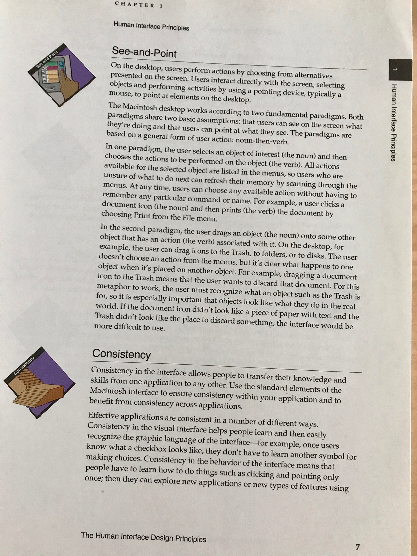
Before the book explains the macOS-specific design guidelines, it covers the fundamentals of human-computer interaction:
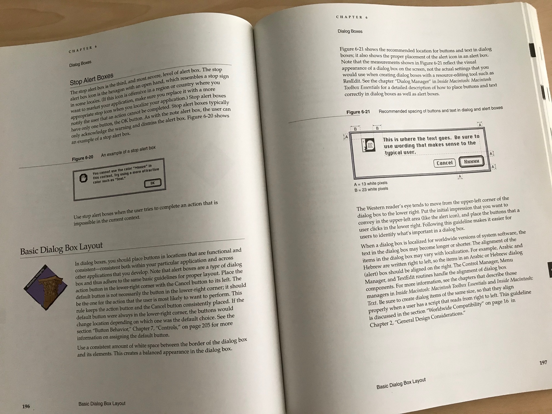
The Mac-specific contents go into a detail that the current HIG simply don’t have anymore:
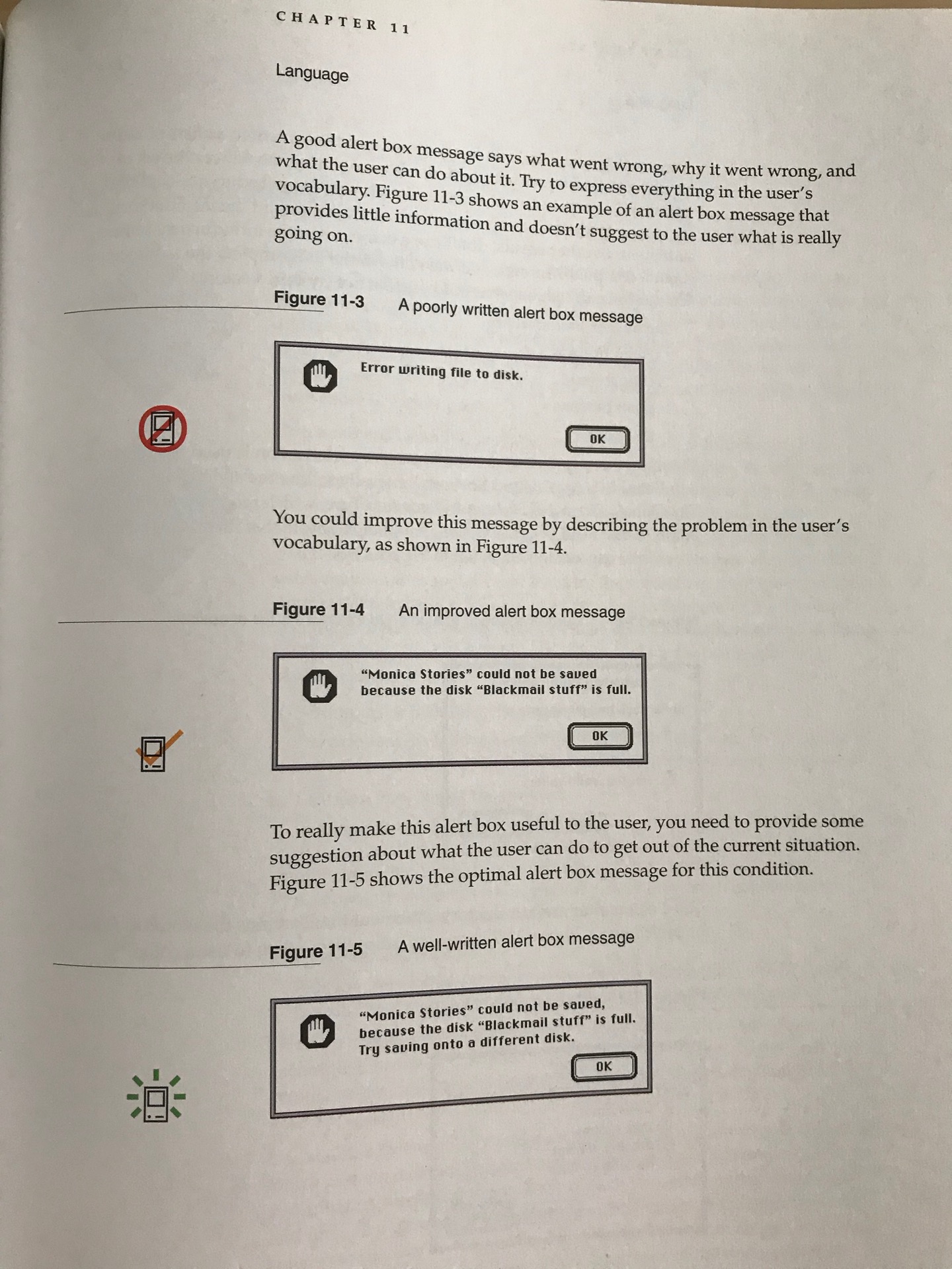
One aspect of the current state of UX Design is that so many products still ignore “small” fundamentals that make a huge different for users, such as providing meaningful — to the user, mind you! — error messages. Check out this really simple example, which is more than a quarter century old. Dvelopers and designers still get this stuff wrong. All. The. Time. That’s just inexcusable.
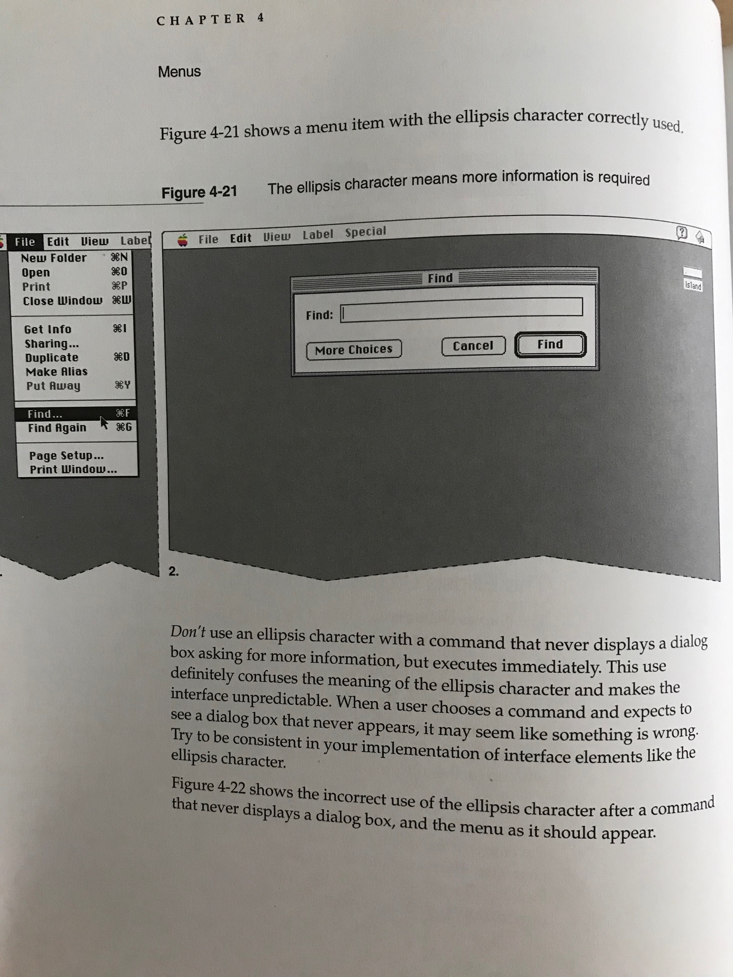
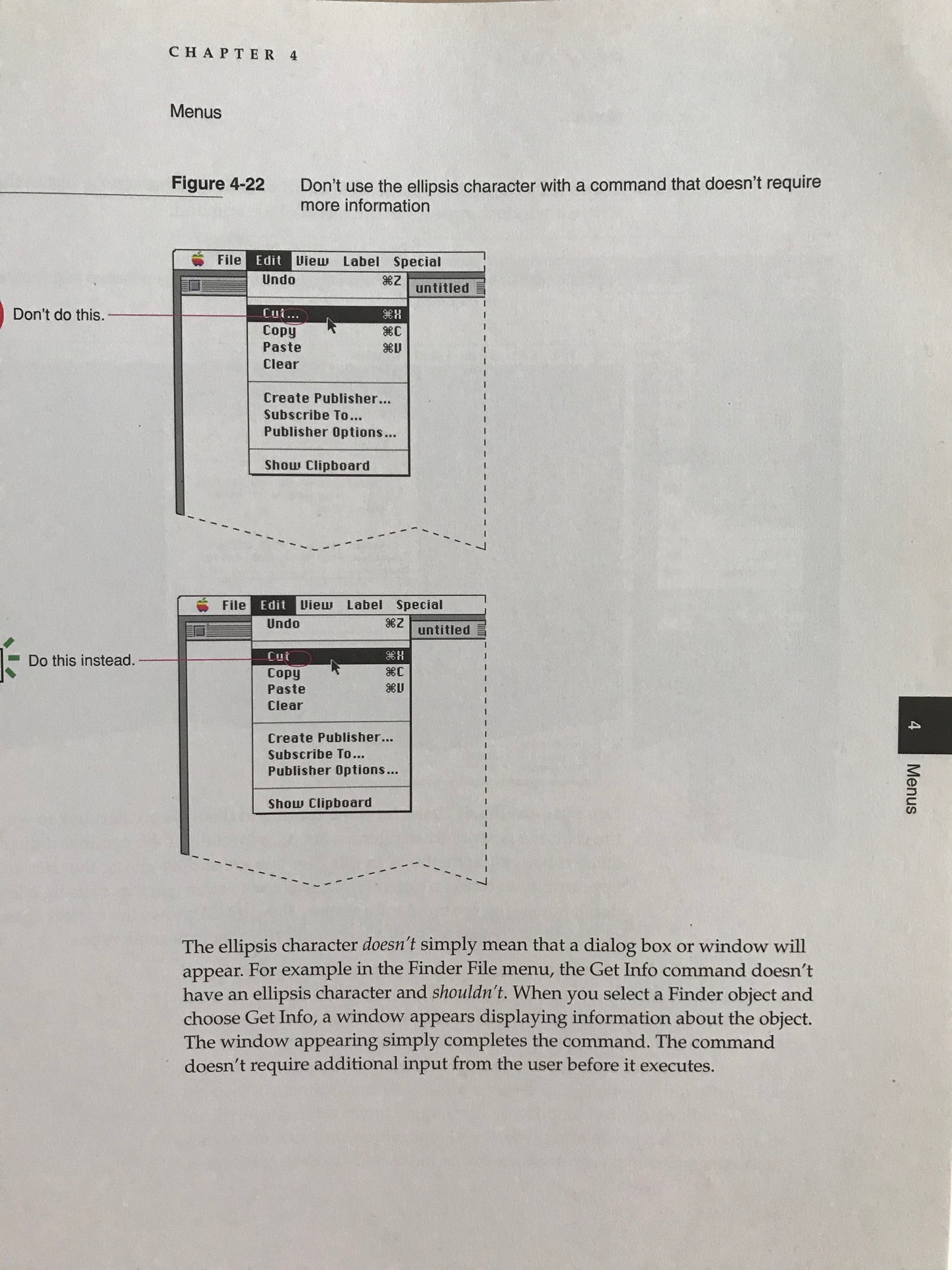
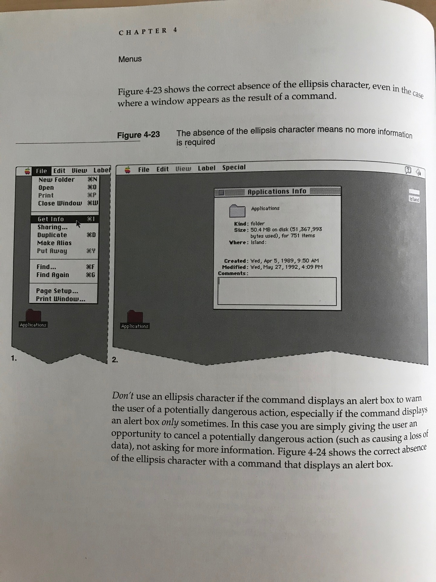
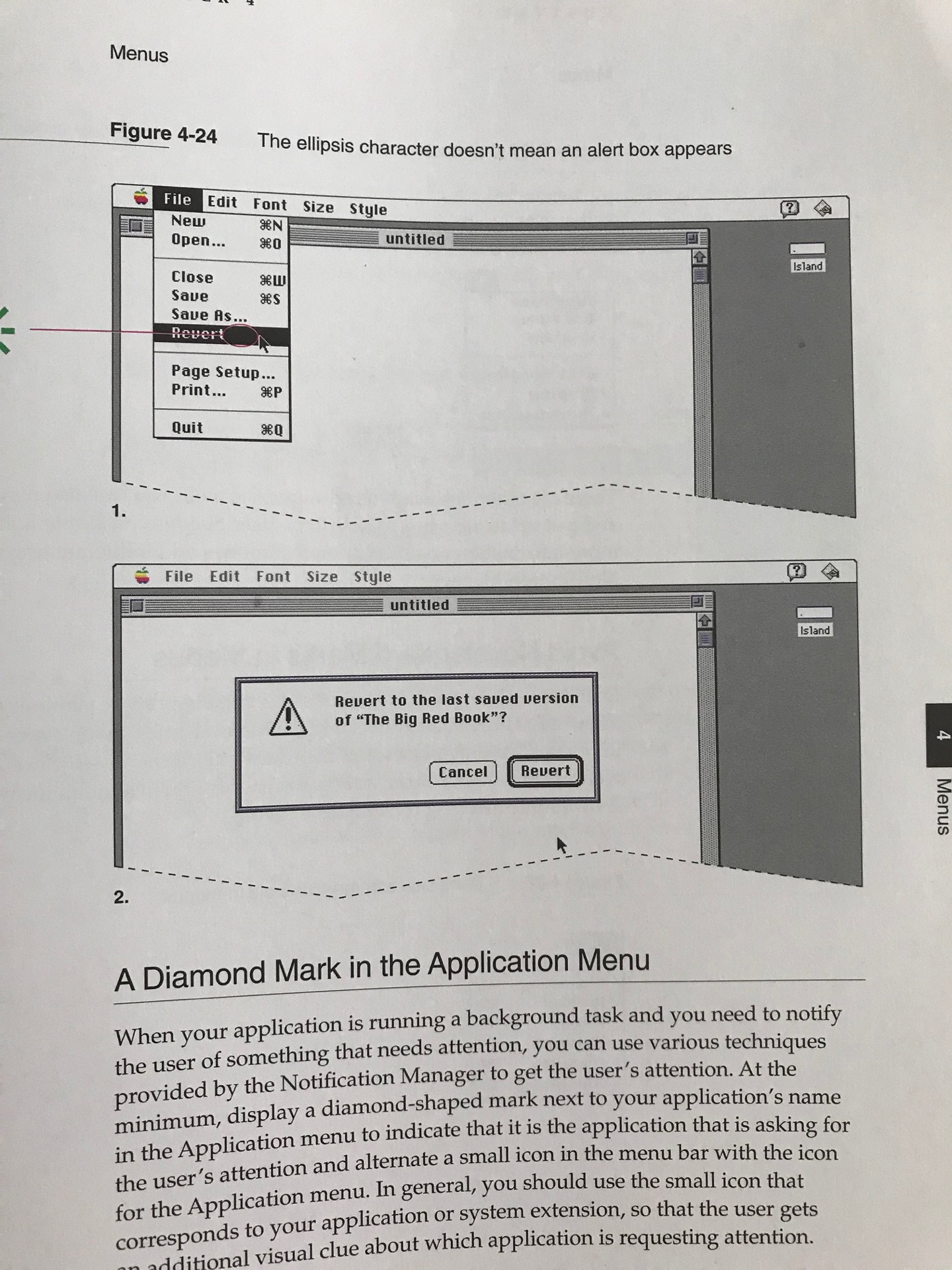
Finally, that ellipsis stuff, @ace! :) The book only addresses ellipses in menu items, but it does so in very thoughtful detail, taking up some 4 pages, net.

The current macOS HIG still provide a wealth of good design advice, but almost everything is chopped up into little chunks of advice.
In contrast, its printed pre-decessor is, in fact, on par with a well-written text book. It’s a great and enlightening read in its own right, which helps readers get much more of a big-picture understanding of the topic than they could hope to get from perusing today’s checklist-formulated guidelines.
3 Likes