Typographically, what the original request was for, and what was demonstrated using U+0335 Combining Short Stroke Overlay, is different from a regular strikethrough styling.
When you style text as “strikethrough”, the stroke normally runs the full width of the character box, so that adjacent characters with strikethrough appear to have a continuous line running through them. U+0335, however, as the name states, is a short stroke, a little narrower than the visible glyph. Adjacent characters with this applied do not appear to have a continuous line.
So for the purpose originally stated, strikethrough style really isn’t the best solution. U+0335 is probably the best choice for the specific effect originally requested.
Interesting, and thanks - I’ll take a look. The idiot whose answer is cited displays only his own ignorance by writing that it’s “a nonsense; period”. It’s a requirement (avoidable, but best used) when amending certain legal documents in England and Wales.
With apologies if this was mentioned (I did try to see if it was) or if is too obvious (I don’t mean to insult anyone’s intelligence), and admittedly it’s not a perfect solution…
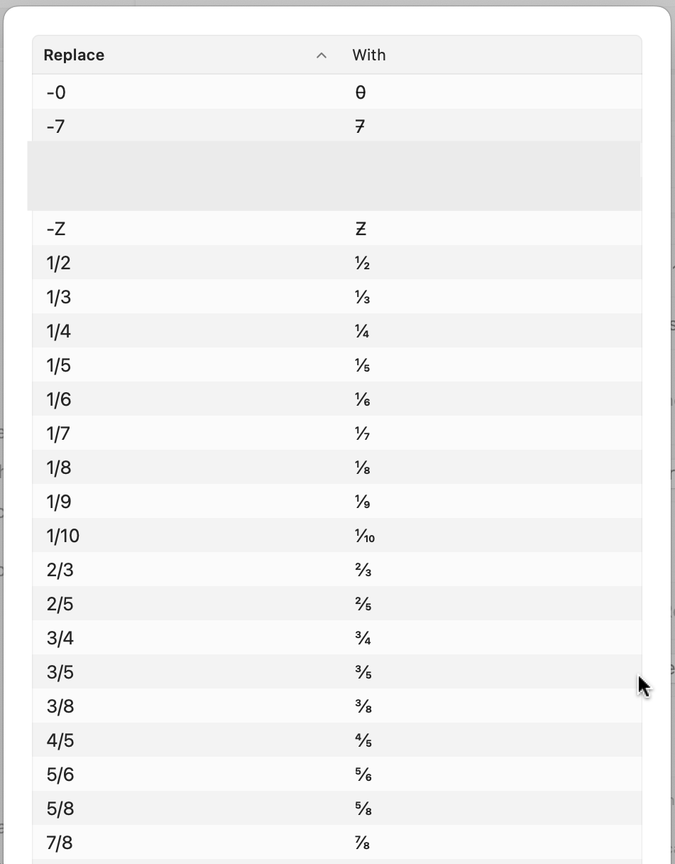
What about creating Text Replacements in Settings? I did this years ago for fractions (½, ⅓, ⅞) after reading about that here, and just did it for 7̵, 0̵ and Z̵ with some copy/pasting.
Then I tried it in several programs (what you youngsters call “apps”).
It works nicely in Apple’s programs – I tried Notes, Pages, Numbers, Keynote, TextEdit, and changed to all sorts of fonts, some built-in, others added. (Let me know if you’d like some screengrabs of those).
But sadly it did not work in Microsoft Word, even after I did the same thing in AutoCorrect Options. Oops.
So yeah, not perfect, but a step in the right direction, hopefully.
It’s a bit surprising to me that we’re thirty posts into the thread and no one has identified a non-cursive/calligraphic typeface that meets the OP’s requirements.
There might be an interesting opportunity for a typeface designer to generate a couple of font families with the character elements commonly found in handwritten European characters, e.g., having true “seven” and “zed” characters with crossbars, rather than having the crossbars associated with special characters.
I’d be interested in seeing a monospaced “terminal” style typeface, as well as more common serif and non-serif faces.
(I was educated in the US, but I generally use the “European” style of characters when I write by hand. I used to work for a German company, and I came to appreciate the reduction in ambiguity.)
It’s interesting to see this quoted here as “European” style.
Around the Bay Area I often see people use the 7 with a stroke in handwriting (or even the Z). These are not immigrants. These are people that went to the same local public schools I did but they somehow end up writing like that. I wonder where it comes from.
I spent 20 years in Central and Scandinavian Europe, and while over there I did at times put a stroke on my 7s or used a curly 9, I never did that here before and I don’t do it now either. One thing I never saw over there though is people write their 8s as two stacked circles. That always cracks me up.
As I said in the previous thread, I started when a rent payment in Germany of 70 DM was processed as 10 DM (this was in the mid-1970s). BTW, after a career in the USAF, I still use DD MM YY dating and also use 24 hour time on my Watch and clocks.
Unless you mean your reference to “strikethrough” fonts, I must have missed it. A “strikethrough” is different from a crossbar or a slash. Strikethroughs typically occupy a full character width, while crossbars and slashes are “diacritics” that can differ in width and other characteristics from glyph to glyph and generally are more subtle and refined than a strikethrough.
I try to avoid ever using numbers for months on my documents. There’s just too much ambiguity when sharing content with people from around the world. I always write something like “1-JUN-2023”, including on checks and legal documents.
If I need an all-numeric format, then it is always YYYY-MM-DD, so the string sorts by date. e.g. “2023-06-01”
Oops, mea culpa! I meant to type DD-MMM-YY where the month is the first 3 letters. I also usually don’t use a leading zero for the first 9 days as in your 1st paragraph.